Management View
Purpose of the plugin
The Management View is used to maintain attributes for products based on the underlying data model.
Introduction
Classified products can be selected and their attributes maintained within the Management View.
Attributes of different types (e.g. string, boolean, etc.) can be maintained and references (asset and product references) can be linked.
Prerequisites and relations to other modules
The Management View is closely related to the Configuration View, in which the data model is made available.
Various editors can be accessed via the Management View, which offer additional options and can be used to edit attributes more easily or display them in a different way.
The Bulk Editor, for example, makes it easier to maintain mass data, while the product view can be used for various additional options, such as metadata translation.
In addition, various AI functionalities (e.g. text translation or generation) or workflow functions can be started.
How to access
Users can open the Management view via the sidebar.
It is also possible to jump directly to the Management View via function 'Open in Classification View', which can be configured for example in OMN Search.
How to use
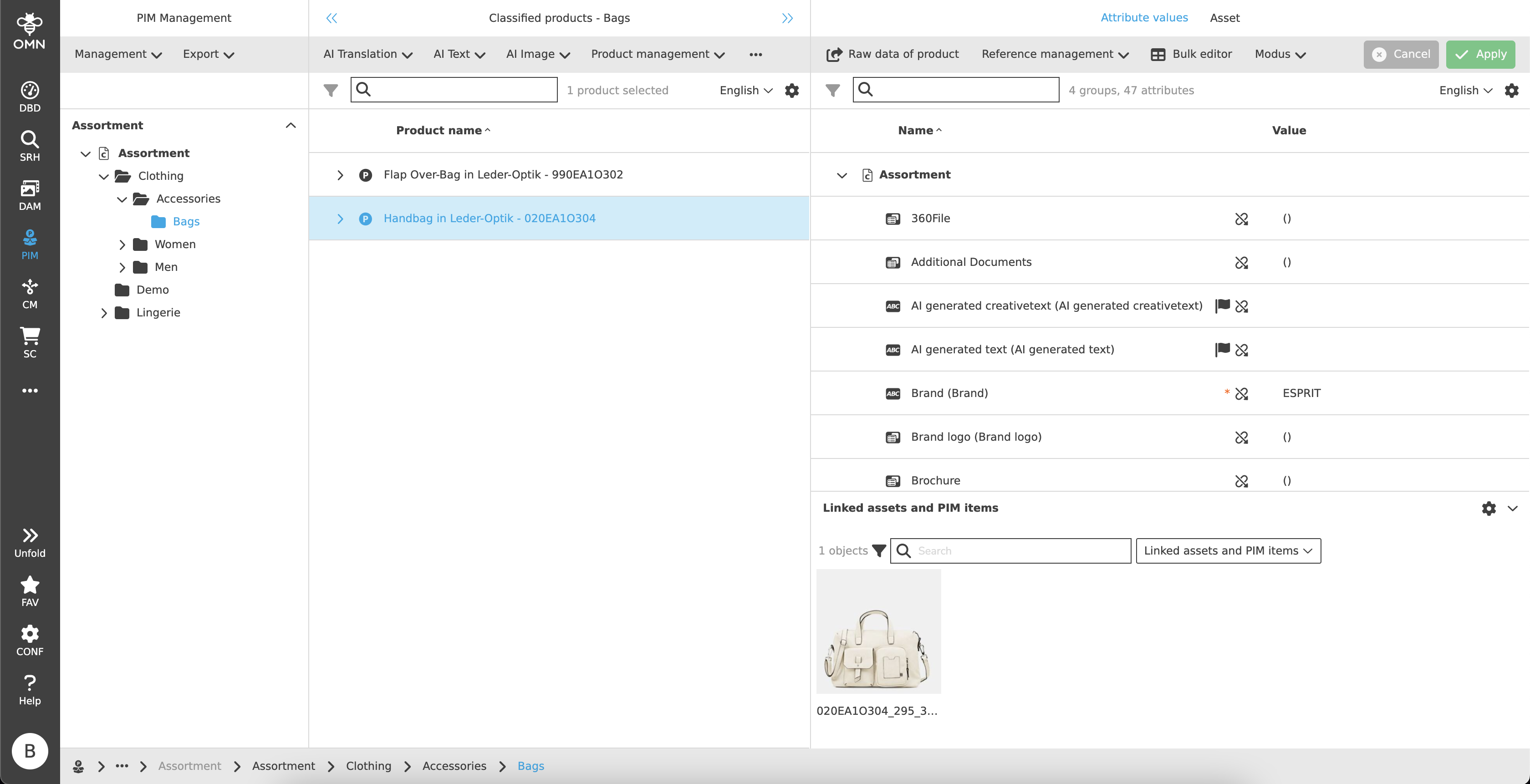
Like most plugins, the Management View consists of a left, center and right view.
-
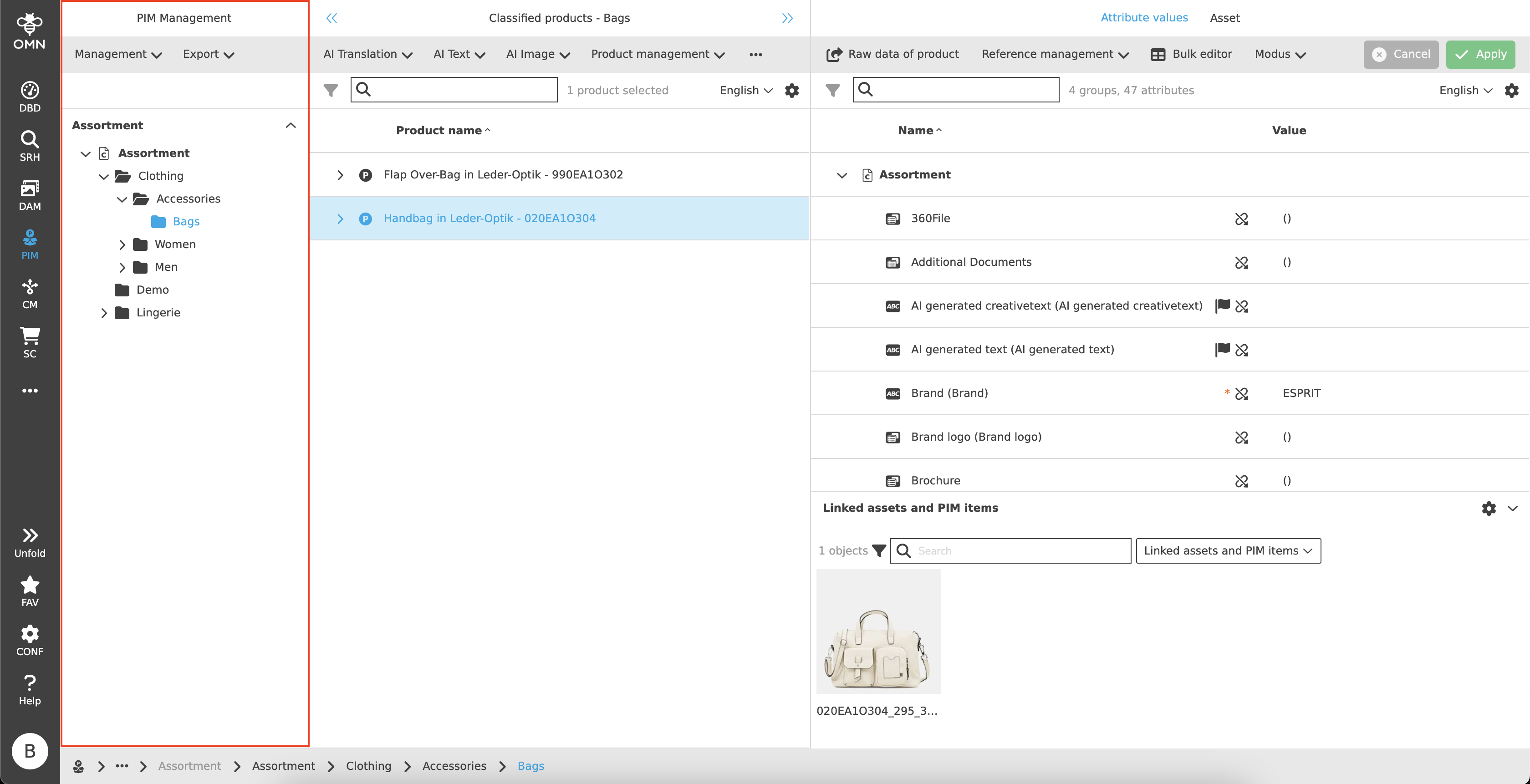
Left View
Navigation area, display of classifications and underlying nodes -
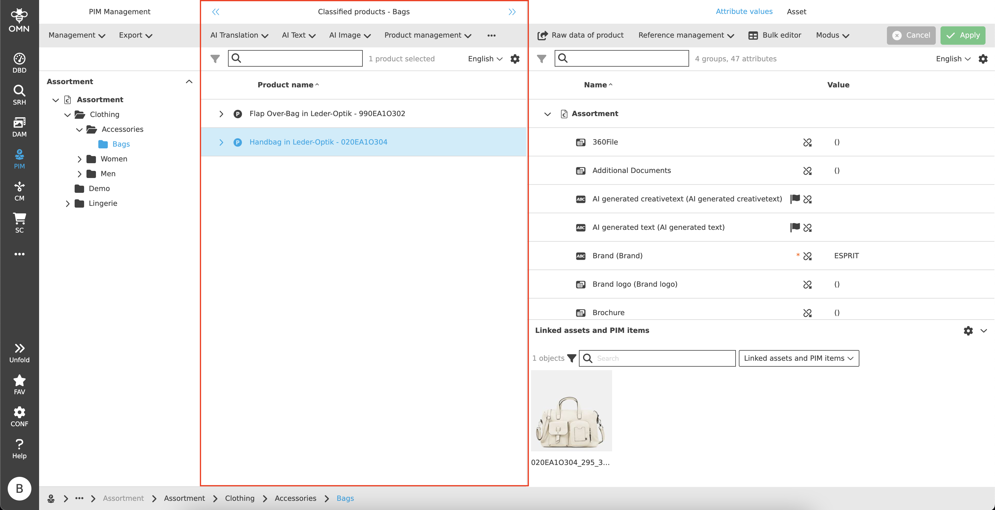
Center View
Display of the classified products, articles and variants of a node -
Right View
View for maintaining attributes and linked files
Left View
The classifications are visible in the left view. These contain folders with various nodes that can be localized.
Center View
In the center view, products are displayed with their articles and variants in a hierarchical and group-like display. These can be expanded and collapsed as required.
Toolbar & Functions
Various functions and editors can be executed or opened using the toolbar. All functions are configurable, examples include:
-
Opening the Product View
-
Opening the Bulk Editor
-
Use of various AI services (e.g. text generation, automatic translations, …)
-
Product management functions (e.g. product creation, editing or deleting products)
-
Export functions
Statusbar
The statusbar includes a quick search function, the option to change the language and settings.
Quick Search & Object Counter
A quick search function is available to users to reduce content and simplify the search for specific products.
One or more values can be entered here to find the desired product.
Next to the quick search is an "object counter", which displays the number of products. Articles and variants are only included in the count when a selection is made.
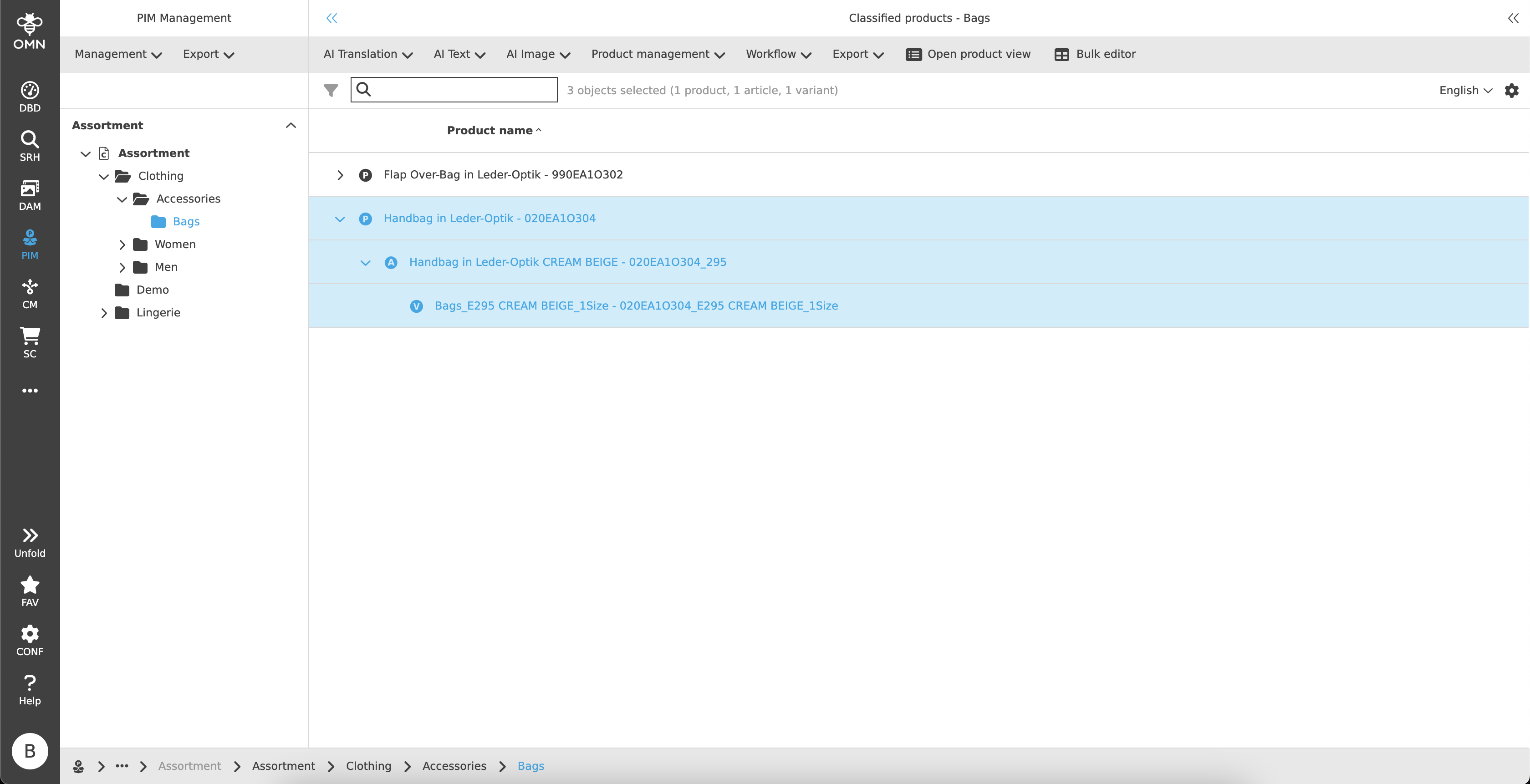
Canvas
The canvas area is structured like a table and contains hierarchical product groupings consisting of products, articles and variants. These are each marked with their own symbol (P, A, V) and grouped together.
Products form the parent element, followed by the articles and finally the variants.
By default, the products are displayed, articles and variants remain collapsed.
It is possible to filter and/or sort columns.
Right View
After selecting one or more products, articles or variants in the center view, the right view is opened.
This contains the actual Management View for maintaining the product attributes.
The right view contains two tabs: attribute values and asset.
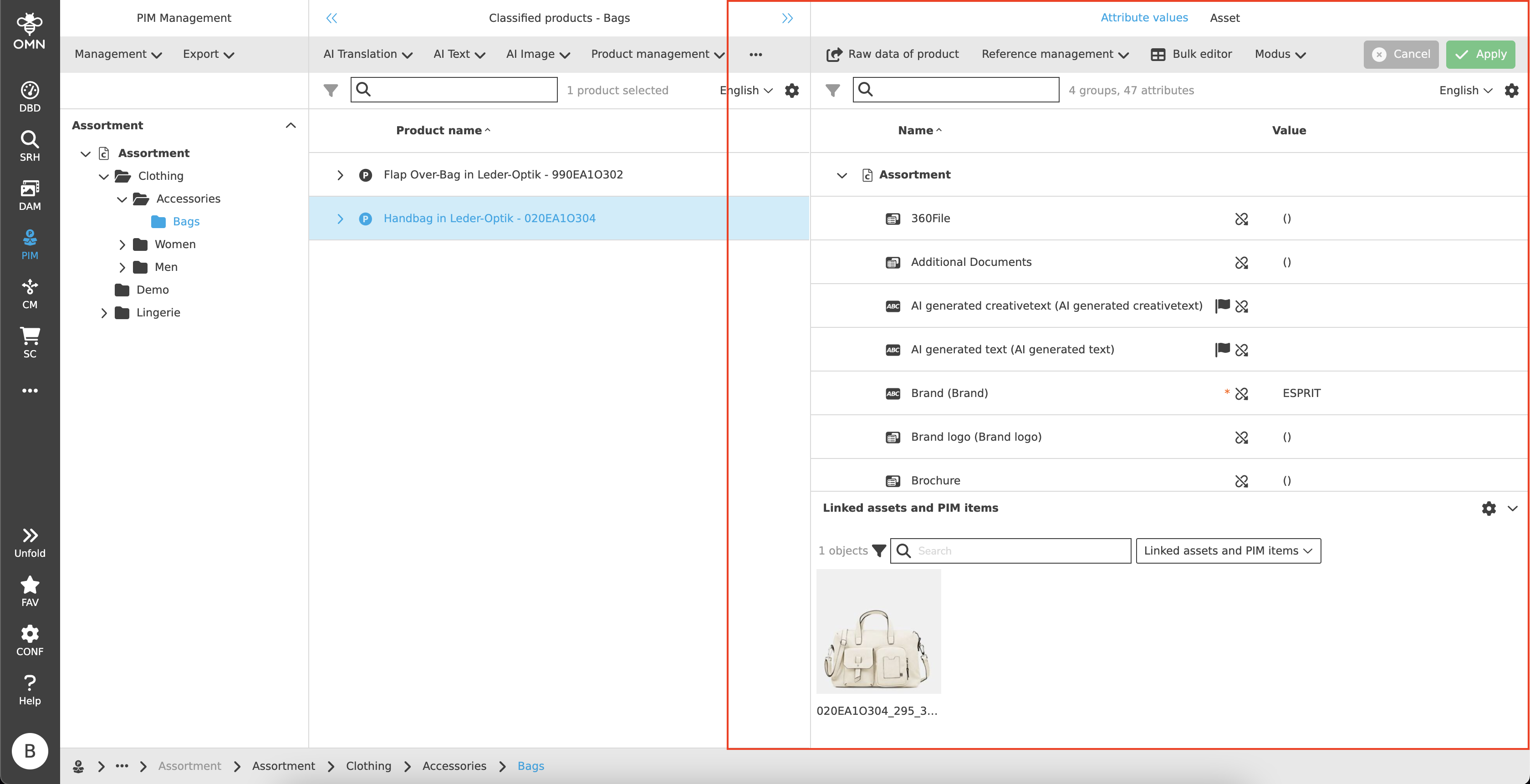
Attribute Values
The user can edit all values allowed by configuration in the Maintain View for attribute values.
Toolbar
In addition to configurable functions, the toolbar also offers the option of saving and discarding changes.
Functions
The available configurations of the toolbar are, for example:
-
Reference management (e.g. change or remove reference, sorting, open files)
-
Grouping by tag or node
Save & Discard
The toolbar contains an option to save or discard all changes.
-
Discard
If the "Discard" button is clicked, all changes made up to the last save are discarded. -
Save
Clicking on the "Save" button saves all changes made up to the last save.
There are two cases that can restrict saving:-
Required fields
As soon as required fields are not filled, a dialog appears after clicking on "Save", which displays all required field attributes that have not been filled (in the case of language-dependent attributes with information about the missing language).
The user is asked whether the changes should nevertheless be saved. -
Mandatory fields
As soon as mandatory fields are not filled in, a dialog appears after clicking on "Save", which displays all mandatory field attributes that have not been filled in.
Changes cannot be saved in this case.
-
Statusbar
The statusbar includes a quick search function, the option to change the language and settings.
Quick Search & Object Counter
A quick search function is available to users to reduce content and simplify the search for specific attributes.
One or more values can be entered here to find the desired attribute.
Next to the quick search is an "object counter", which displays the number of groups and attributes.
Statusbar Settings
The statusbar settings enable the following:
-
Display data type as icon
-
Column visibility
Language Switcher
The statusbar also has a language switcher.
This does not change the language setting of the entire page (this process takes place in User Settings) - instead, the setting relates to the language-dependent attributes.
As soon as the language is adjusted, all language-dependent values are displayed in the selected language.
Canvas
The attribute values canvas area is used to maintain attributes and is divided into two areas: Maintain area and linked assets and PIM elements.
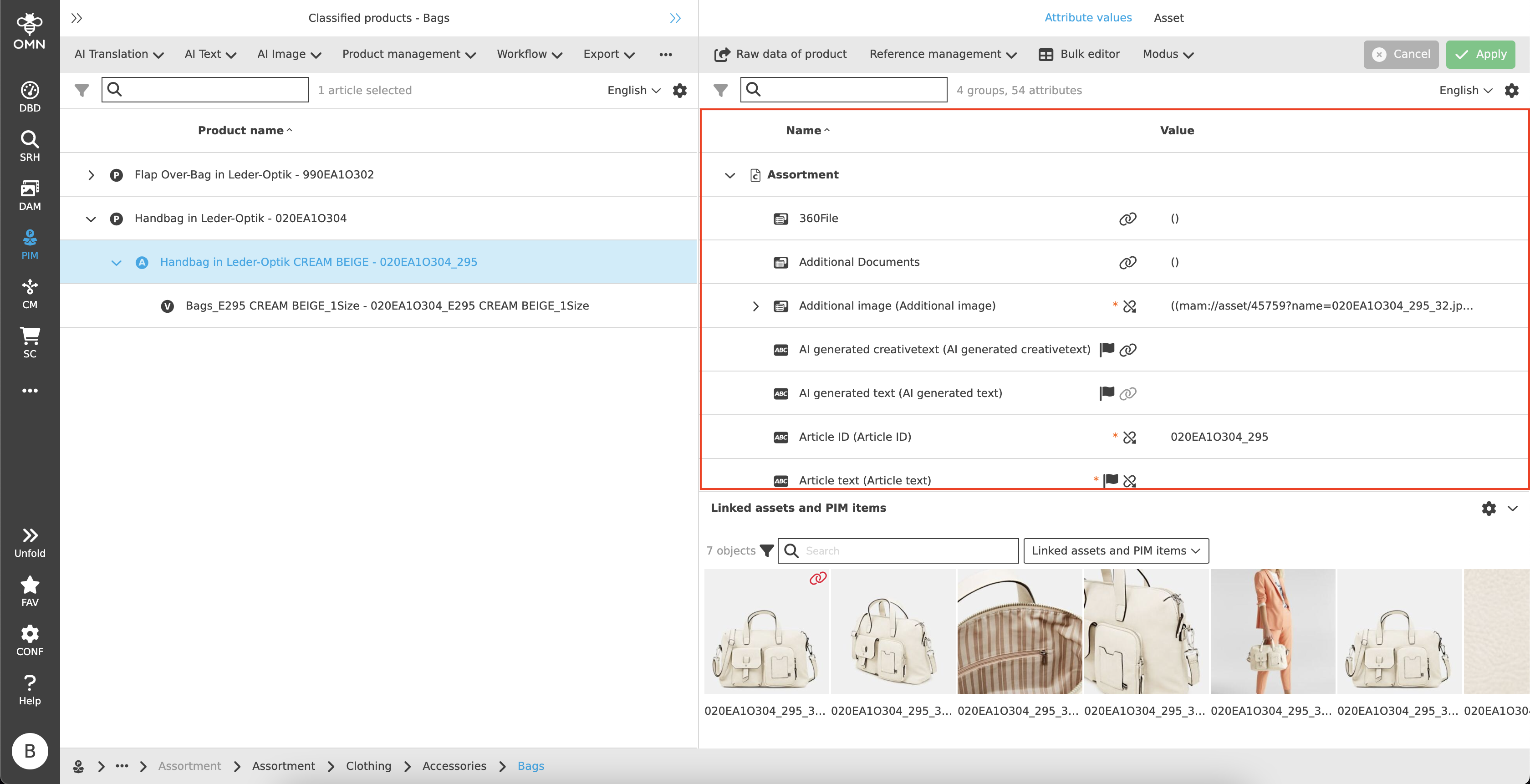
Maintain View
The Maintain View is structured like a table and contains all attributes of the selected product/article/variant.
It must be taken into account that the display of attributes on a level depends on the inheritance rules (see Configuration View).
It is possible to filter and/or sort columns.
To maintain/edit the values, text and numerical values can be entered directly into the input fields.
Various other data/input types are also available for maintenance:
-
 String
 -
 Real
Real -
 Date
Date -
 Boolean
 -
 Table
Table -
 Reference Table
Various icons can appear within the Maintain View:
-
 Flag
Flag
Is displayed if it is a language-dependent field and values can be maintained in different languages. -
Inheritance
The inheritance icon (paper clip) indicates the status of the inheritance. This can have the following characteristics:-
 Parent object
The parent object is always the initial value from which the downward inheritance starts. -
 Inherited
The values were received from the parent object. If the icon is displayed in a lighter gray, this means that the inheritance may not be changed due to the configuration and the inherited value must be adopted. -
 Inheritance broken
Users can enter their own values in the fields, thus breaking up the inheritance from above.
The value can also be canceled and reset by clicking on the symbol.
-
-
 HTML
HTML
The HTML tag is displayed as soon as the value contains valid HTML text. -
 Pencil
Opening the table editor and adding further attribute values/expressions -
Required and mandatory fields
-
Required fields
Asterisks in the color orange - the fields should be maintained, but can remain empty -
Mandatory fields
Asterisks in the color red - the fields must be maintained and must not remain empty
-
Linked assets and PIM items
There is an accordion at the bottom of the Maintain View that displays linked/referenced files and PIM items.
These are displayed with an asset or product preview.
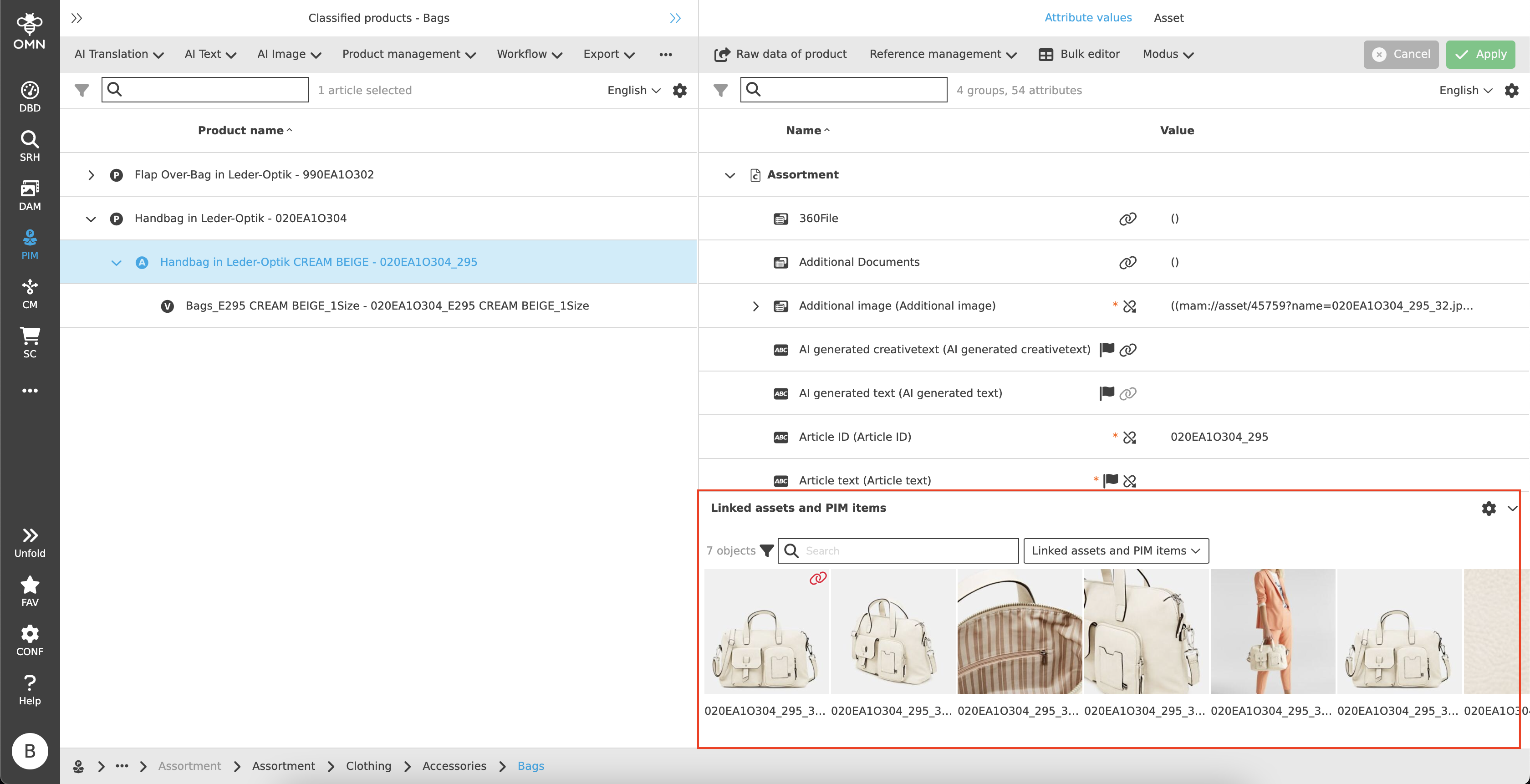
To link one or more files or a product, the user can drag the corresponding file directly into the accordion area using DnD.
This opens a referencing dialog, which can be used to select one or more reference attributes via a dropdown.
These reference attributes can subsequently be changed via the toolbar.
Linked products, articles and variants are marked with the corresponding symbol. For both files and products, the information about the type of object (e.g. "Asset") is visible with the mouse on hover.
In addition to the product icons, two further icons can be displayed:
-
Inheritance paperclip
Inherited images, that are visualized with a red paper clip (see also Inheritance) cannot be changed. A tooltip is visible on hover: "Asset is inherited and cannot be changed".
Inherited images, that are visualized with a dark gray paper clip (see also Inheritance) can be changed. A tooltip is visible on hover: "Asset is inherited and can be changed". -
Warning
Red exclamation mark in the triangle. A tooltip is displayed on hover: "The allowed cardinality was exceeded", which means that the cardinality was subsequently adjusted and reduced. Either the reference attribute must now be changed or the file must be removed.
Asset
The "Asset" tab offers the option of displaying all images linked to the product.
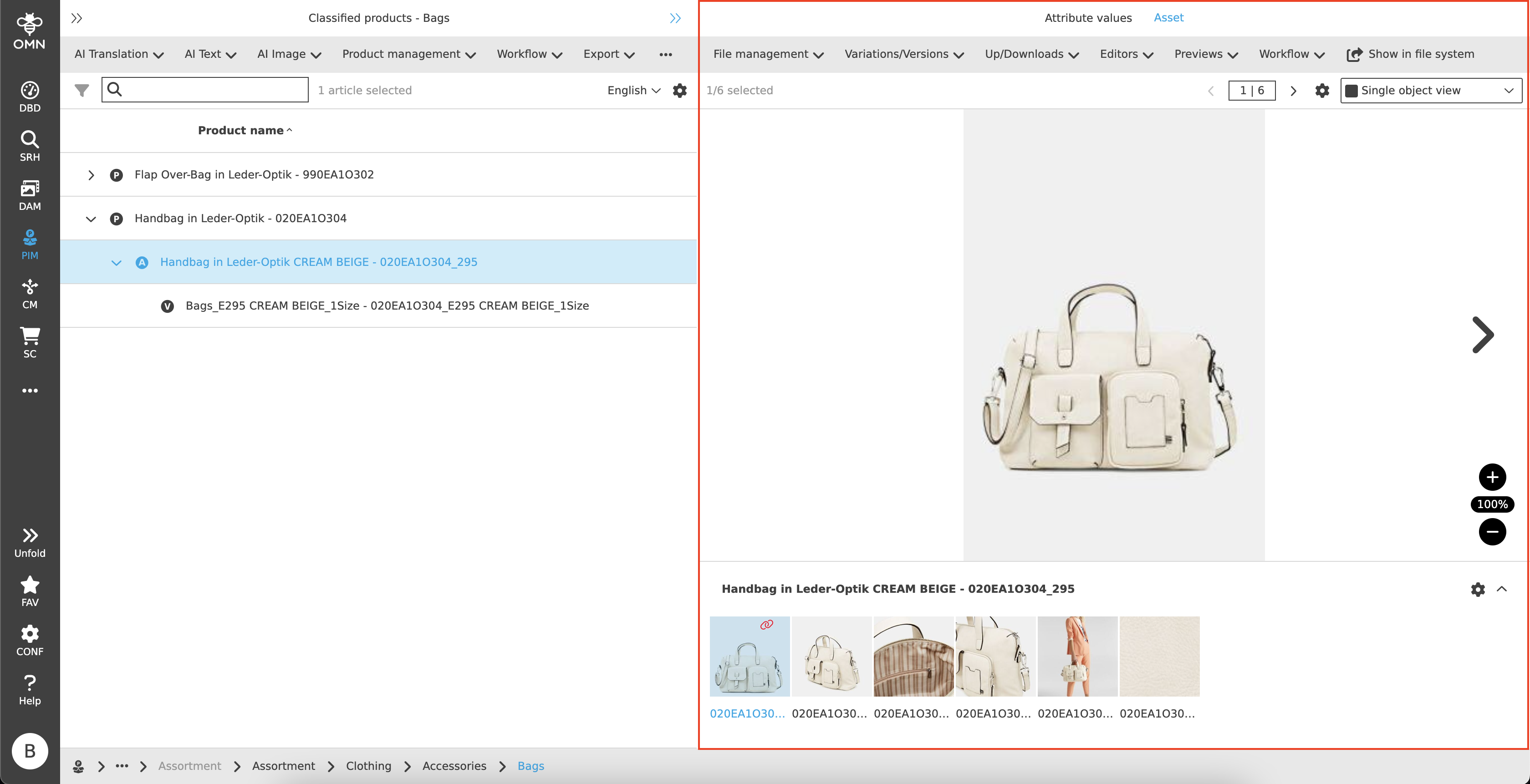
Toolbar & Functions
The toolbar offers the configuration of various functions that can be PIM- or DAM-specific.
These are for example:
-
Data management functions (rename, delete, …)
-
Create variants
-
Download file
-
Open file in editors (e.g. Annotation Tool, Aperture Tool)
-
Show file in fullscreen mode
-
Workflow functions
-
Open/display file in DAM
Statusbar & image visualization
Within the statusbar, the user has the option of selecting different views for the image visualization (e.g. Light Table, Single Object View).
Depending on this selection, the display of the statusbar may change slightly. For example, the Light Table view contains a quick search with object counter, whereas the Single Object View only contains an object counter.
The settings and visualizations are therefore always based on the options offered by the respective view.