FSTable (Content Plugin)
Purpose
This plug-in offers a content view to show the details of one or more chosen object like an asset, product, workflow, glossary object, channel project etc. in form of a table.
Tables can be added in central or in right panel. More details in the FSNavigation.
Possible Usage of the plugin
You can use the plug-in as follows:
-
Center Area of the Frontend:
Plugin |
Object type |
Note |
Page plug-in "AdvancedSearch" |
|
|
Page plug-in "FormbasedSearch" |
|
|
Page plug-in "FSNavigation" |
|
|
Page plug-in "ClassificationView" |
|
(for AssetView configuration) |
Page plug-in "WFLTodoList" |
|
|
Page plug-in "WFLStatus" |
|
|
Page plug-in “ShoppingCart” |
(only available as Sidebar Object) |
|
Content Plugin “ProjectTableView |
|
|
Content Plugin “ProjectWorkflowView |
|
|
Content Plugin “ProjectAssetView |
|
|
Content Plugin “ProjectProductView |
|
|
Function Plugin “ProductView |
|
|
Function Plugin “Usage History |
|
Preconditions
To configure the FSTable plugin, following preconditions should be given:
-
Configured expressions, which should be displayed in the table for specific type.
|
Supported Plugins
The FSTable does not support other plugins.
In terms of using the plugin in the context of another plugin (see Possible Usage of the Plugin section), additional plugins can be configured and used.
For example, for the table view used in the page plugin FSNavigation, a function plugin e.g. a download plugin can be configured and used for a selected item in the table.
General configuration
The configuration of FSTable plugin includes two parts:
Tab |
Description |
Note |
General configuration |
General configuration of the plugin |
|
Icon Assignment |
For assigning an icon for the plug-in. |
See more details under Assigning Icons |
Table 1 Content plug-in 'FSTable' Configuration Structure
Tab |
Description |
Note |
||
Object type |
Selected the object type you want to display in the table. Available object types:
|
The following object-types are no longer supported:
|
||
Grouping enabled |
Activate the checkbox to allow the user to group objects with respect to the column information. When the checkbox is activated, new tabs are available:
|
A column 'Grouping' shows as first column and a corresponding function button appears at the top of the table.
|
||
Sort attribute inside the group |
Can be defined by selection of a available sort attribute like name or data. |
Available only when the 'Grouping enabled' checkbox is activated. |
||
Sort direction |
The sort order can be defined by ASC or DESC.
|
Available only when the 'Grouping enabled' checkbox is activated. |
||
Fixed grouping by default column |
The checkbox fixed grouping defines if the grouping can be changed in the frontend or is fixed. |
Available only when the 'Grouping enabled' checkbox is activated. |
||
Pagination enabled |
Activate the checkbox to use pagination mode instead of lazy loading mode for display of items in table as default. When the checkbox is activated, new tab are available:
|
|||
Pagination page sizes |
FSTable pagination page sizes, check default value with * |
Available only when the 'Pagination enabled' checkbox is activated.
The new HTML5 client no longer uses the Pagination Sizes for the display in the frontend. The pagination, preceded by an asterisk like *1000, is used as the default number of elements on a page. However, the setting can be overridden by the user directly in the frontend. |
||
Filters enabled |
Activate the checkbox to allow the user to set filters so that only particular objects show. |
|
||
Column visibility enabled |
Activate the checkbox to enable or disable the display of columns in the configured table view. |
|
||
Select All enabled |
Activate the checkbox to allow the user to select all assets of a page. |
|
||
Print enabled |
Activate the checkbox to allow the user to print the current table. |
|
||
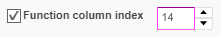
Function column index |
Allows to activate functions directly on assets (e.g. Add to shopping cart). An additional column is needed for the function buttons. Activate the checkbox and enter the number of the column that shall serve as function column. |
The last column number of all created columns is set as default.
|
Table 2 Content plug-in 'FSTable' General configuration parameters
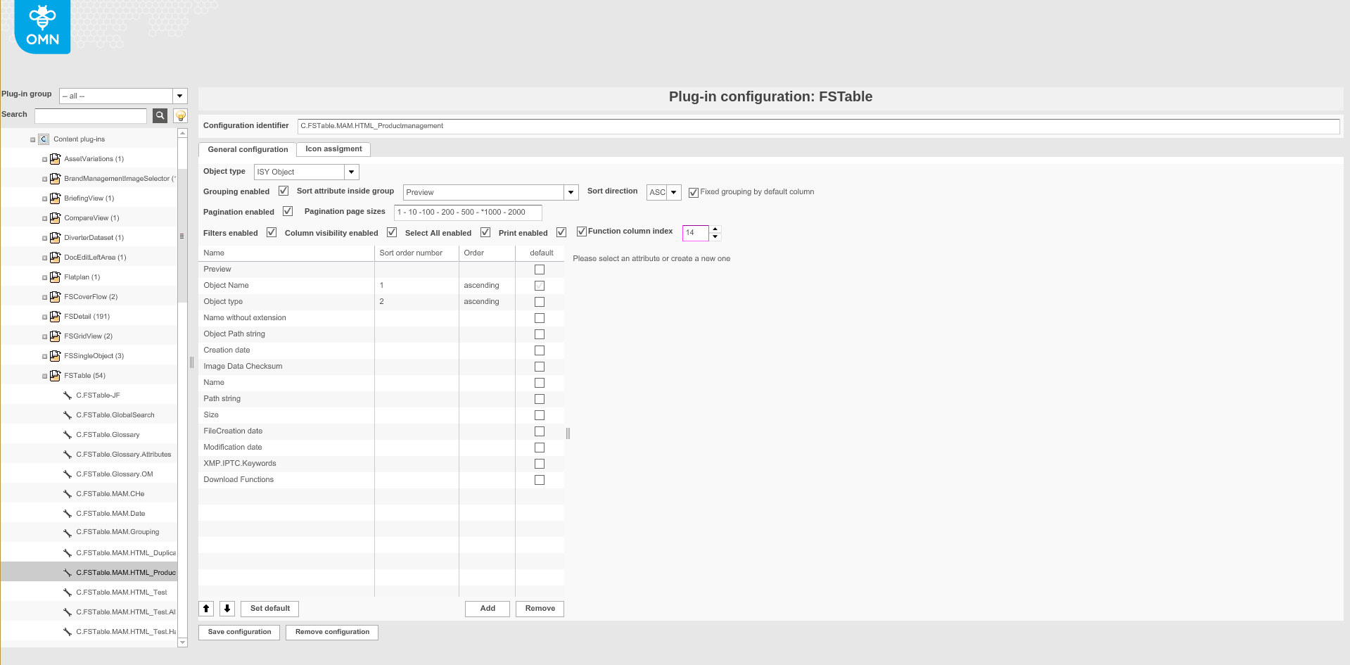
Image 1 Content plug-in 'FSTable'
Adding a column
To add a column to table:
-
Click Add.
-
Add button in the bottom right corner of the 'Adding a column to Table' section.
-
-
Fill in all the fields necessary for a new column (see 'New Column for 'FSTable' ').
-
To set a column as default for sorting the content of a table, highlight the column and click Set default.
-
To change the order of the column (position) use Up or Down function.
-
Specify 1,2,3 sequence numbers for the added columns in the 'Sort order number' column.
-
Only three columns can be selected.
-
-
For the selected columns that have been assigned a 'Sort order number', specify 'ascending' or 'descending' in the 'Order' column.
-
To save the configuration and all changes made, click Save configuration.
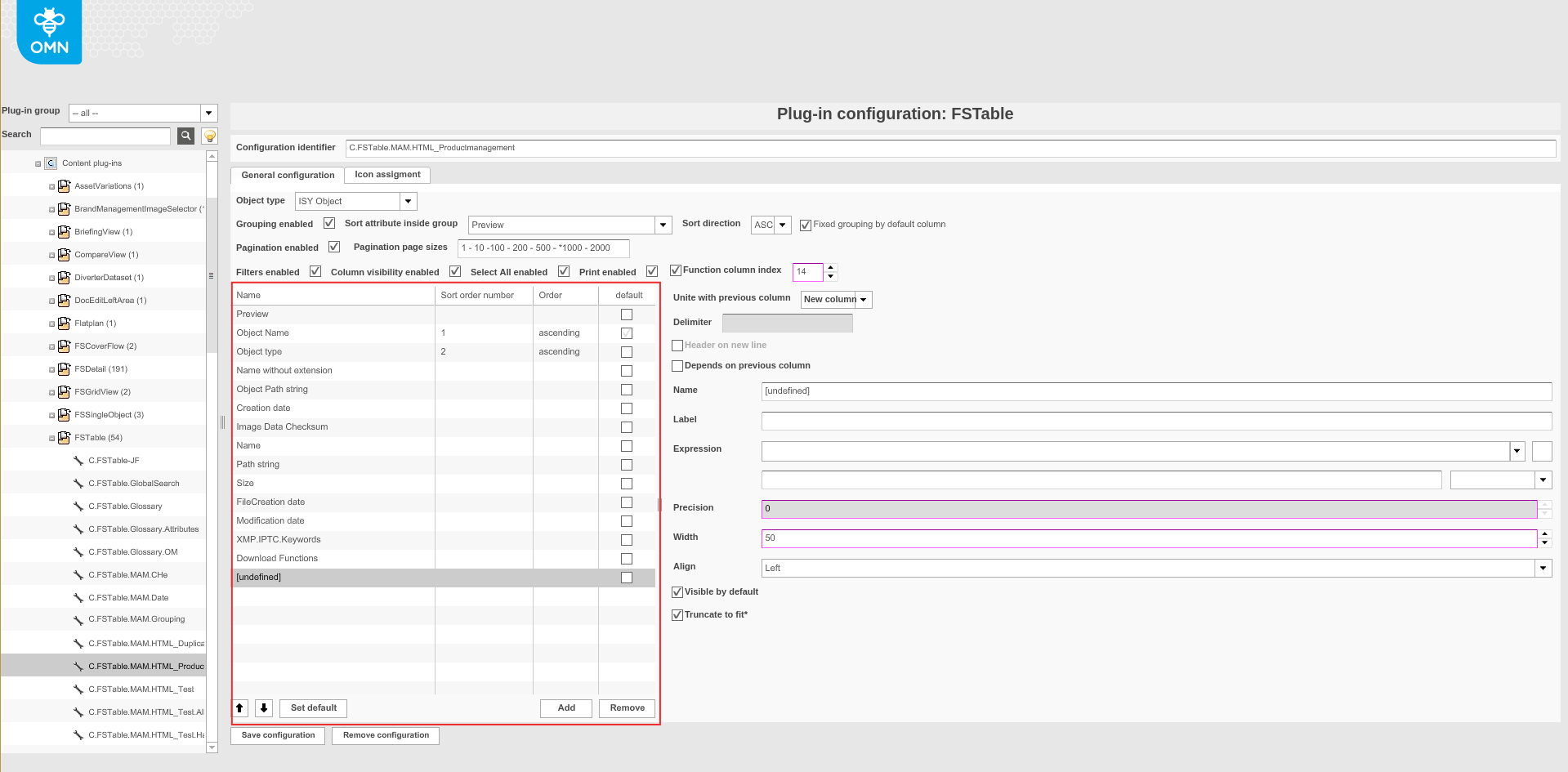
Image 2 Adding a column to Table
Remove a column
To remove a column from the table:
-
Select a column.
-
Execute the 'Remove' function.
-
Remove function in the bottom right corner of the 'Adding a column to Table' section.
-
New Column for 'FSTable'
To add a new column with a specific expression to table:
Field |
Description |
Note |
||
Unite with previous column |
Available options:
|
When the option 'Same line' or 'New line' is selected some other settings like 'Width' and 'Align' will not take effect. |
||
Delimiter |
For entering a delimiter, if columns are set on the same line. |
|||
Header on new line |
As soon as a field is united with the previous column, the header of that column can consist of either one row of two rows. Activate the checkbox to get a header with two rows. |
Available if 'Same line' or 'New line' is selected. |
||
Depends on previous column |
Allows making a column dependent on the previous column. |
If the value for the previous column is empty (null), the selected column will not show a value either. |
||
Name |
For choosing a name for the column. |
|||
Label |
For choosing a label for the column. The label will appear in the header of the table. |
When two fields are shown in one column with a single-rowed header, enter a delimiter. |
||
Expression |
For choosing a suitable expression for the select object type e.g., a Product attribute. |
For a complete list of available Standard expressions and a description please pass on to Standard expressions overview. |
||
Format string |
For expressions of type Number or Date for specifying the number or date format. |
|
||
Precision |
Count numbers of fraction |
The setting is only relevant for number expressions. |
||
Width |
Width of the column can be modified. |
All values in pixels |
||
Align |
For choosing if the column shall be aligned to the left, right or centered. |
|||
Visible by default |
Deactivate the checkbox to disable that a column is visible right away. The user can activate the column by clicking on the 'Columns' button on the UI. |
|||
Truncate to fit |
Enable this option to improve performance for a very long text. |
Table 3 New column for FSTable
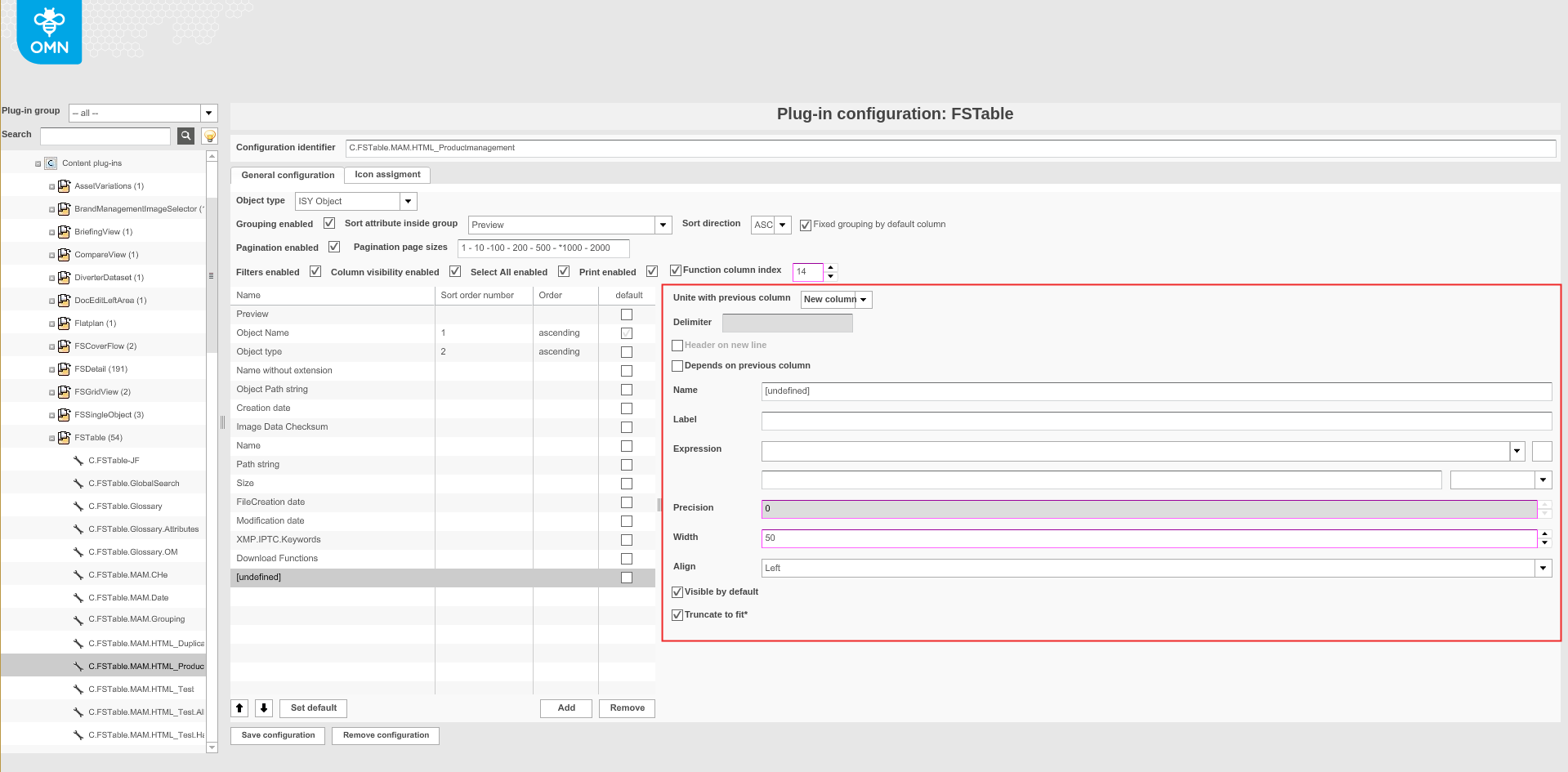
Image 3 Overview New Column
Appearance in the frontend
The table view can be used in different page plugins of different modules in the frontend.
The general principle of the table view and its basic functions is explained in EndUser section under: Knowledge Base | apollon (onlinemedianet.de).