Buttons
A button is usually labeled with a text, a symbol or both. In addition to simple symbolic buttons (e.g. filters), a distinction is made between so-called "Call-to-Action" buttons and "Ghostbuttons".
CTA Buttons
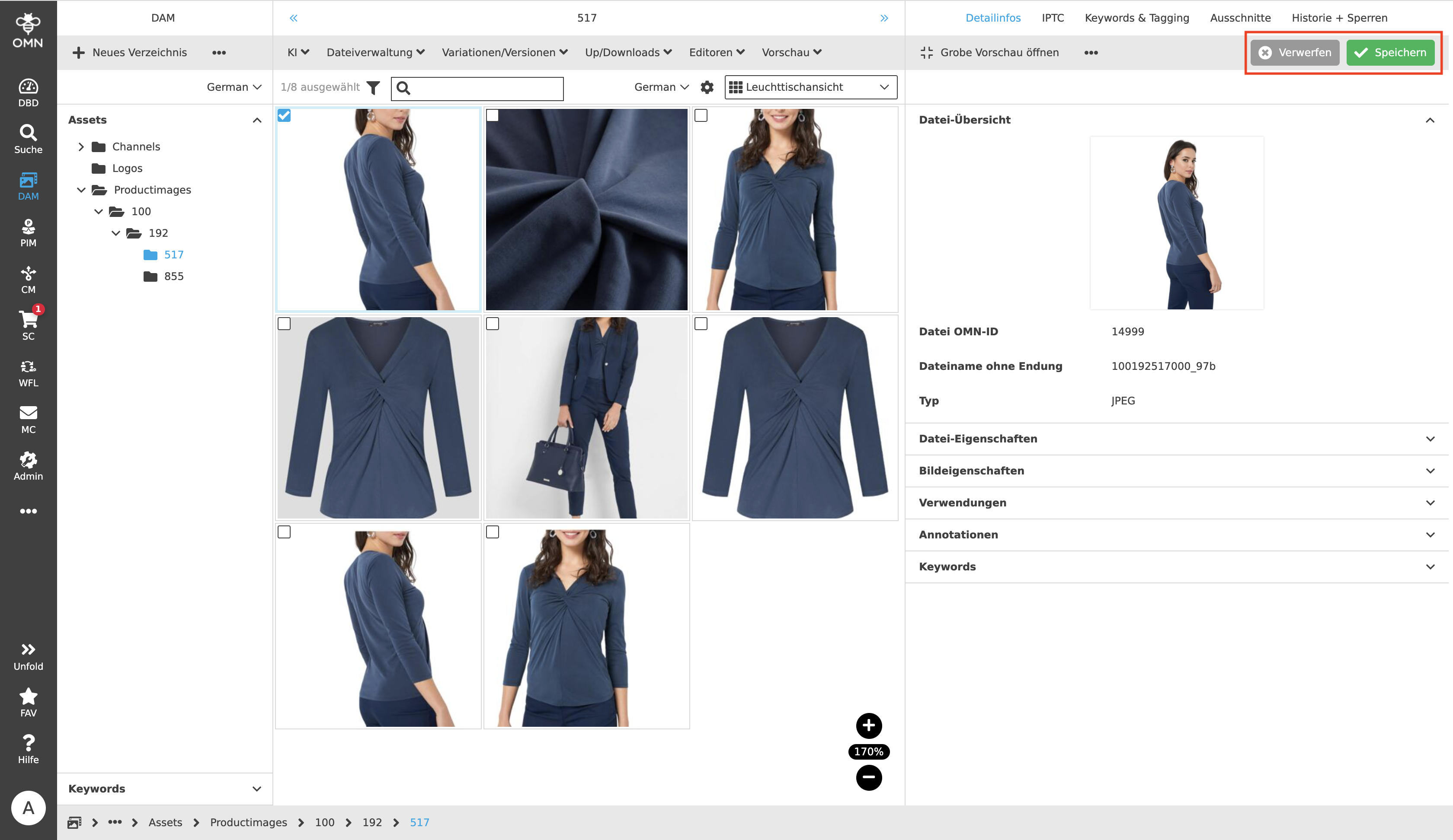
A "Call-to-Action" (CTA) button is a prominent and strategically placed button that prompts users to take an action, such as saving. Within OMN, two different types of CTA buttons are used: "Primary" and "Secondary" buttons.
Primary Button
Primary buttons are designed to encourage the user to execute a specific action. The primary button is more noticeable than a secondary button because it corresponds to the expected action. For example, in the Management View of the PIM module, the preferred behavior is to save changes to attributes, not to discard them.
Primary and Secondary buttons usually appear in a group of one button each. The primary button is displayed in green and always on the right.
Secondary Button
Secondary buttons are less noticeable than Primary buttons and are more like an alternative to the Primary action that users can perform if the action is not or no longer what users want. For example, activities, such as creating a folder, could be quickly and easily canceled with a click on the Secondary button.
The Secondary button is displayed in gray and always on the left side of the button group.
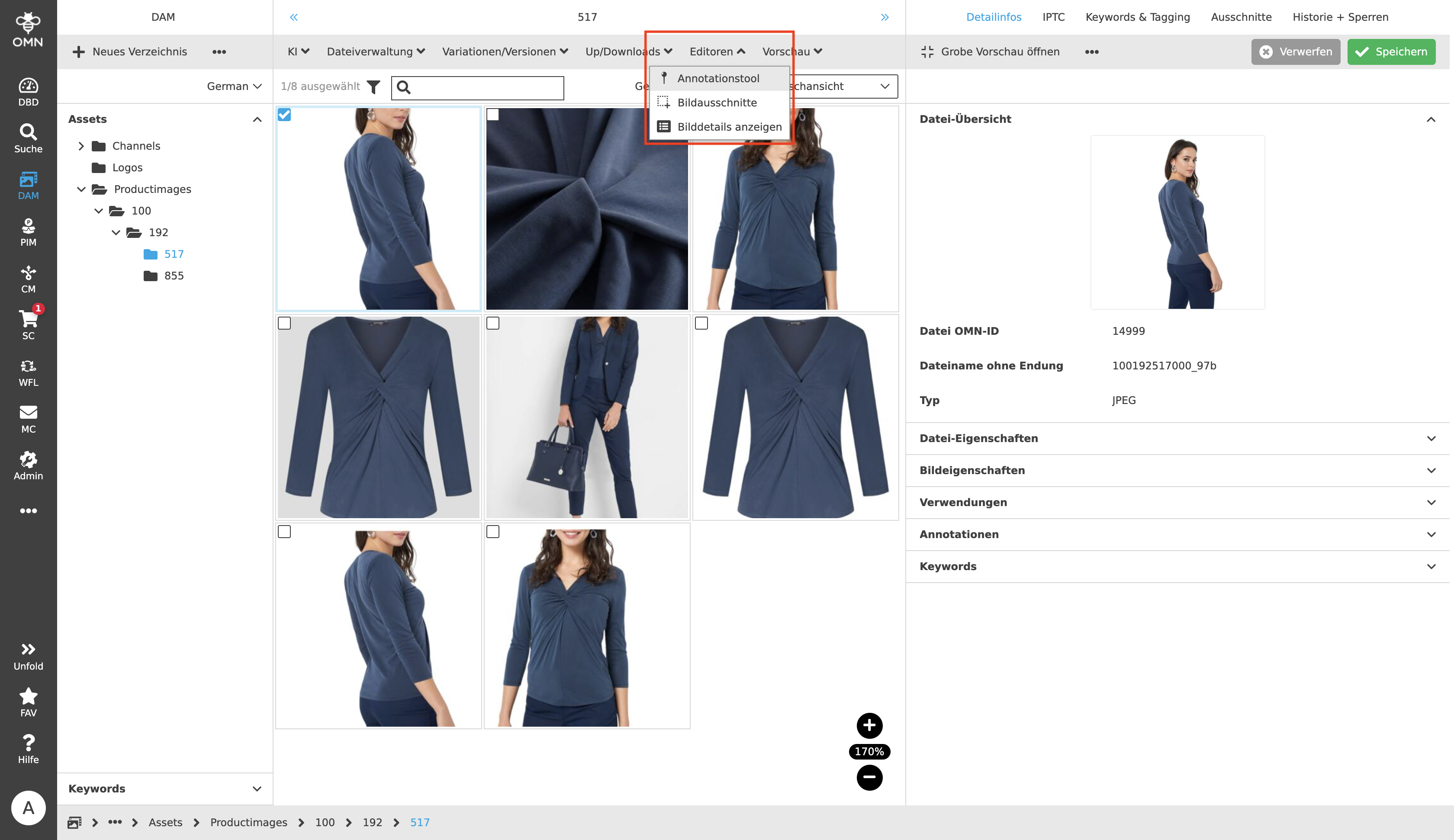
Ghostbuttons
In addition to CTA buttons, which highlight special actions, there are the so-called " Ghostbuttons". With the help of Ghostbuttons, a user can execute functions. This type of button is usually found in the toolbar, but in rarer cases it can also be found in the Center View, such as in the User Settings.
Ghostbuttons are in most cases composed of an icon and a label, more rarely of just a label or icon. Within the toolbar, the buttons are always aligned to the left side, which means that from the left side, there are always as many functions visible as there is space in the line and filled up to the right. If there is not enough space available, the buttons that cannot be displayed are grouped together under the "…" icon. In general, it is possible to combine functions into groups and display them open as a dropdown.