Image Editor
Opening of Image Editor
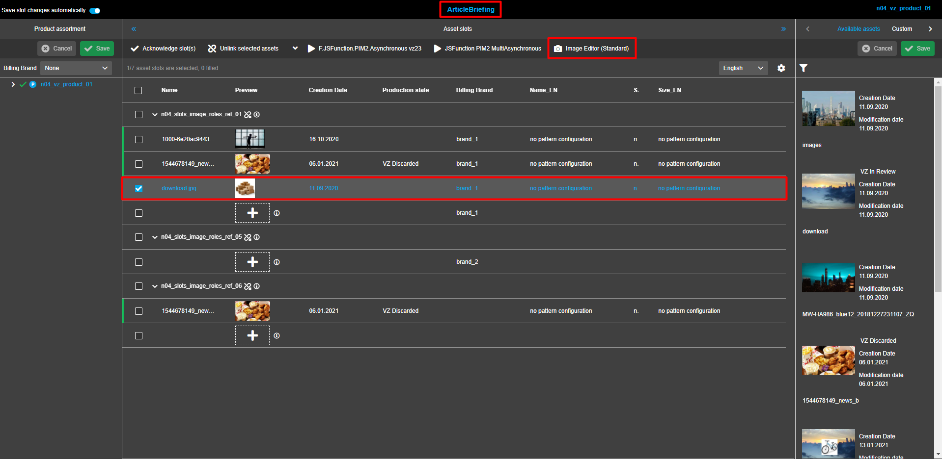
The Image Editor can be opened by following a click on a corresponding button in one of the views listed below:
Content plugins of FSNavigation
From the central view, select the required image asset. In the toolbar of the central view, click on the "Image Editor"-button. The Image Editor is opened in the same tab.
Note that the "ImageEditor"-button can be behind the dotted menu icon or in context menu (dropdown).
Project asset view
In the left view, choose the required project. From the central view, select the required image asset. Click on the button "Image Editor" in the top menu bar of the central view. The Image Editor opens in the same tab.
Note that opening the dotted menu might be needed to find the Image Editor.
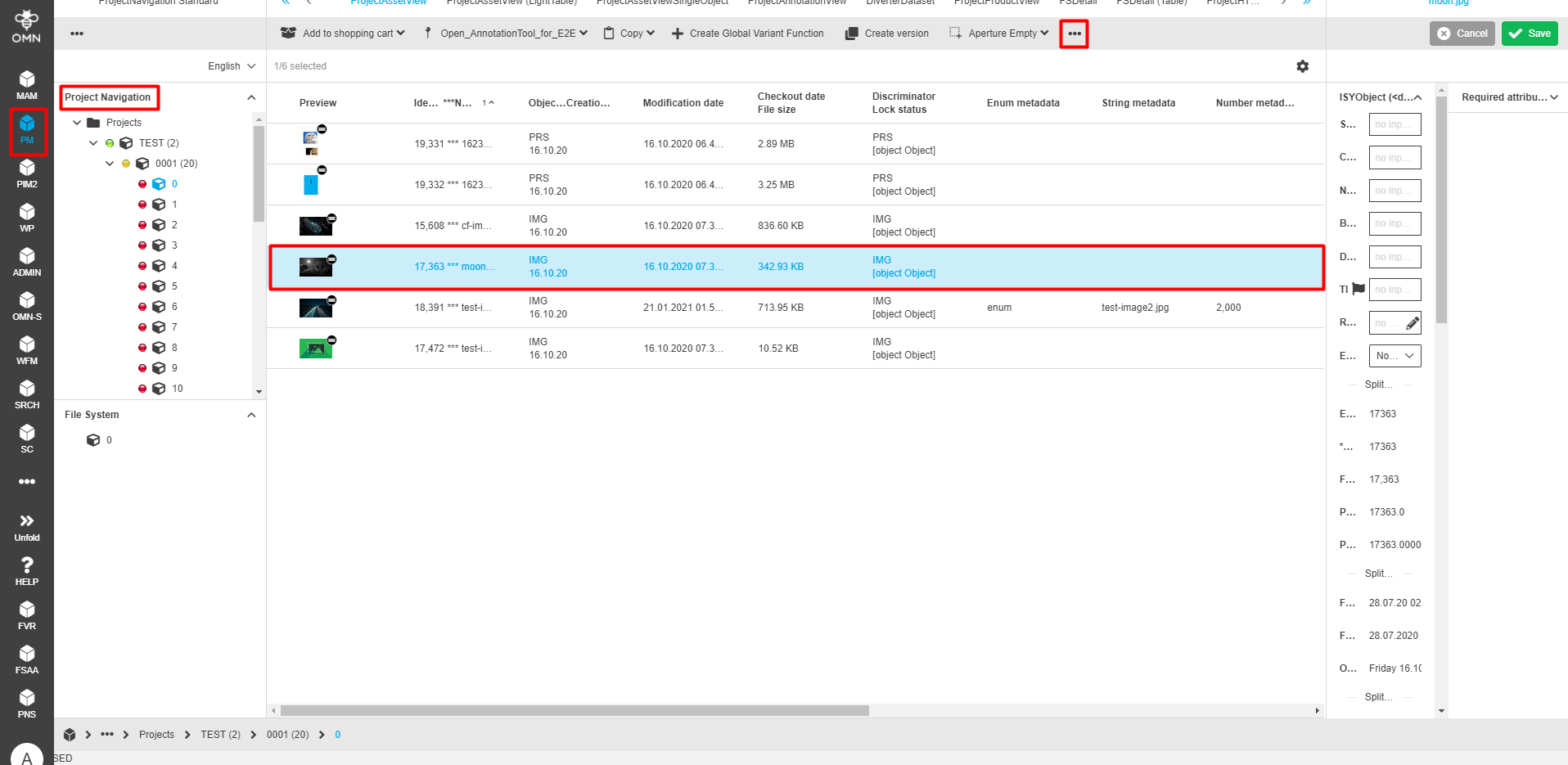
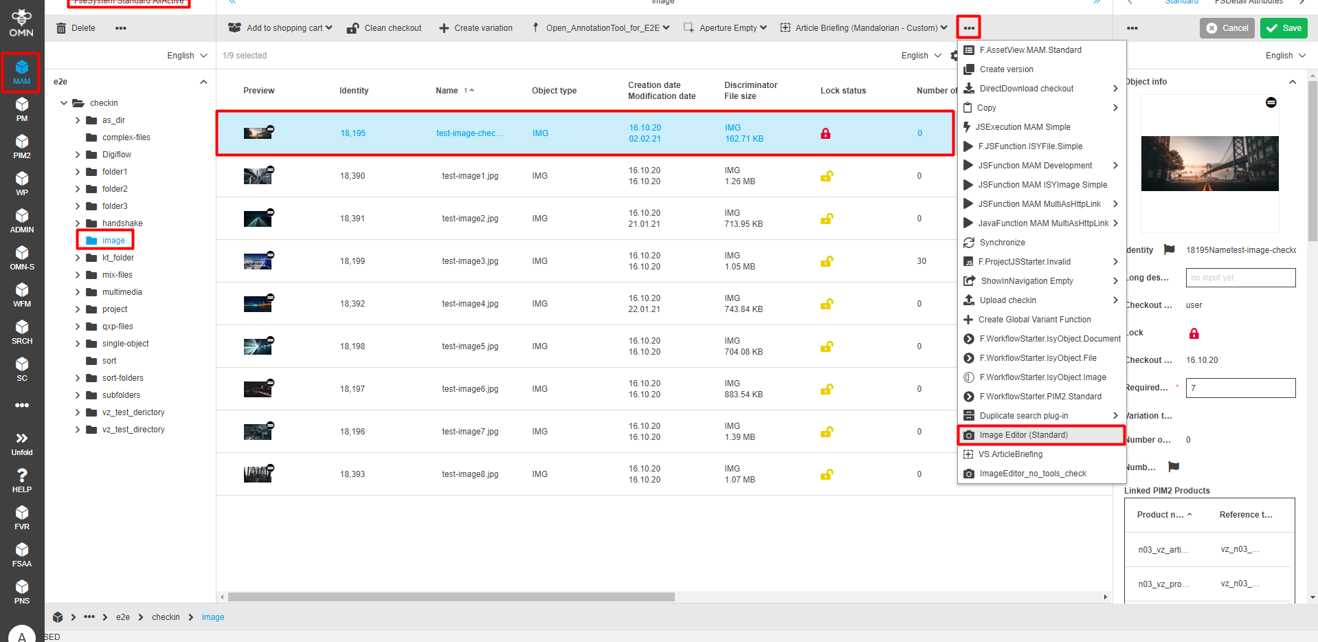
Asset view
While being in any of the editors, select the required assets from the central view. In its toolbar, click on the button "Image Editor". The Image Editor opens in a new tab.
Note that the "ImageEditor"-button can be behind the dotted menu icon or in context menu (dropdown).
| For Article Briefing, Image Editor plugin can be opened only for unacknowledged slots. |
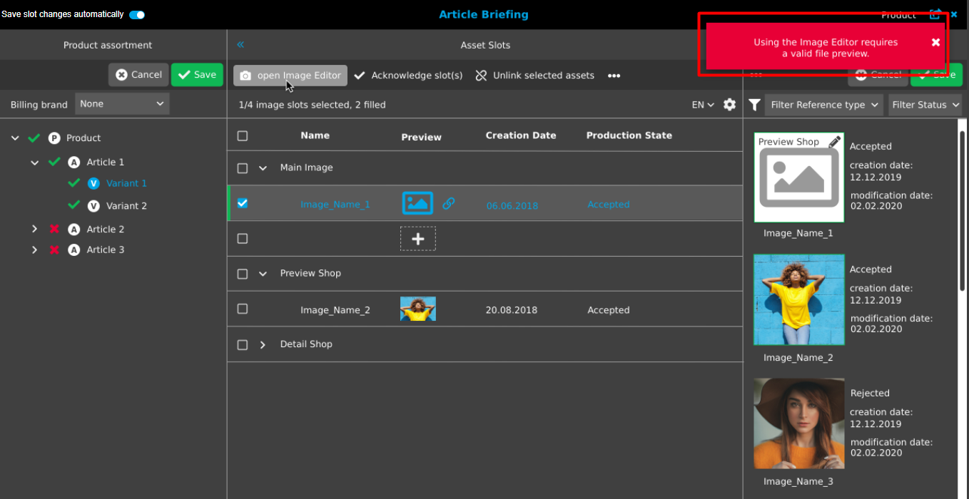
When trying to open an invalid file, the following error message appears: "Using the Image Editor requires a valid file preview."
Working with Image Editor
An opened Image Editor provides two operational areas to work with.
-
Central view area to work with images.
-
Right view area with information about the available layers and special properties for the selected tool.
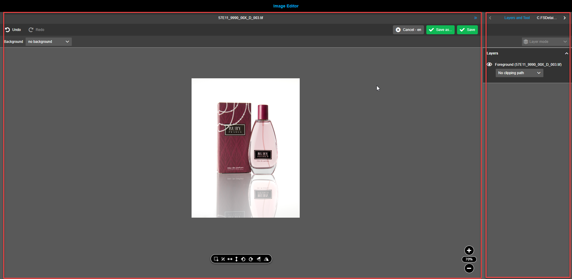
Central view
Navigation bar
The navigation bar contains:
-
The name of the opened asset is shown on the title bar. The name is clickable and leads to refreshing when clicked.
-
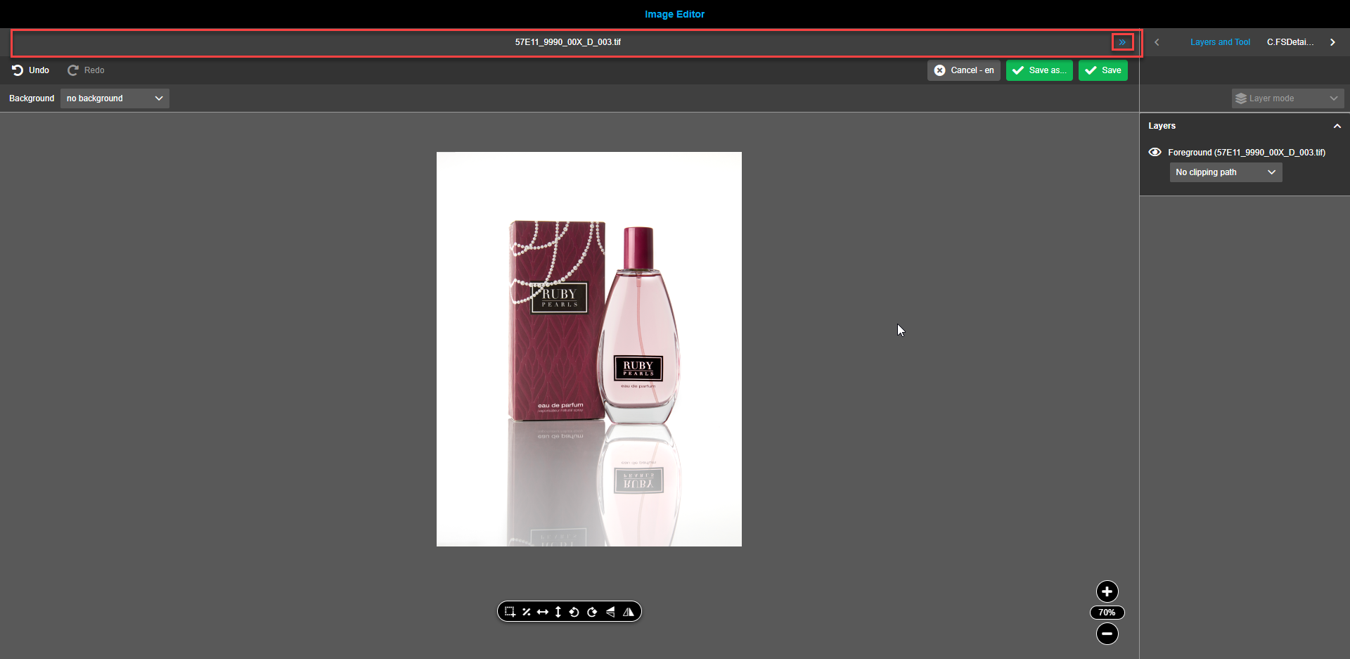
The double arrow icon enabling to collapse and expand the right view providing more space to work with images when required.
Toolbar
The toolbar provides the following functions:
-
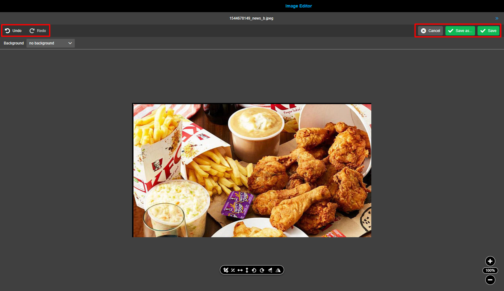
The “Undo” button enables reverting changes made to the image. All changes made since the last save can be redone by a required number of clicks. One click returns by one step. A user sees undone changes immediately after the click.
-
The “Redo” button enables reverting changes made to the image. All undone steps can be recovered by clicking on the redo button. One click returns by one step. A user sees redone changes immediately after the click.
-
The “Save”-button enables to save the made changes to the current image, overwriting the original image. All changes made will be handled by the product in ArticleBriefing. If no further changes were made to the image then the "Save"-action is executed without dirty checking.
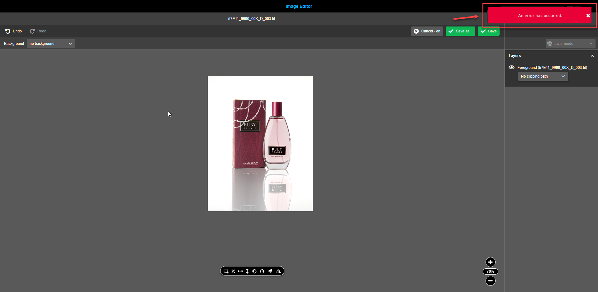
If changes can’t be saved and unexpected error(s) occur a red toast message stating "An error has occurred" is shown to the user.
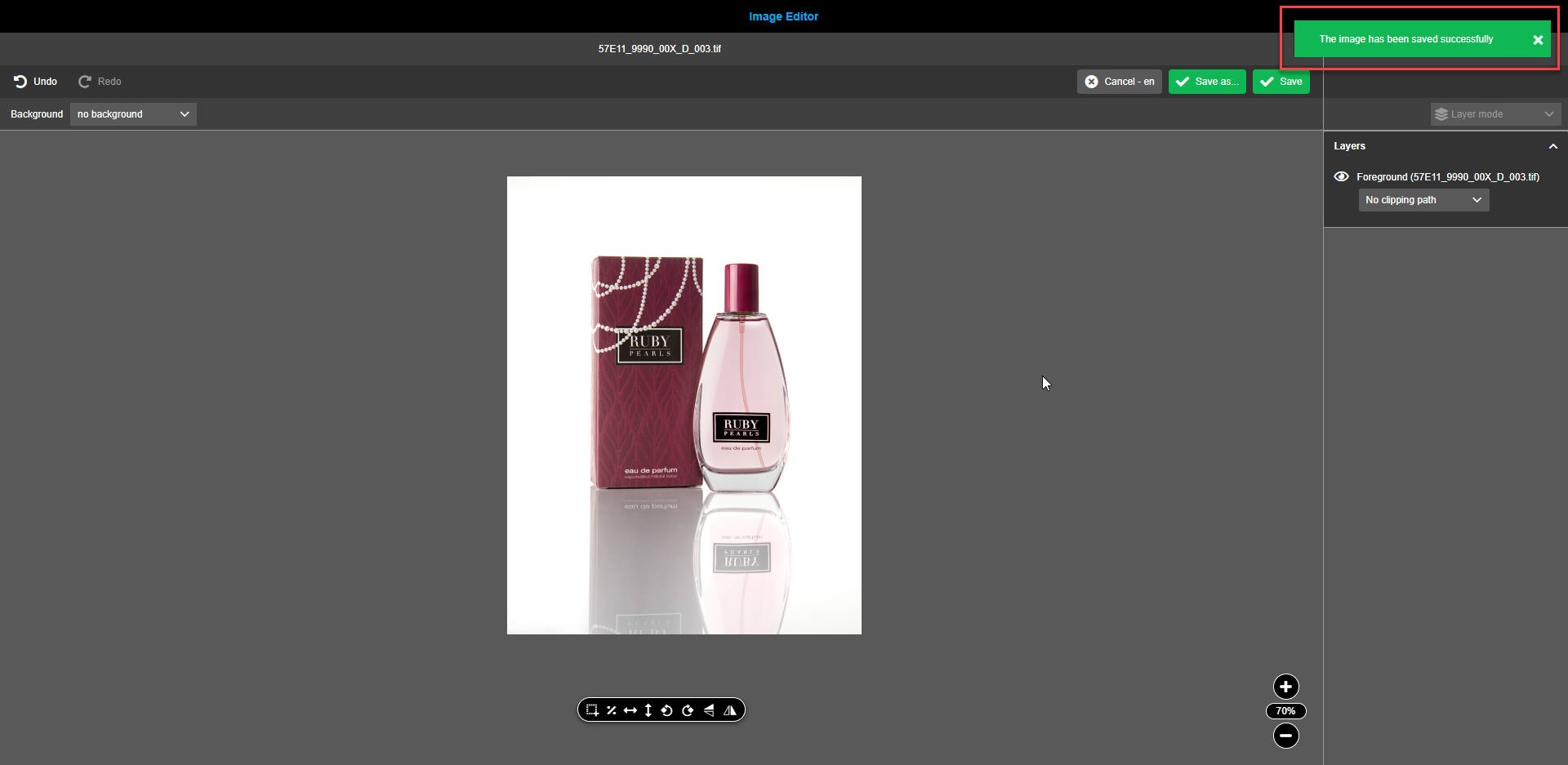
If changes have been saved successfully, a green toast message stating "The image has been saved successfully" is shown.
-
The button “Save as” will trigger the execution of the described modification inside the image editor. All changes made will be handled by the product in ArticleBriefing. Each Image Editor plugin provides a default image conversion script. This can be modified based on certain needs.
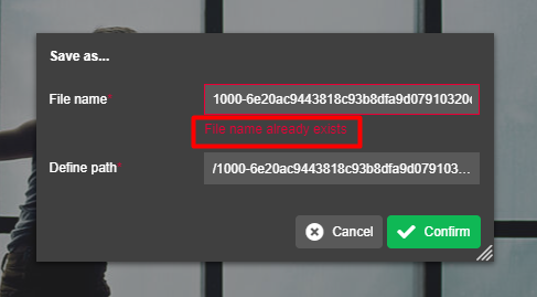
When the button “Save as…” is pressed, a modal window with predefined as per the script “File name” and “Define Path” appears. If needed, both “File name” and “Define Path” can be changed. The button “Cancel” should be clicked, if the image shouldn’t be saved. To proceed with saving, click on the button “Confirm”.
"Save as" function doesn’t need any user input if it is configured on backend. In this case modal window doesn’t appear.
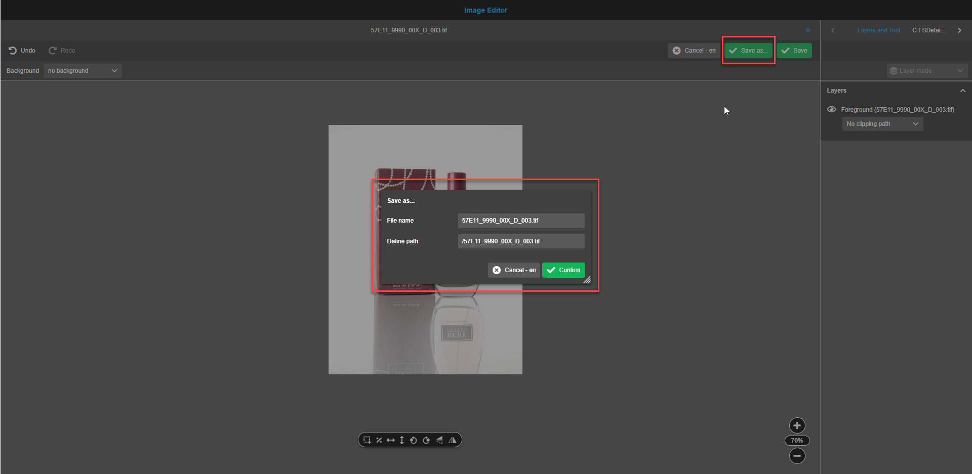
When entering a file name which is already used for another file, the modal window shows the message “File name already exists”. The box with the existing filename shows a thin red frame. This helps to avoid rewriting potentially useful files.
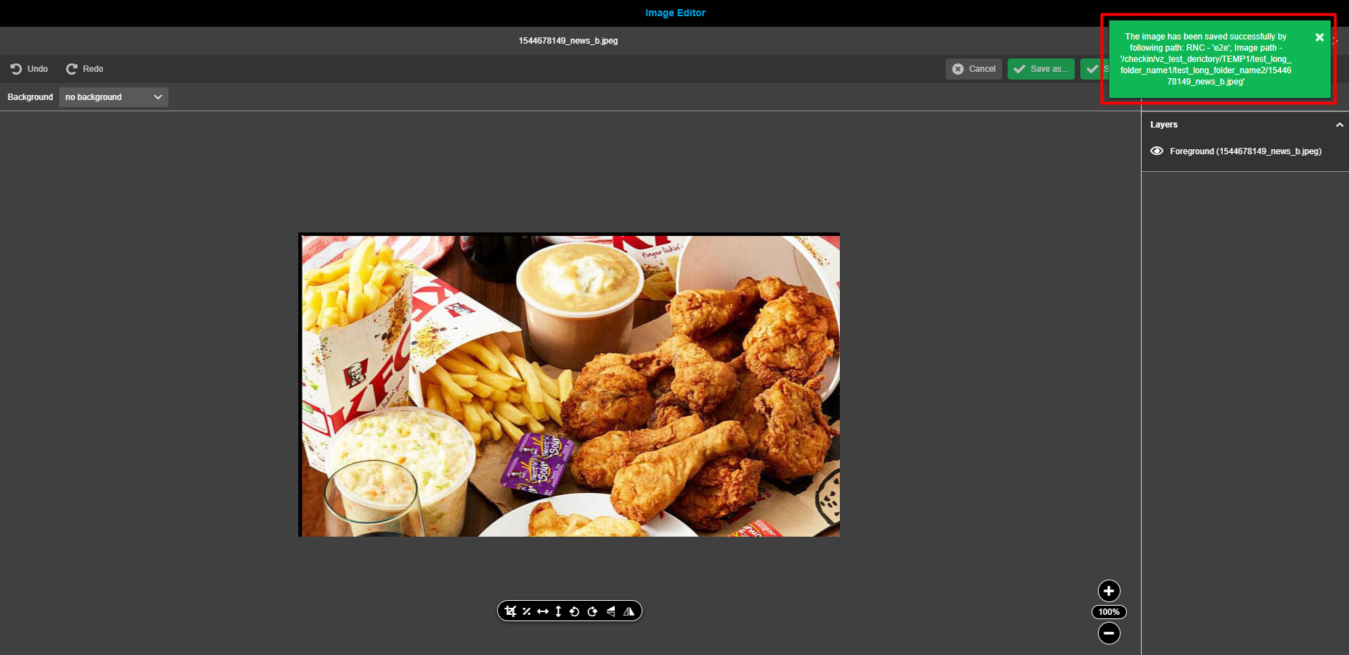
If changes have been saved successfully, this green toast message is shown to the user: "The image has been saved successfully by following path: RNC - '<result_rnc_identifier>'; Image path - '<result_image_path>'".
If changes can’t be saved and unexpected error(s) occur, a red toast message stating "An error has occurred" is shown.
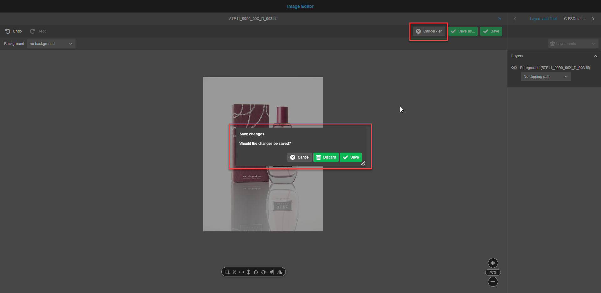
To reset all after the last save action done changes, the user has to press the button "Cancel". After pressing the button, a confirmation modal window appears.
-
The “Cancel”-button discards an attempt to cancel changes.
-
The “Discard”-button discards all the changes made after the last save.
-
The “Save”-button saves changes as described above.
| If both buttons "Save" and "Save as…" are activated, then by default the button "Save as…" will be used for saving. |
Statusbar
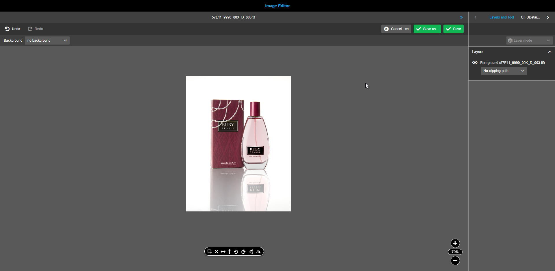
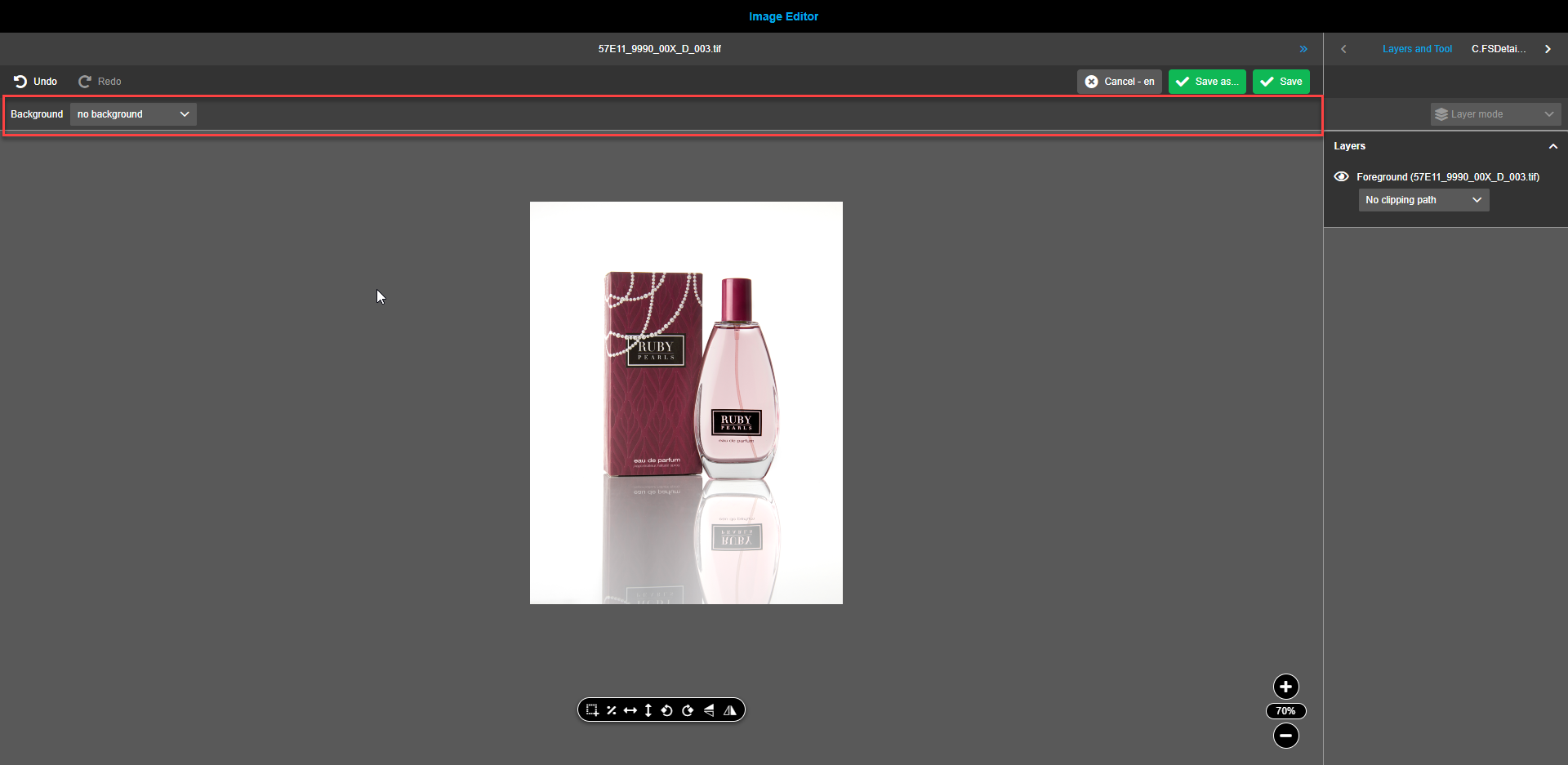
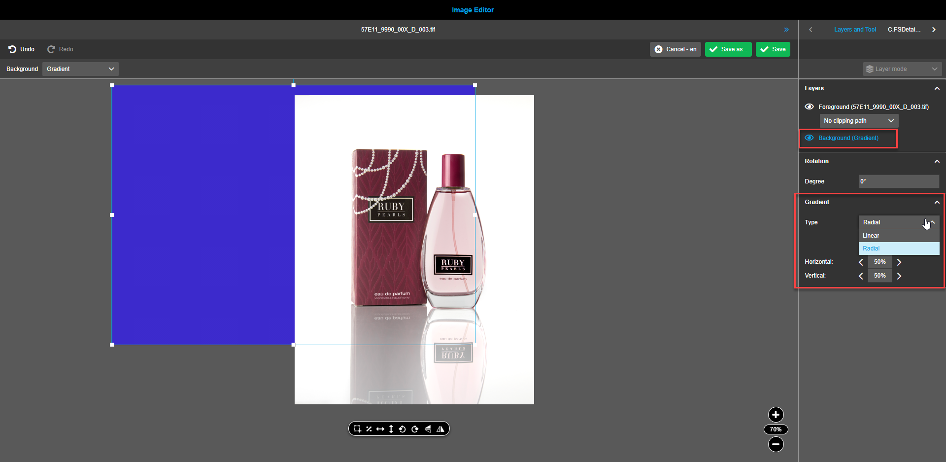
The status bar contains a dropdown-menu to select a background or gradient. By default, no background is selected.
Canvas
Canvas contains:
-
Preview of modified asset. Can contain 2 layers: Background and Image to modify. Assets and backgrounds can be moved by click and hold with mouse cursor. While moving, the mouse cursor changes to "grabbing hand".
-
Floating toolbar which contains tools to modify image (Crop (Aspect ratio), Clipping paths, Proportional scale, Horizontal / Vertical fit, Rotate image, Flip/Flop)
-
Zoom Element.
Floating toolbar
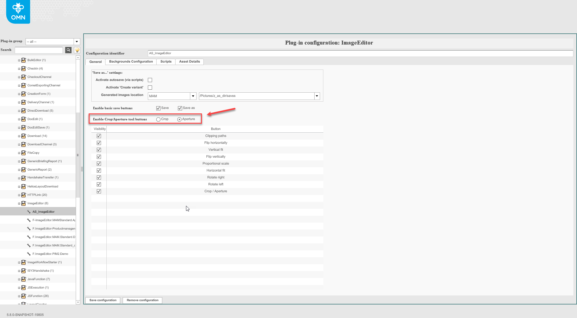
The function buttons are shown and enabled (if configured in backend).
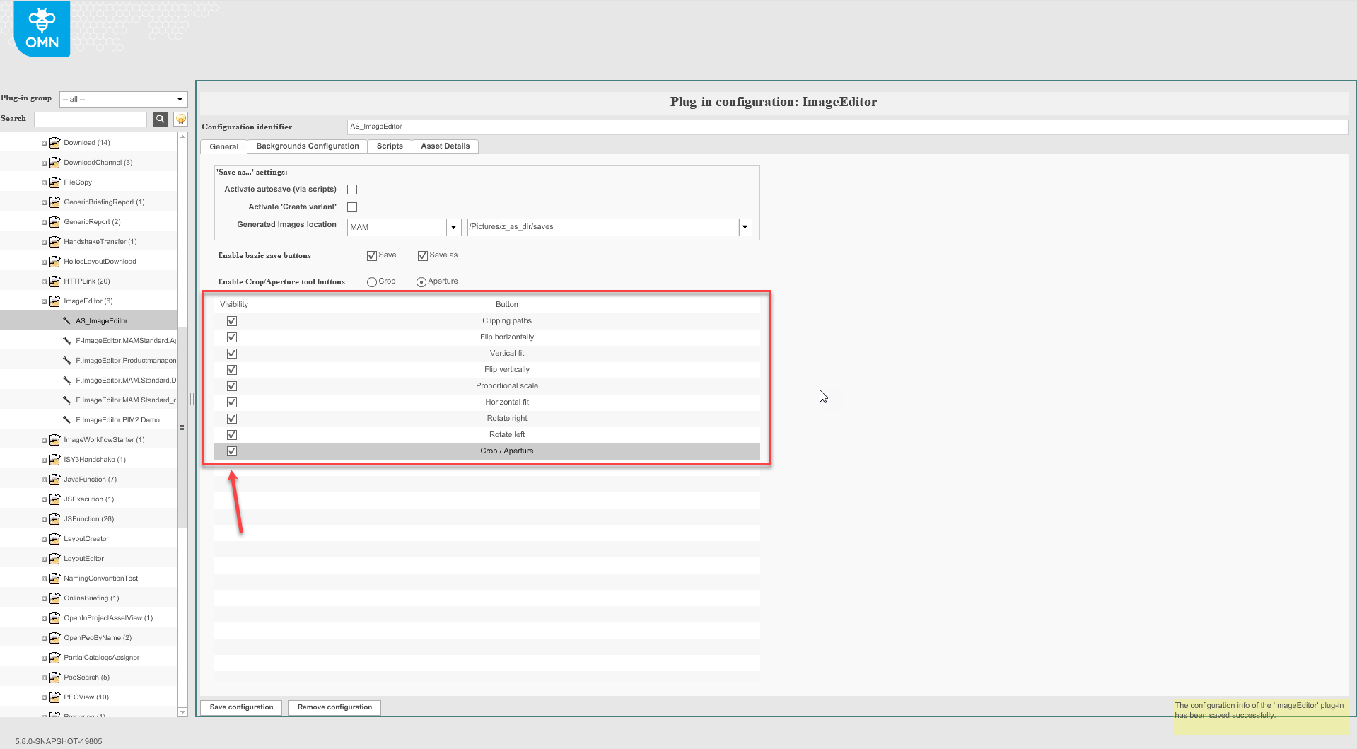
User can choose between Crop and Aperture tools by checkbox in background configuration.
Cropping
Assets, backgrounds and gradients can be cropped. It is possible to single select (foreground or background).
To crop foreground or background, select an appropriate layer (on canvas or on right panel), click on the crop icon in the floating toolbar.
The icon has a tooltip stating “Crop” when hovered. When the crop-icon is activated, the icon-color changes to blue.
Additional floating menu with predefined on backend aspect ratios appears. Also the right view starts showing all possible settings for the Crop tool.
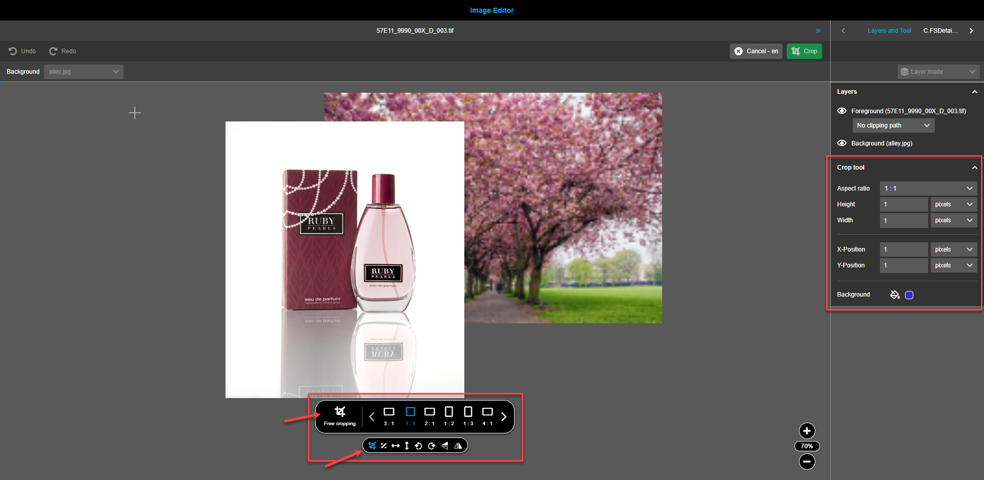
Depending on the needs, cropping can be done freely or using preset side ratio shapes. To apply precise cropping, set the required values in the right view. Pixels, centimeters, or inches can be applied for a precise cropping. The crop area is split into a 3x3 matrix for convenience.
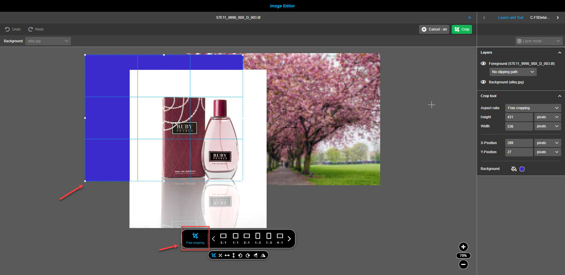
| It is possible to create a crop area which is bigger than the image itself. Parts bigger then the original will get a background color (color can be defined with color picker in right panel). |
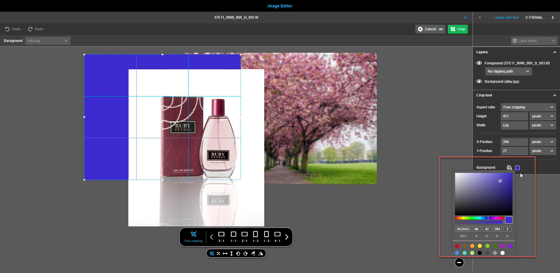
To apply cropping changes, press the “Crop”-button in the toolbar. Press the “Cancel” button to remove made changes.
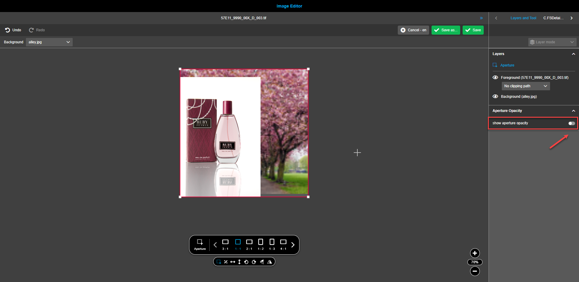
Aperture
Aperture is a viewport that represents the final result. The aperture is visualized in canvas by a red rectangle.
When function in the floating toolbar is selected the aperture can be defined in canvas by mouse.
As soon as a user creates an aperture with the mouse in the canvas a new layer is shown in the right panel in accordion layers.
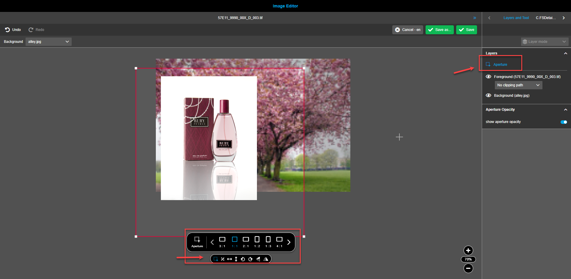
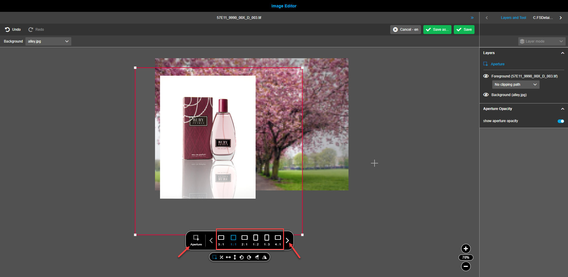
It is possible to do a "Free aperture", this means the user can define aspect ratios / proportions of the aperture by his / her own.
Also, it is possible like in cropping tool to have defined aspect ratios from backend configuration.
The default aspect ratio option should always be displayed as the first option.
In case there are multiple aspect ratios configured in the backend (more than 6), user can navigate through aspect ratio list by using left and right arrows.
|
Aperture layer has limited functionality in relation to the other layers: the other functions in the floating toolbar are disabled - it should be not possible to do any modifications except of aperture tool modification itself because an aperture is in general a predefined aspect ratio which should not be modified for example by rotating it. |
| For the aperture layer it is only possible to select it in the right panel by click on the name of the aperture layer (never by clicking on the canvas or drawing with the mouse). |
The aperture has no max. dimension, this means proportion as selected/ predefined will be kept, but the user can scale it as big or as tiny as he/she likes to.
The aperture is always at the top of the canvas and is not hidden by other layers and elements.
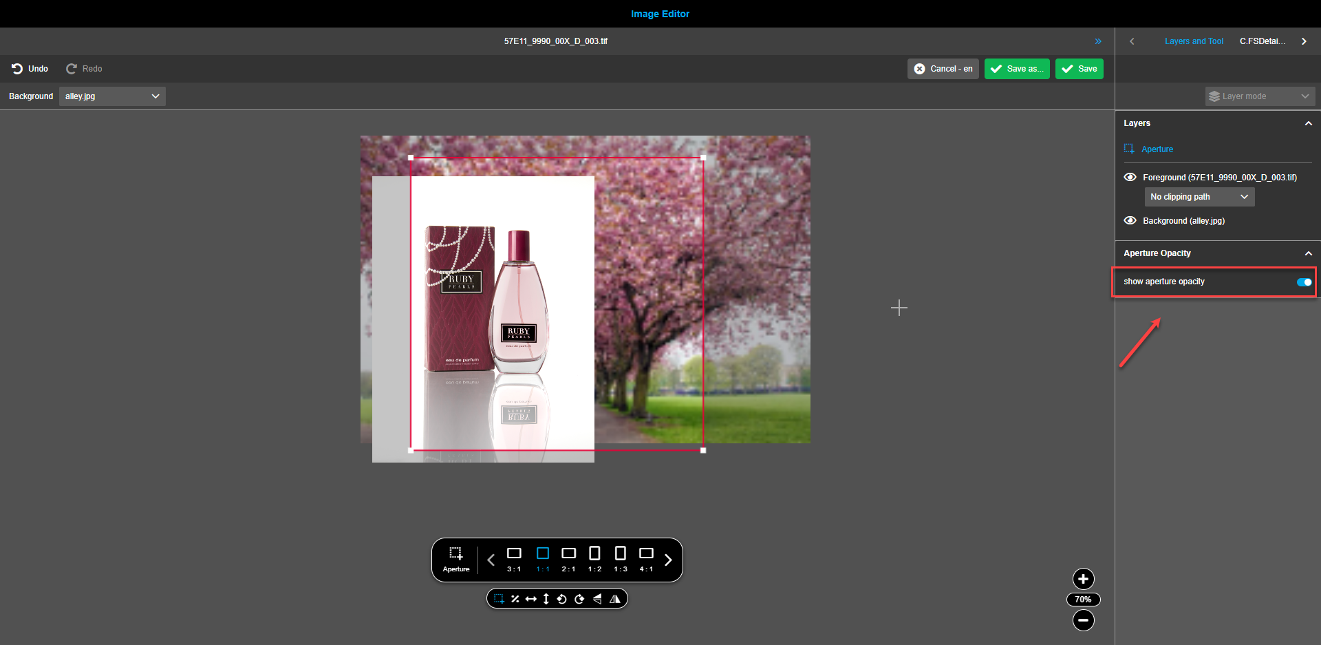
As soon as the aperture is applied to the canvas the accordion "Aperture opacity" is shown in the right panel, which allows seeing in the canvas only parts of the composition which represent the final result.
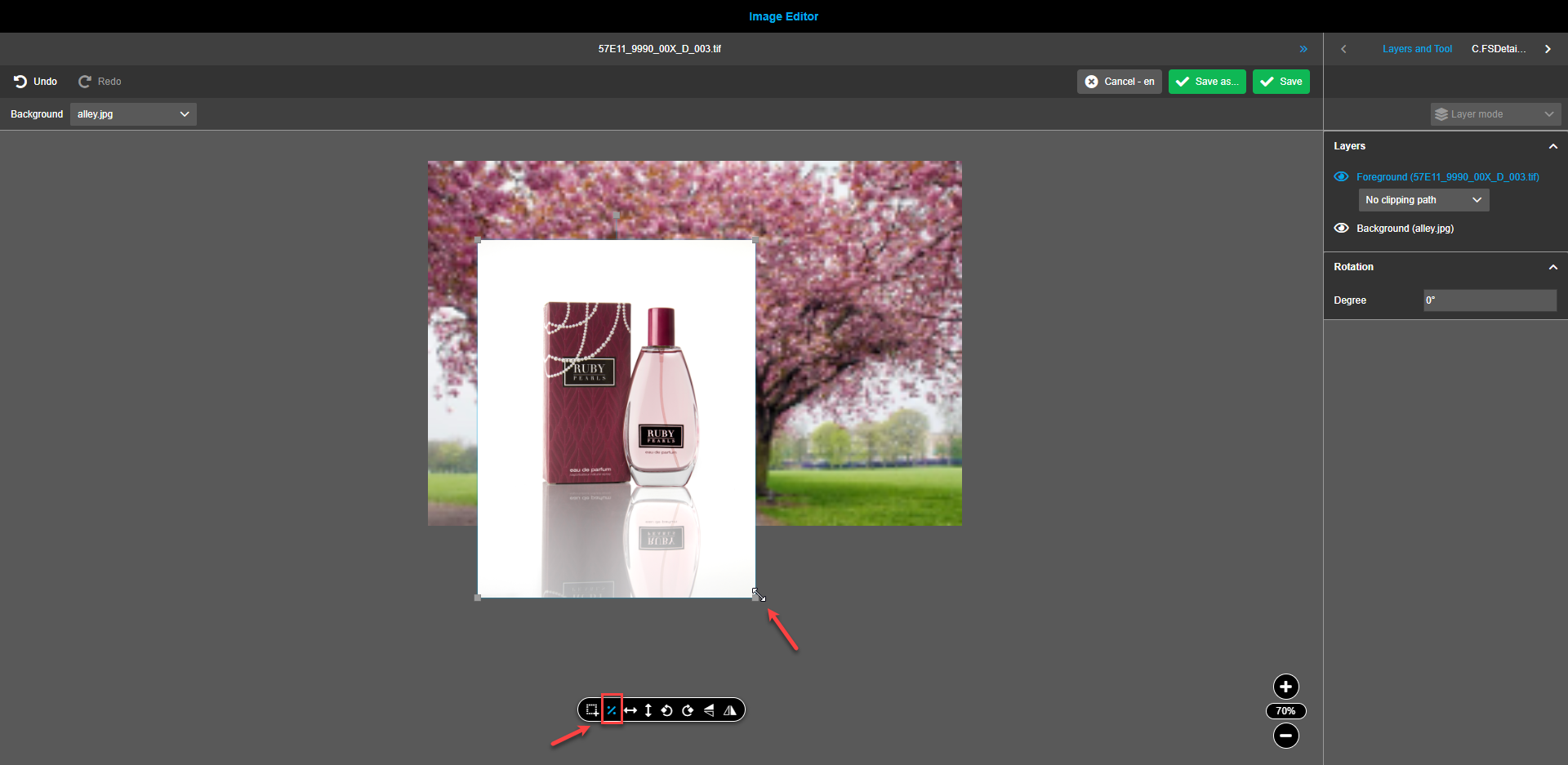
Proportional scaling
To activate proportional scaling, click on the “Percent” icon in the floating toolbar. Hint states “Proportional scale” when the icon is hovered over. If the icon “Percent" is activated, then the image will be resized in accordance with the initial aspect ratio.
| For the background image or gradient, the function "proportional scaling" is automatically activated. To deactivate it, click on the “Percent”-icon in the floating toolbar. |
|
It is possible to use multi select and scale foreground and background simultaneously. To do so, use the following keyboard shortcuts: Scale proportionally: Windows: Shift+Mouse Mac: Shift+Mouse Scale proportional with reference point in center: Windows: Shift+Alt+Mouse Mac: Shift+Alt+Mouse |
Horizontal/vertical fit
To center and align the location of the gradient background with the foreground and vice versa, use the tools “Vertical fit”- and/or “Horizontal fit” in the canvas toolset. Executing the function will adjust the height/width of the background to the height of the foreground and vice versa, depending on which layer is selected.
| If aperture was added to canvas selected layer will adjust the height/width of the aperture. |
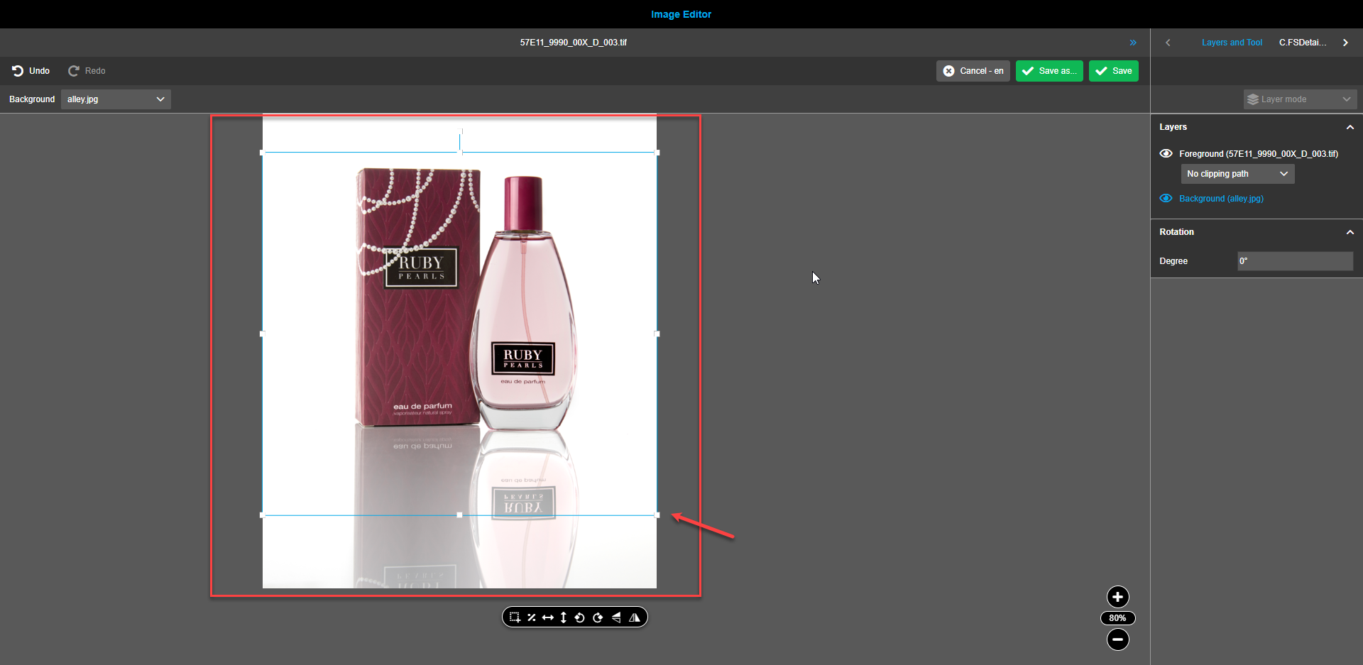
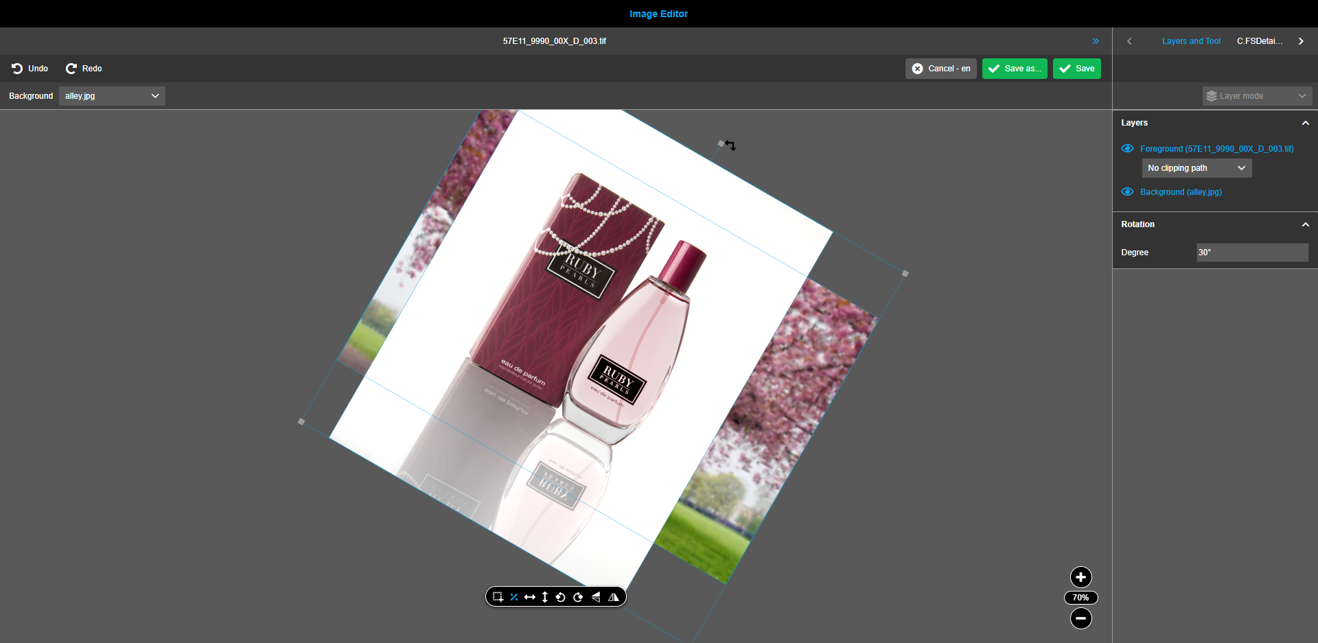
Image rotation
Rotation angle of assets, backgrounds and gradients can be changed by mouse, hovering over the white square in the center of the upper edge and changing the rotation while holding the mouse button.
To change the rotation angle by 90 degrees left or right, use the buttons in the floating menu. Both buttons have tooltips stating "Rotate right" and “Rotate left” when hovered over correspondingly.
For precise rotation fill in a “Degree” box in the “Rotation” block of the right view. 0 is a default setting and any value from 0 to 360 can be entered.
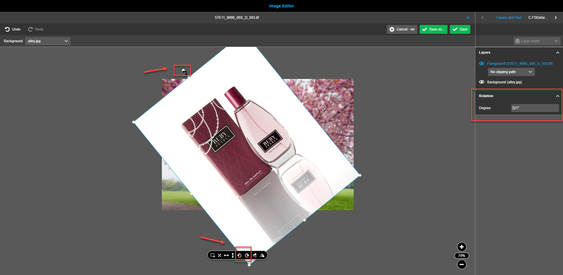
User can rotate two layers together in case of multiselection of layers.
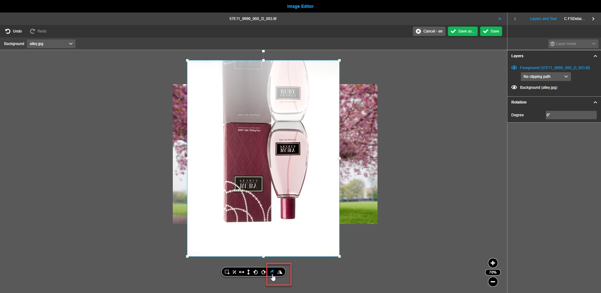
Flip/Flop
Assets, backgrounds and gradients can be flipped by x- and/or y- axis when required. To flip the background, click on the icons in the floating toolbar. The buttons have tooltips stating "Flip horizontally" and "Flip vertically" correspondingly when hovered.
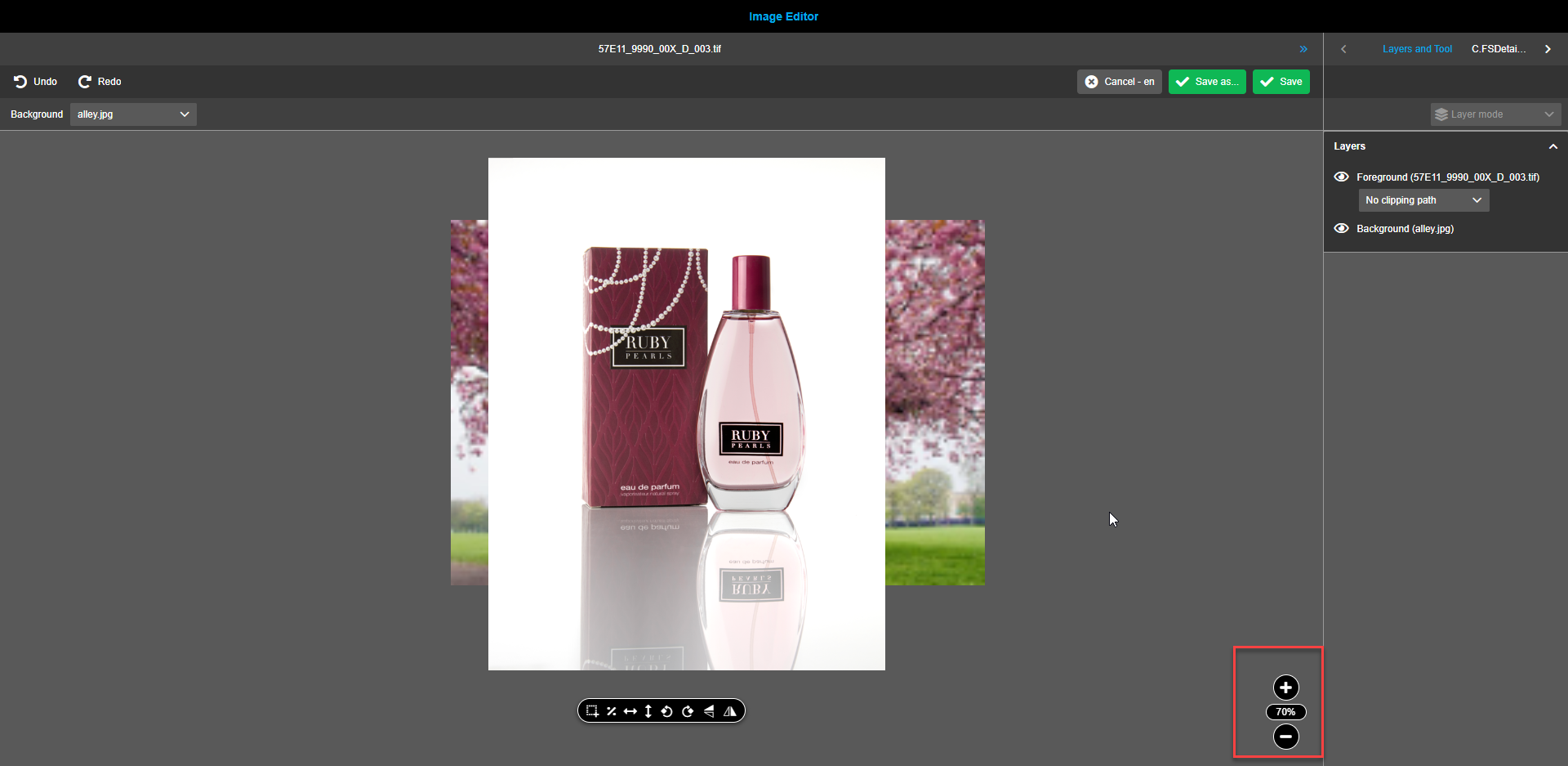
Zoom
The zoom element is placed in the bottom right corner of the canvas.
By default system calculates and applies the zoom out coefficient to fit the composition into canvas.
By clicking on the plus or minus buttons, the value can be changed by 10% with every click. The percentage of the zoom can also be manually entered into an oval field (middle element). Any integer value from 10 to 350 can be entered.
In case of attempt to enter an out-of-range value is done, the previous valid value persists.
| Selection of asset or background / gradient has no effect on zoom element - both layers will be zoomed at the same time. |
Additional information about background functionality
| Only one background or one gradient can be added to the canvas. |
To add a background, click on the “Background”-dropdown-menu and select the required option. Gradient or defined images can serve as a background. Defined images have a preview-modal-window which is shown when hovering over these entries.
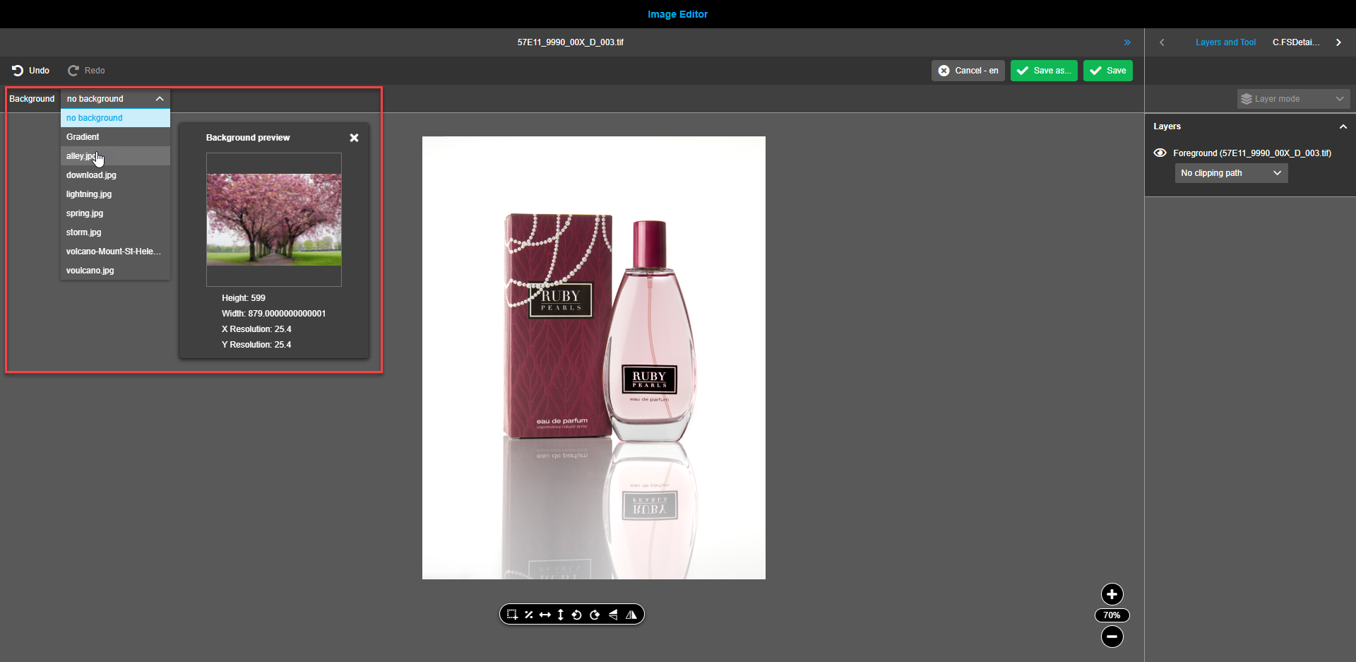
Gradient is always present among the background options while presence of images depends on configuration settings.
To add a background to the composition, choose the corresponding option from the dropdown. A new layer entitled "Background" is added to the right panel. A background field appears on the canvas.
Background is placed in canvas by next rules:
-
If no layer is selected - background is added in original size and put in the centered position of the canvas.
-
If one layer (foreground or aperture) is selected - background is added in dimensions (proportionally scaled) of selected layer and put to the centered position of the selected layer.
-
If multi select (foreground and previous background) - background is added in dimensions (proportionally scaled) of the selection area and put to the centered position of the selected frame.
Frame for background or gradient can be moved, resized.
Following functions can be executed on the background: Proportional scale, Horizontal / Vertical fit, Rotate image, Flip/Flop, Additional from framework, Crop.
Additional operations available for gradient
Gradient is placed in canvas by next rules:
-
If no layer is selected (aperture layer is not added) - gradient is added in size of the foreground and put in the centered position of the canvas.
-
If no layer is selected (aperture layer is added) - gradient is added in size of the aperture and put in the centered position of the canvas.
-
If one layer (foreground or aperture) is selected - gradient is added in size of the selected layer and put in the centered position of the selected layer.
-
If multi select (foreground and previous background) - gradient is added in size of the selection area and put in the centered position of the selection frame.
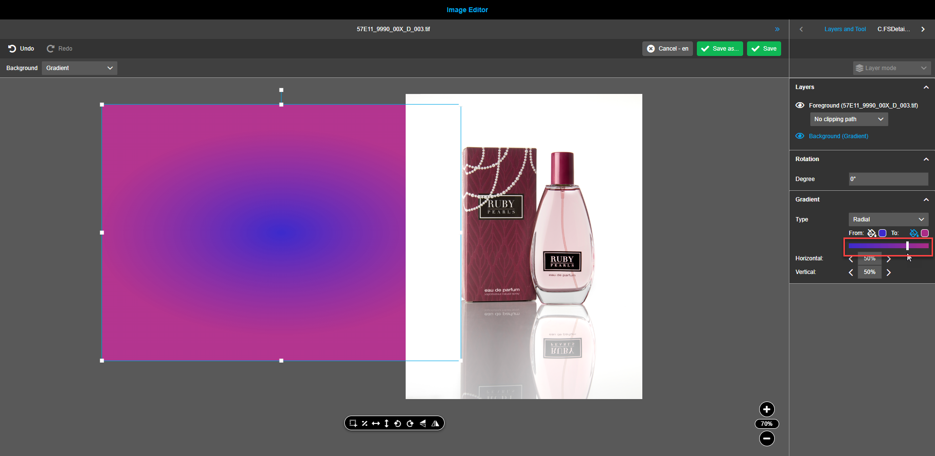
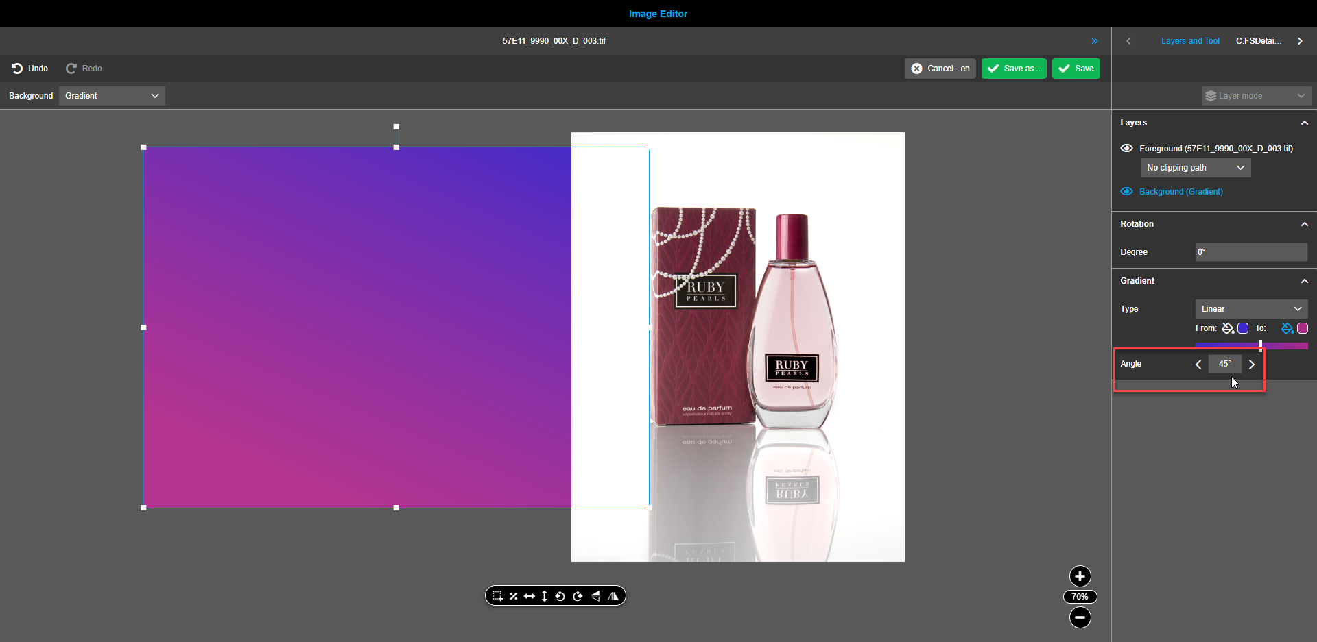
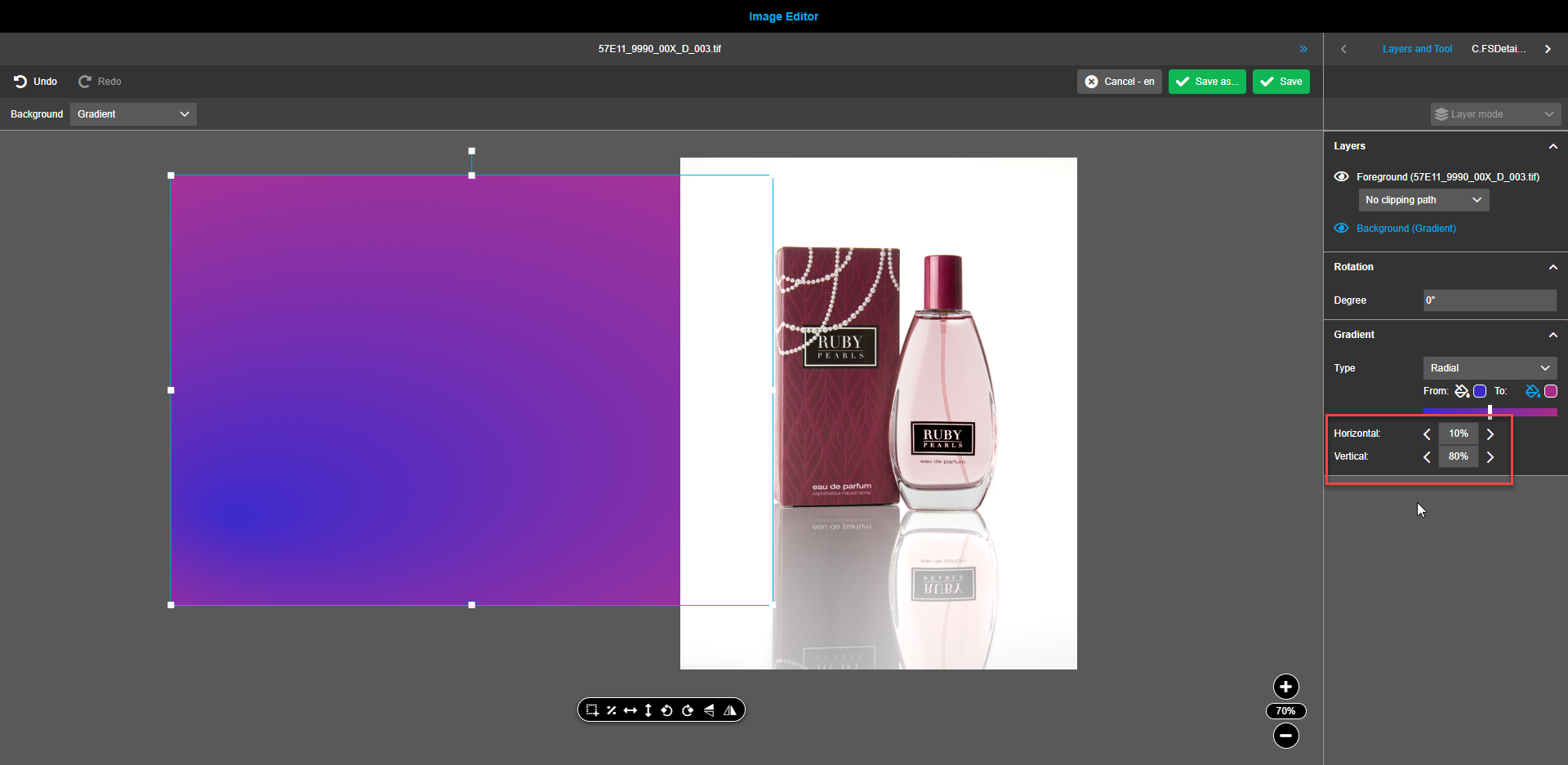
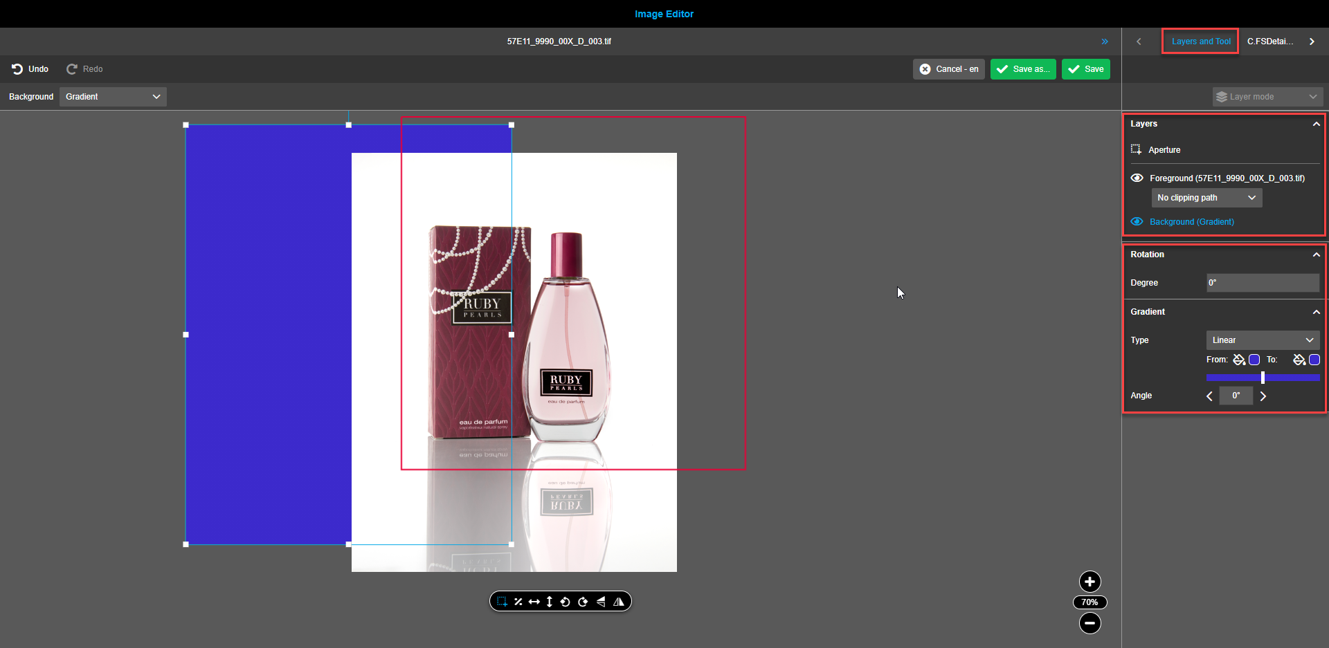
Changing color, type, opacity, range, and angle of a gradient background
To change the gradient type, choose the Linear or Radial option from the Gradient Type dropdown in the right view.
To change the colors of the gradient, use two color pickers.
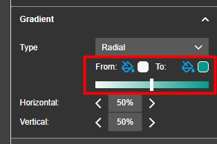
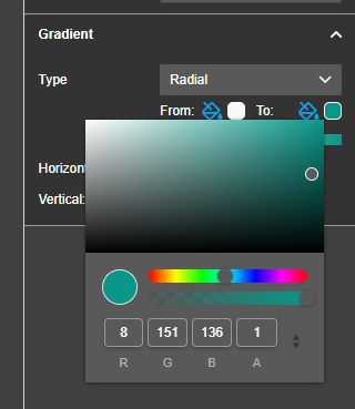
To change the opacity of the gradient background, use the opacity-slider available for each of the two color pickers.
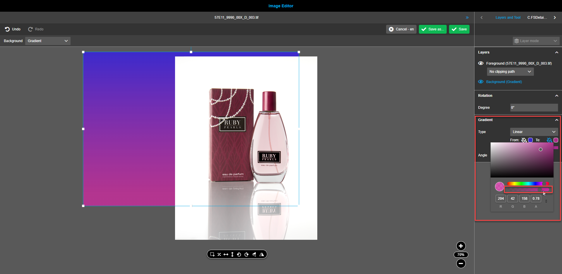
To control the prevailing color (start or end) in the gradient, use the range slider. By default, the controller is placed in the center.
To change the angle of the gradient background (applicable only to Linear gradient), change the angle value by entering it manually or using the arrows. The manual entry allows entering any whole value from 0 to 360 while arrows change the value at 10 degrees at a time.
To change the location of the radial gradient center (applicable only to Radial gradient), use the horizontal and vertical stepper values. The default value is 50% for both steppers. Values can be entered manually or by means of the arrows. Manual entry allows entering any integer value from 0 to 100 while arrows change the value at 10 degrees at a time.
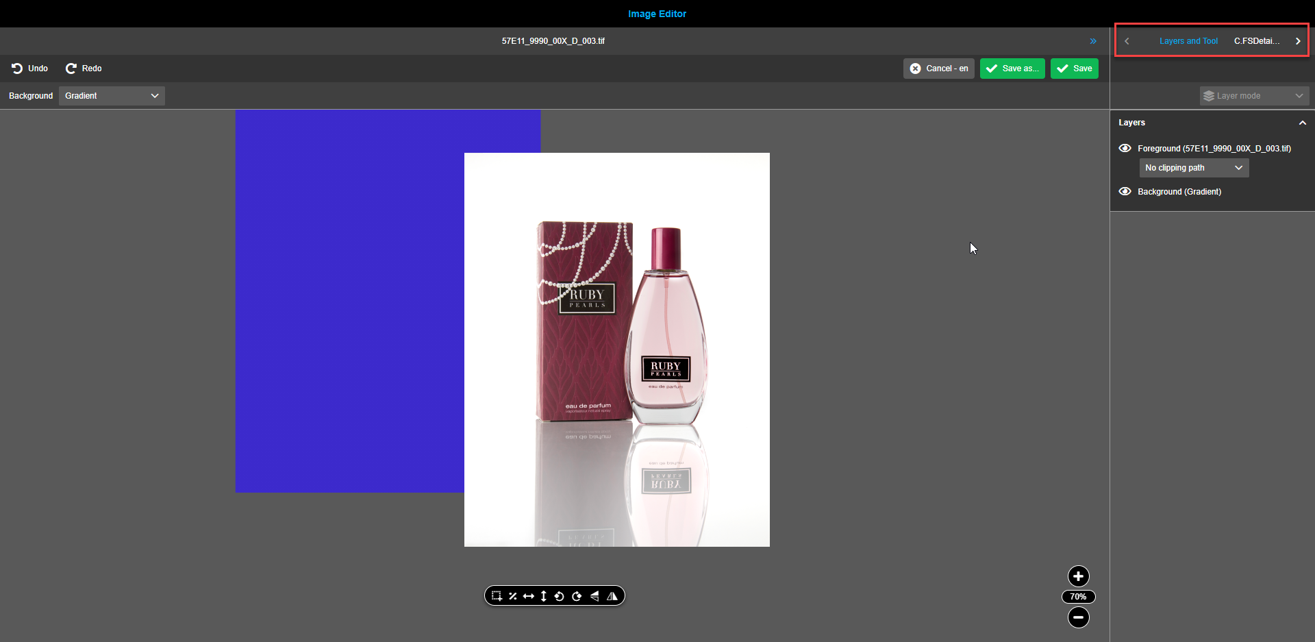
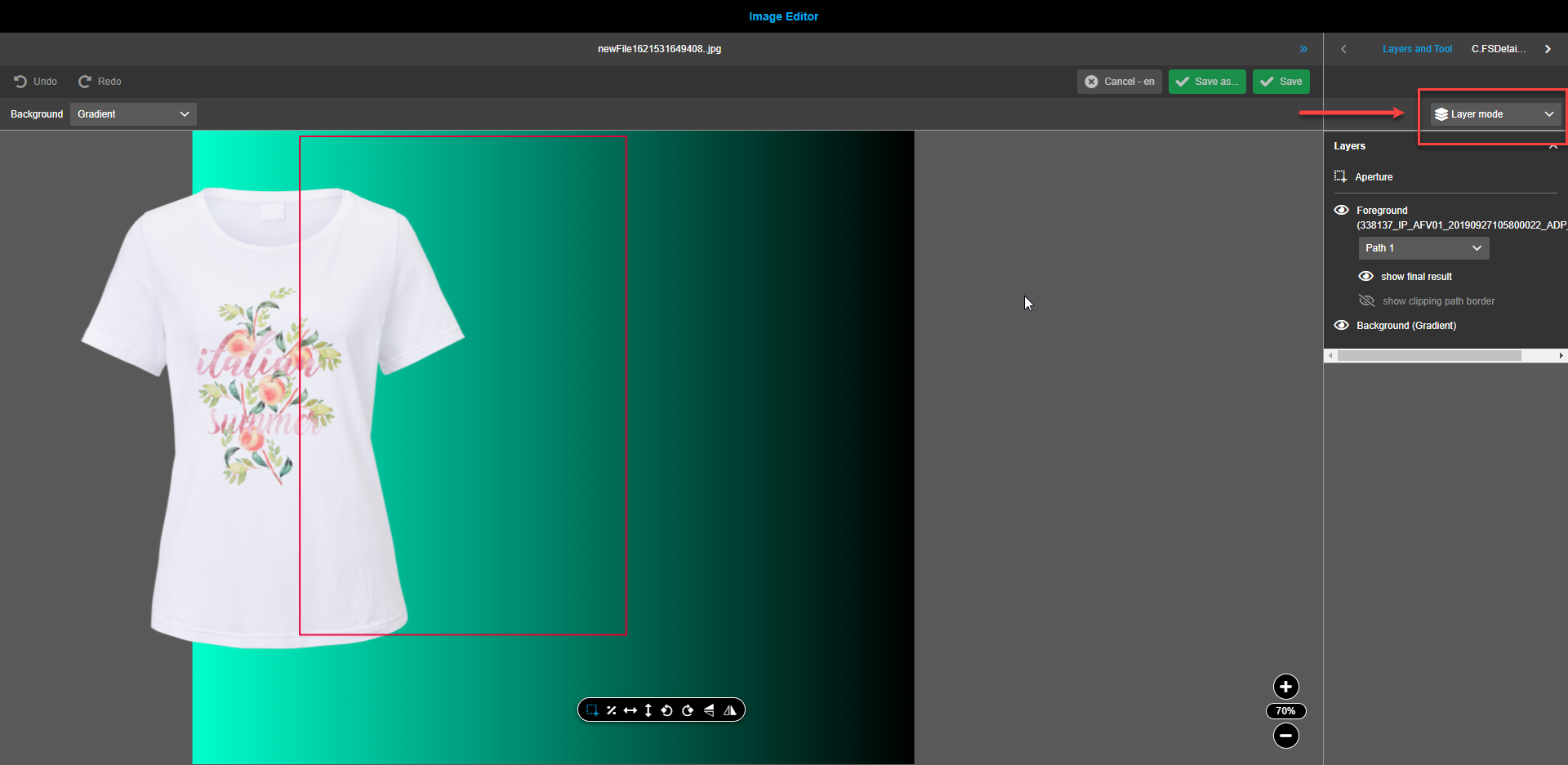
Right view
Navigation bar
The navigation bar in the right view always reflects "Layers and Tool", containing information about the available layers and special properties for the selected tool (selected in the floating toolbar of the canvas in the central view).
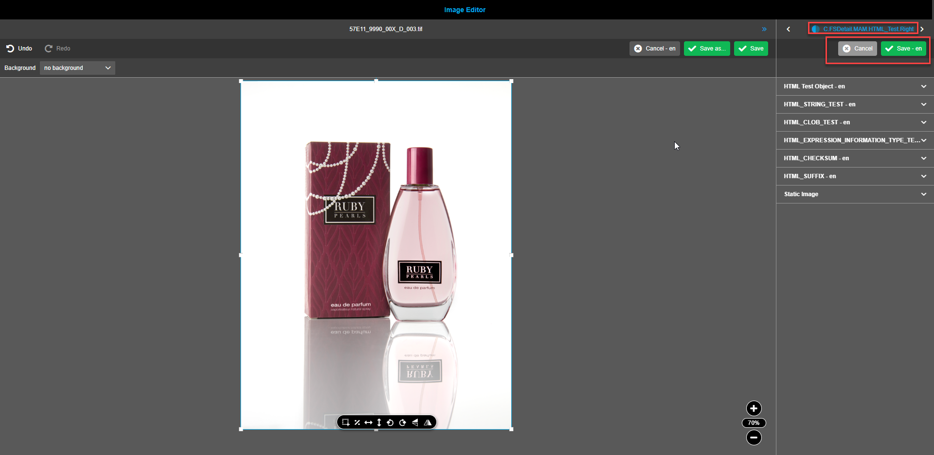
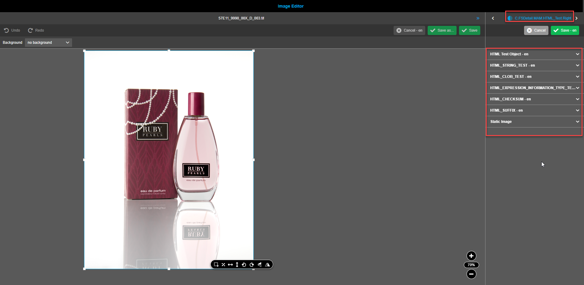
If the navigation bar is configured, the additional tab(s) for FS Details are shown. If FS Details are present, in the toolbar the buttons “Save” and “Cancel” become visible. To navigate through the tabs use the right and left arrows.
Users can change metadata of assets in tab(s) for FS Details. Changes can be saved by clicking on the “Save”-button. To discard the changes otherwise, the button “Cancel” can be used.
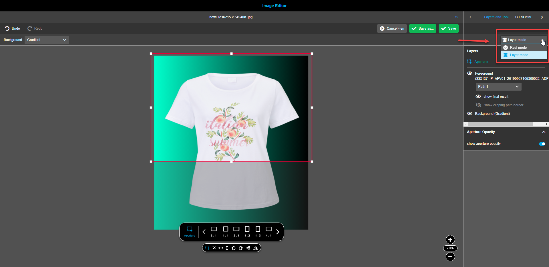
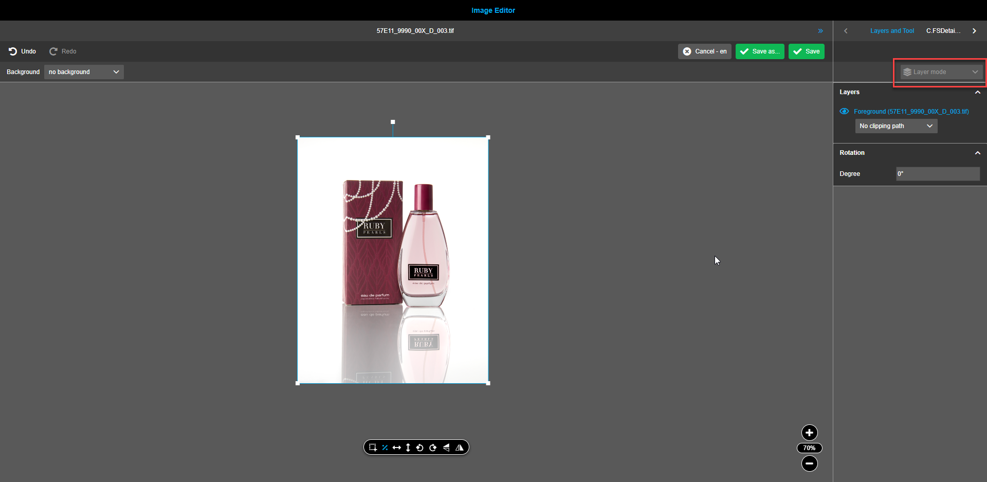
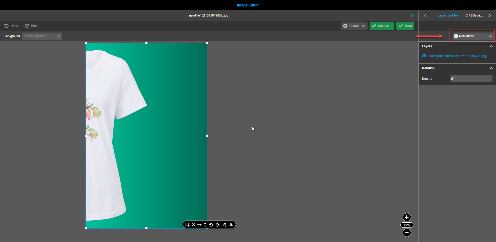
Content switcher
The content switcher in the right panel has two entries:
-
The "Real mode" - which represents the calculated image (one layer with all information = final result).
-
The "Layer mode" - which represents the composition.
-
If opened asset has no composition content switcher is disabled.
User can create composition for asset: change foreground (modifications with floating toolbar functions, select clipping path), add and modify background or gradient, add aperture or crop image, move layers.
User saves composition by clicks on "Save as" button.
Then "Real mode" is selected in the dropdown (user sees the calculated final result in canvas and in the layers panel on right-hand side).
| Real mode is a read-only mode, means there are no further adjustments possible by using tools in floating toolbar. |
-
If opened asset has composition content switcher is enabled.
Image Editor opens asset in "Layer mode". The user can directly see the previous composition and can modify it and save changes.
The user has the possibility to switch to "Real mode" with content switcher.
Canvas
If the tab "Layers and Tool" is selected in the Navigation bar, the canvas can contain two accordions:
-
layers (always available)
-
selected tool (optional as not all tools have special properties)
If the tab “FS Details” is selected in the Navigation bar, the canvas contains one or more accordions to show metadata.
Clipping paths
| Clipping paths are applicable only for foreground images. |
| Only previously selected assets contain clipping paths |
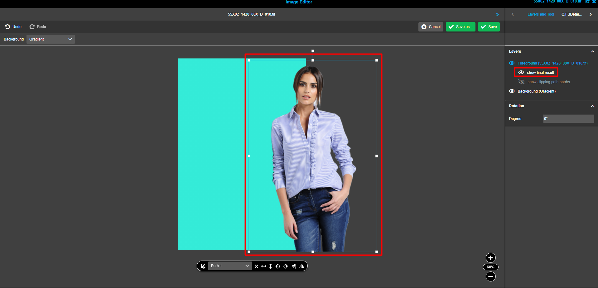
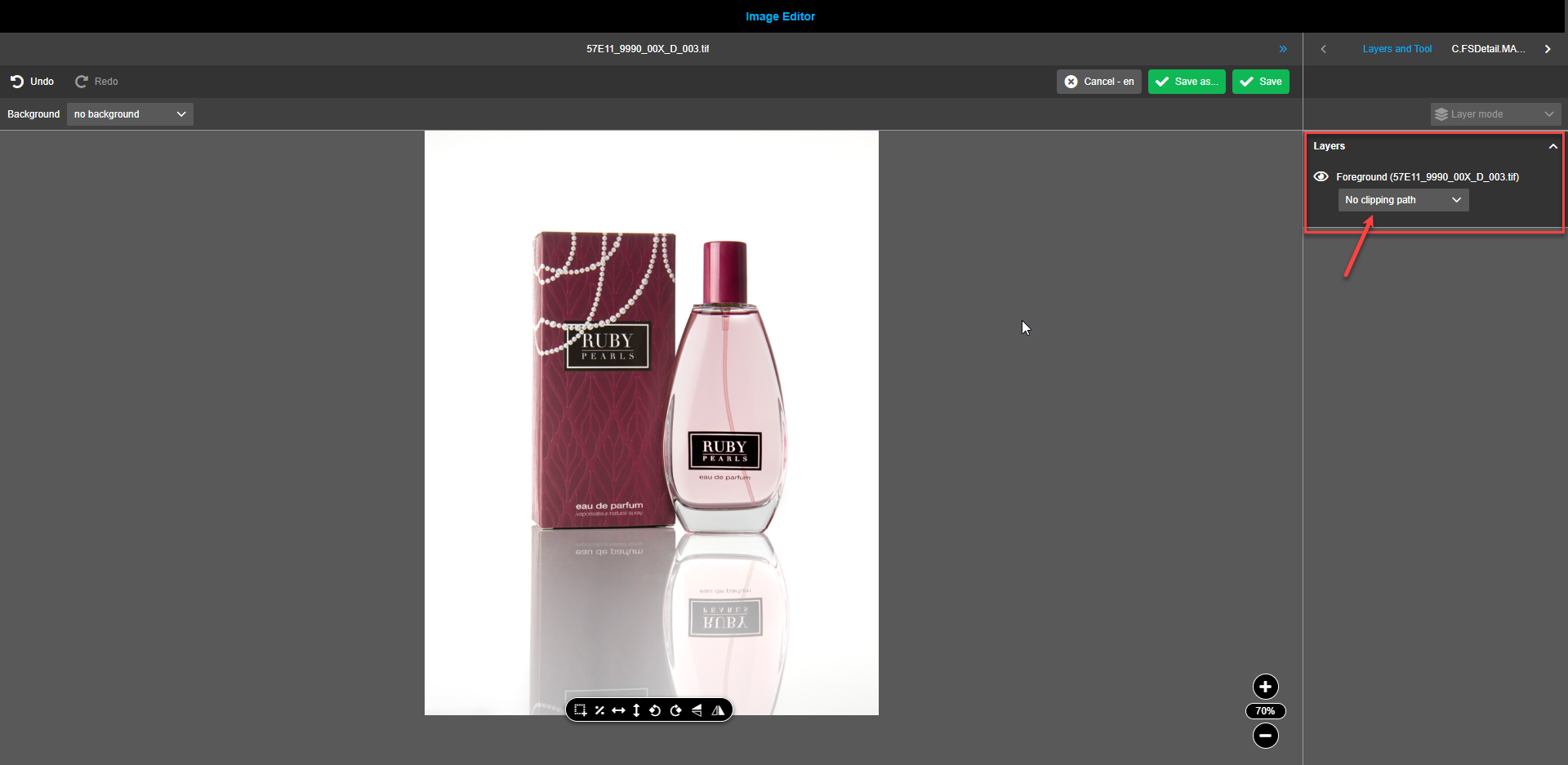
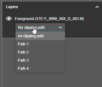
If an asset has a "clipping path" or several of them, then an additional dropdown appears under the Foreground layer in "Layers" section on right panel.
By default, "No clipping path" is selected in the dropdown. When hovered, a tooltip states "No clipping path".
To select the required clipping path, select the available option from the dropdown. As soon as a clipping path is selected, two new child layers appear in the right panel "layers". Layers are not visible if "no clipping path" is selected in the dropdown.
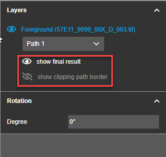
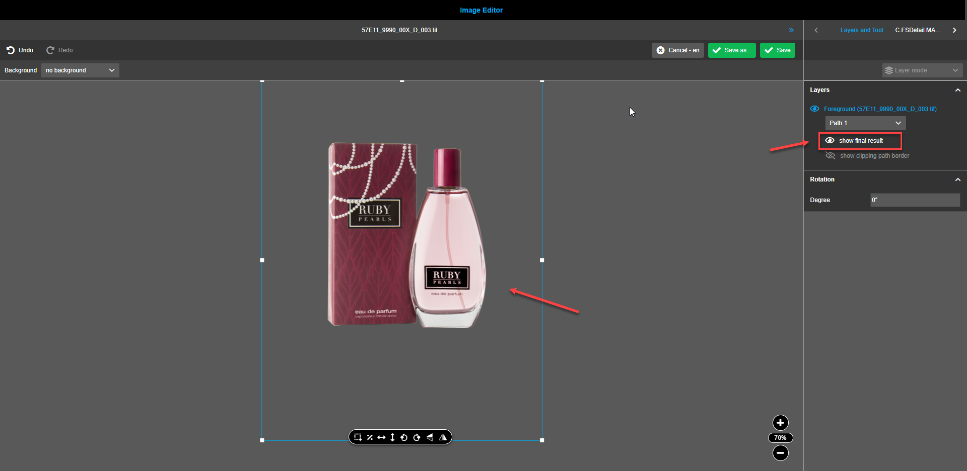
To see the area of the clipping path on the canvas, click on the “show final result”-icon in the right view. Only the clipping path area of the asset will be visible.
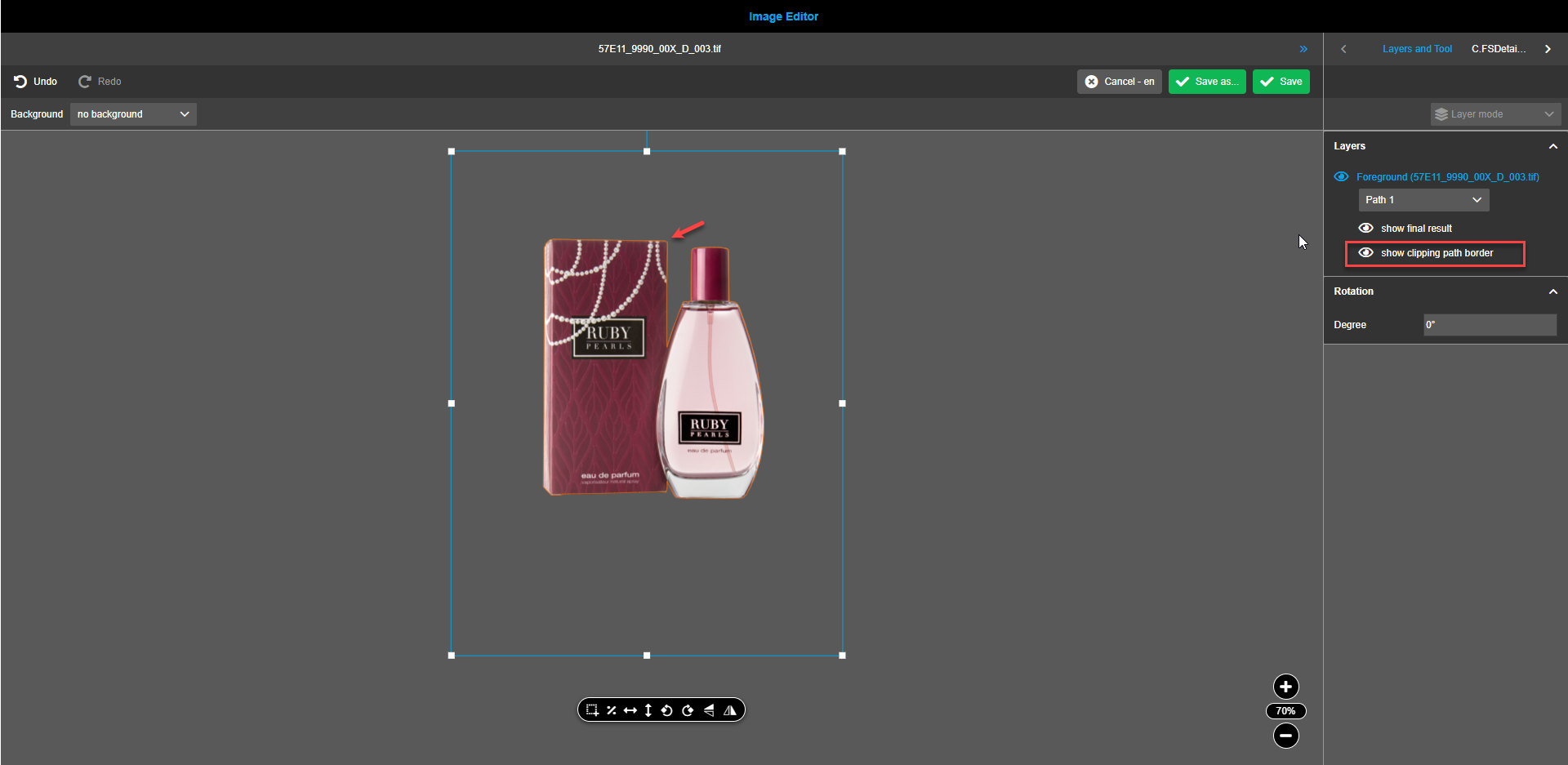
To see the border of the clipping path area on the assets, click on the “show clipping path border”-icon in the right view. The clipping path area contour is highlighted on the asset.
A foreground with applied clipping path can be placed against the background.