Notifications
Within the OMN there are different forms of notifications. These include badges, tooltips, dialogs and message boxes.
Badges
Badges are needed to visualize a number, more precisely the number of new messages in the Message Client or the number of assets in the Shopping Cart.
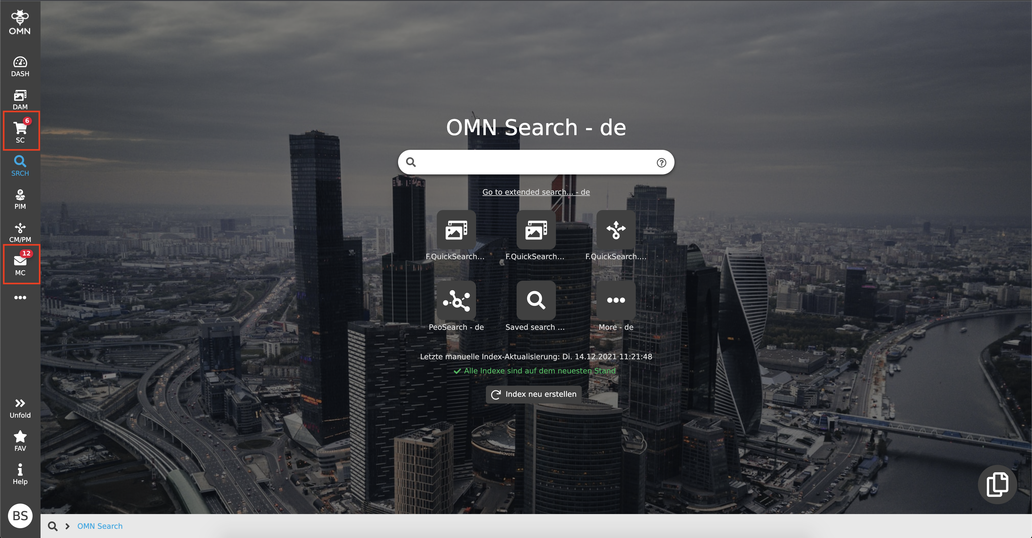
Badges are displayed as small red circles containing the respective number. This tells a user at first glance how many elements are located in the respective module.
Tooltips
A tooltip is a kind of quick information. For example, if no or only a certain part of a text can be displayed, the cursor can be hovered over an element, e.g. an input field or icon, and the corresponding (complete) text is displayed.
Dialogs
Dialogs are windows with messages that convey certain information or "task" to the user. A user must necessarily consider the message of a dialog, because an action must be confirmed before the window can be closed again. It can be an information notification, for example that mandatory fields have not been filled in, or a dialog for entering values (e.g. create a new attribute).
.png)
Message boxes
Message boxes are used to visualize to a user whether an action that has just been performed, such as copying assets, was successful or not. They are always displayed in the upper right corner of the screen and disappear by themselves.
.png)
There are three message types:
-
Success messages
-
Green message
-
The action could be performed successfully
-
-
Warning messages
-
Yellow message
-
Shows a warning, for example because of incomplete maintenance or changes in the system
-
No error is present
-
-
Error messages
-
Red message
-
The action could not be executed
-
Suggested solutions are often included
-