Input fields
Input fields are intended for text (string attribute types) or number fields (real attribute types). For example, short or long product texts or prices can be entered in such fields. There are three different types of fields: Input fields, text areas and growing fields.
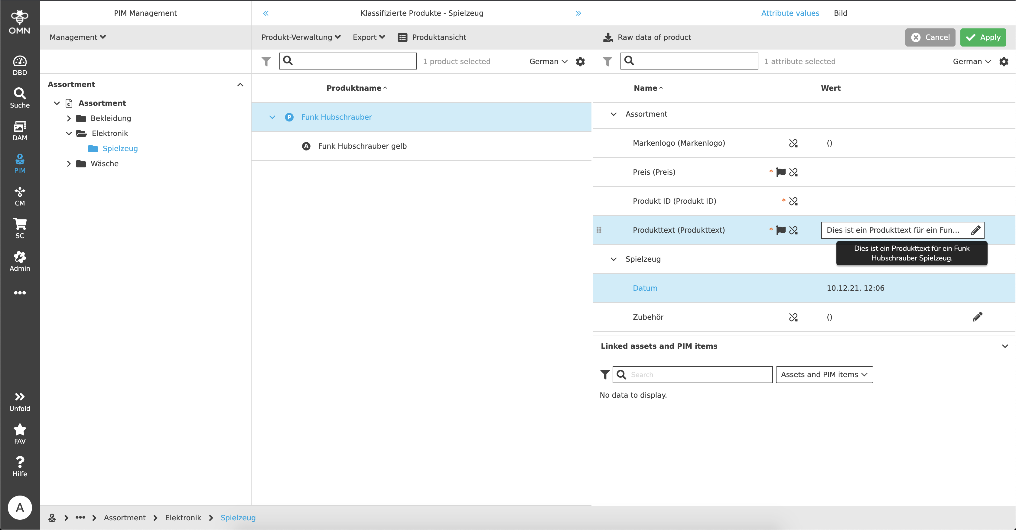
Input fields are single text lines that are rather intended for shorter text entries. If more text is entered than can be displayed, the text is abbreviated with "…" and the rest is displayed as a so-called tooltip when the cursor is hovered over the field.
Text areas are extended input fields, which can thus reflect multi-line inputs. Here, too, the text is abbreviated if there is not enough space available. These text areas, if so configured, can be built in as expandable or growing text areas. Thus normal input fields or text areas can grow with the content (up to a maximum length).
For input fields, if required, a validation is available. Example:
In PIM, a "real" attribute has been created in which only numbers are allowed. In addition, the value may only be between 0 and 30. If the user now enters a 5 in the number field, a green line is displayed - the value is valid. If a 50 is now entered, a red line and an error message are displayed because the value is invalid.