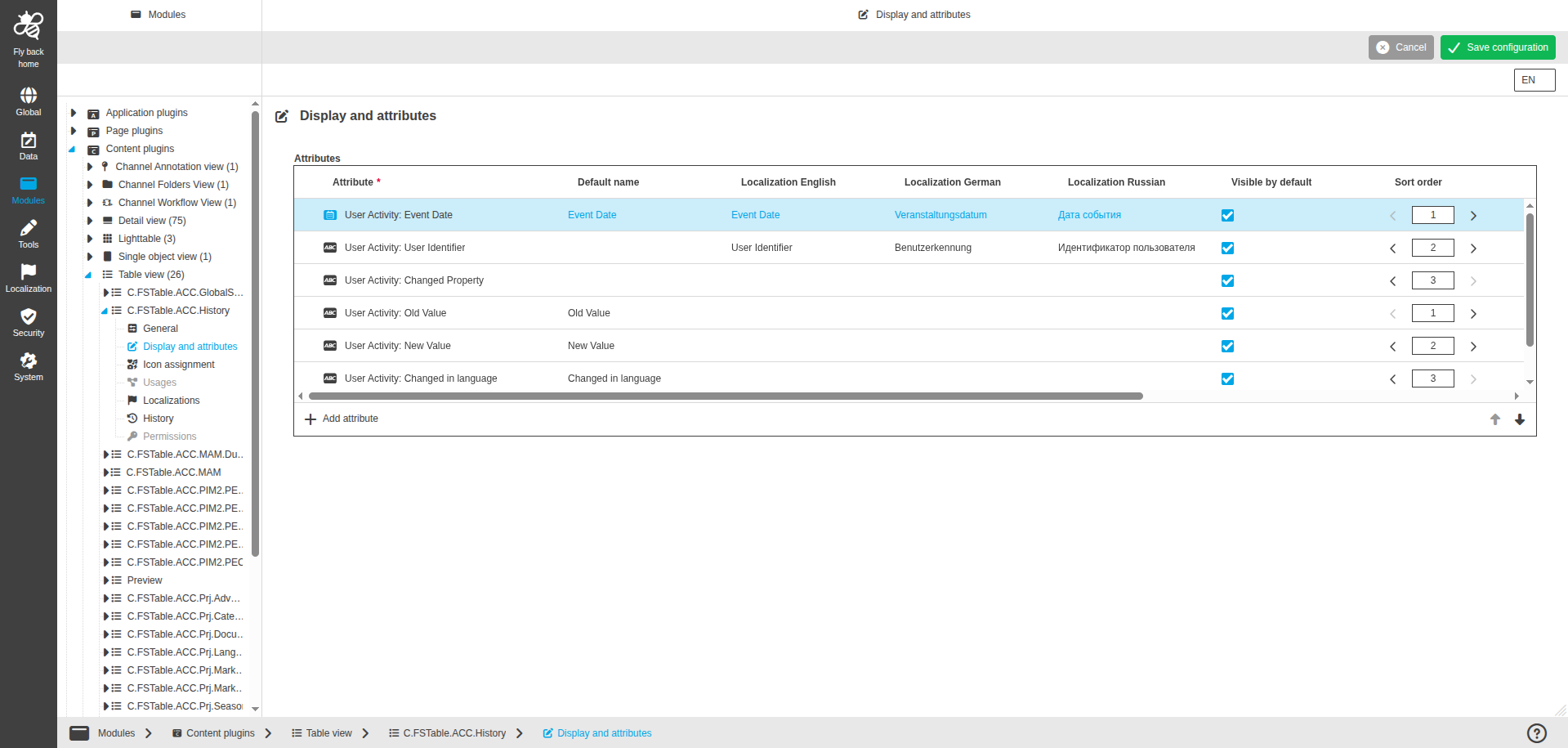
Display and attributes
This page provides the possibility to configure the display settings and attributes which should be available in the Table View plugin in the UI.
| Name of option | Description | Note |
|---|---|---|
Attributes |
|
The following table lists the configuration options within the 'Attributes' table widget:
| Name of option | Description | Note |
|---|---|---|
Attribute |
|
|
Default name |
The option is used to enter a default attribute name, which will be shown in the UI if no localization of the set system language is available. |
The attribute name shows by default as soon as an attribute type is chosen. |
Localization columns |
The option is used to enter the attribute name for each available system language, which will be shown in the UI. |
|
Visible by default |
The option is used to define if attribute information will be shown by default in the UI. |
|
Sort order |
The option is used to define sorting criteria order. |
|
Sorting orientation |
The option is used to define sorting direction of the criteria. |
Allowed inputs: Ascending, Descending. |
Sort by default |
The option is used for the attribute types that should be used as sorting criterion. All items will be sorted by default in the UI. |
|
Width |
The option is used to define attribute (column) width by default. |
**Allowed integer values: range 0px - 3000 px
|
Advanced settings row function button |
The button is displayed in the last column. |
For more details see Advanced settings |
The following properties are available in the advanced settings modal:
| Name of option | Description | Note |
|---|---|---|
Unite with the previous column |
The dropdown to select unite option
|
Only single select is possible |
Delimiter |
The text input which allows to define a delimiter between the 2 united attributes values in the same line. |
Available in case 'Unite with the previous column' is set to 'same line'. |
Header on new line |
The toggle to define if united column header should start from new line.
|
Available in case 'Unite with the previous column' is set to 'same line' or 'new line'. The toggle is off by default. |
Precision |
The single stepper defines the number of decimal places. |
Only numeric values which are greater than 0 are allowed. Only available in case the attribute is a number attribute. |
Date style |
The dropdown to select the style for the date which is shown in the UI for the attribute.
|
Only single select is possible. Only available for date attributes. |
Show time |
The toggle to define if timestamp should be shown.
|
Only available in case the attribute is a date. |
Unit |
The dropdown to define the resolution or dimension unit.
|
The dropdown is available only for attributes where expression.linkType is 'resolution' or 'dimension' (e.g. Image: X/Y resolution, Image width/height). Depending on the expression.linkType, the dropdown is filled with different values. |
Truncate to fit |
The toggle to define if attribute text should be truncated.
|
Toggle is turned off by default |
Align |
The dropdown to set alignment position.
|
Available for all attributes. The attribute values will be shown aligned as configured in the column in the UI. |
Content language |
The dropdown will contain the activated content languages of the mandator and an empty entry. |
Only available in case that attribute was configured as language-dependent. |