Input Options
OMN offers a user various options to make entries. These include, for example, checkboxes, input fields, dropdowns or date pickers. These will be described in more detail below.
Input fields
Input fields are intended for text (string attribute types) or number fields (real attribute types). For example, short or long product texts or prices can be entered in such fields. There are three different types of fields: Input fields, text areas and growing fields.
Input fields are single text lines that are rather intended for shorter text entries. If more text is entered than can be displayed, the text is abbreviated with "…" and the rest is displayed as a so-called tooltip when the cursor is hovered over the field.
Text areas are extended input fields, which can thus reflect multi-line inputs. Here, too, the text is abbreviated if there is not enough space available. These text areas, if so configured, can be built in as expandable or growing text areas. Thus normal input fields or text areas can grow with the content (up to a maximum length).
For input fields, if required, a validation is available. Example:
In PIM, a "real" attribute has been created in which only numbers are allowed. In addition, the value may only be between 0 and 30. If the user now enters a 5 in the number field, a green line is displayed - the value is valid. If a 50 is now entered, a red line and an error message are displayed because the value is invalid.
Text Editor
Basically, all "String" attribute types can also be opened in a so-called Text Editor, provided that the configuration allows it.
The Text Editor can be opened by a user hovering over the input field and clicking on the pencil icon that appears.
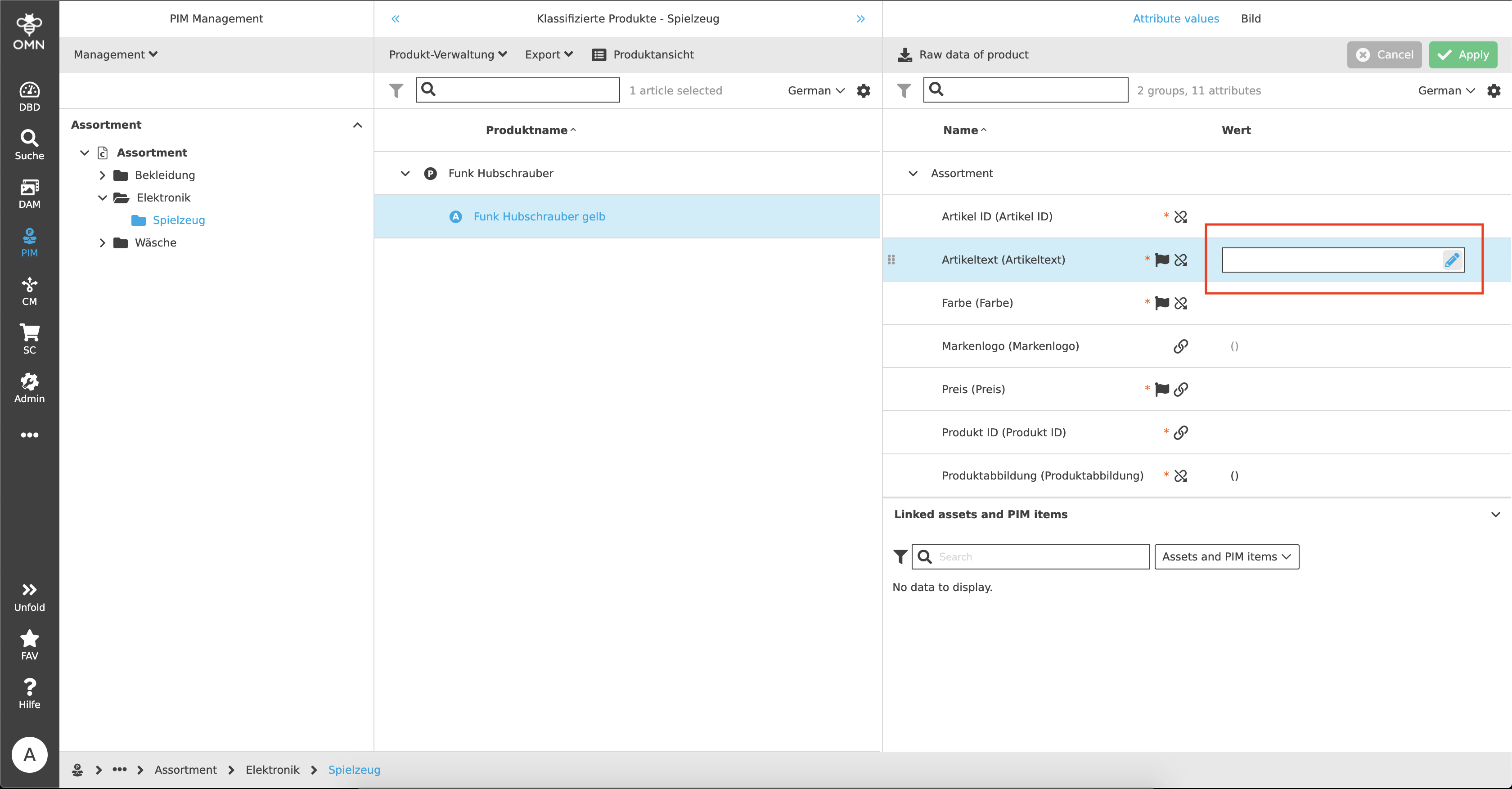
This opens a modal in which the user is given significantly more space for text creation than in the conventional input field and there are additional options for text editing.
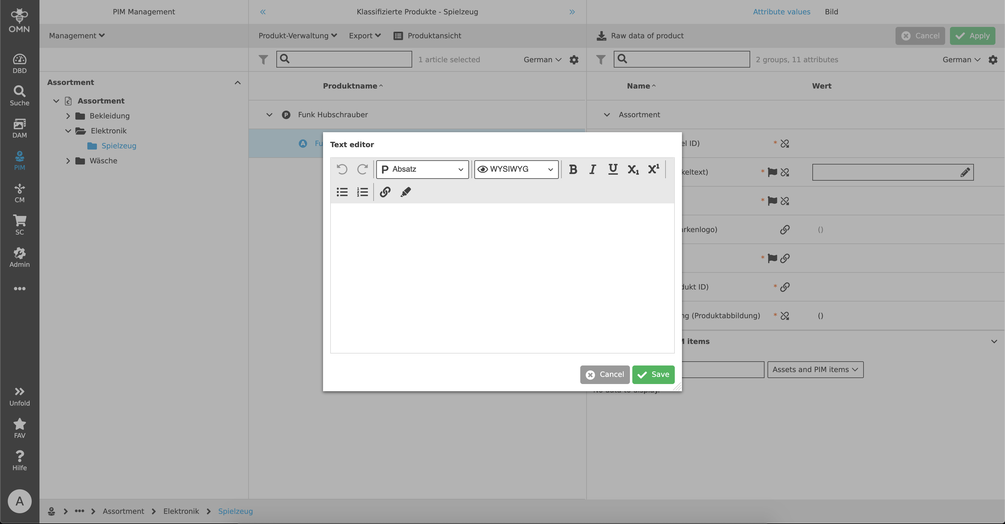
The Text Editor offers the user many additional functions:
-
Undo and Redo
-
Different text sizes (headings and paragraph)
-
Different view options
-
WYSIWYG (= What You See Is What You Get) → The text is displayed during editing exactly as it will look later in the output
-
HTML → The text is written with HTML code
-
PLAIN → Contains text information only
-
-
Offers for text layout (bold, italic, underline, subscript, superscript)
-
Enumerations (indents, numbering)
-
Links
-
Markings
Dropdowns
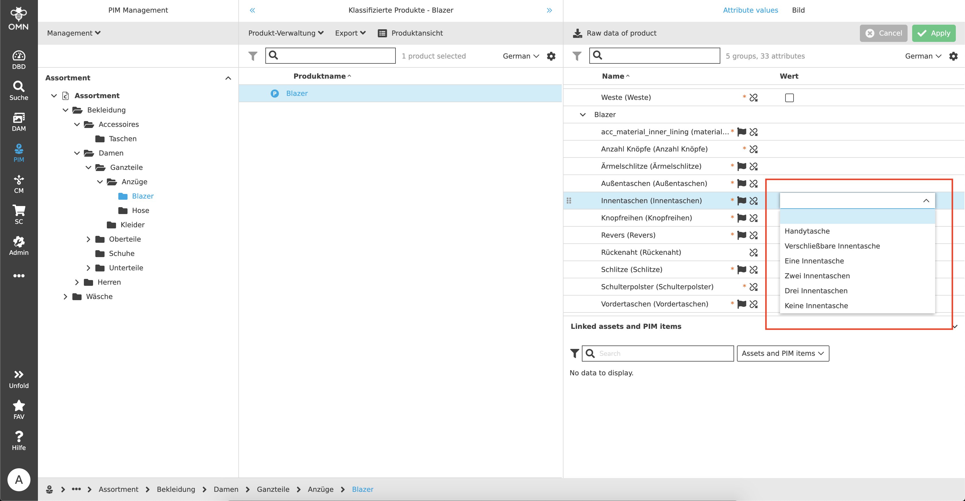
A dropdown is a so-called selection list that allows a user to specify one or more values from a list of given values.
Basically there are four different dropdown types:
-
a standard dropdown
-
a searchable dropdown
-
a multiselect dropdown
-
and a dropdown to which values can be added
Standard Dropdown
The standard dropdown is a simple selection list. By clicking on the field, the dropdown opens and shows a selection of different values, one of which can be selected.
Searchable Dropdown
Certain dropdowns can be searchable. Basically, a searchable dropdown is the same as a standard dropdown, except that a user can make entries in the field to reduce the selection. This makes sense especially when there are a particularly large number of values available.
Multiselect Dropdown
More than one value can be selected within a multiselect dropdown. This is visualized to the user with checkboxes. If the user clicks on several checkboxes, they are added to the selection and appear as so-called "chips" in the selection bar. The selected values can either be deselected via the checkboxes or deleted by clicking on the "X" in the chip.
Datepicker
The tool for displaying and editing date fields, also called "Datepicker", is composed of an input field and one or two icons for editing date and time.
.png)
In the input field a user can directly enter the desired date (in the given format). Alternatively, the user can click on the calendar icon to directly select the date in the calendar.
.png)
In addition to a date, a time can also be selected if the configuration allows it.
.png)
Checkboxes
Basically, checkboxes are used to indicate an active or inactive status. There are two main use cases for which checkboxes are needed.
Selections
Checkboxes are used in many places, for example within tables, to select specific files. The user can make a single or multiple selection of certain files by clicking on the checkboxes and perform actions on exactly these in the subsequent step. For certain functions, such as downloads, assets must be selected beforehand in order for them to appear in the toolbar in the first place. Also for copy or move actions the files have to be selected before.
"True" or "False"
In addition to selections, checkboxes are also used to determine a state. For example, so-called "Boolean" attributes can be created in PIM that can query a "true" or "false" state. An example of this would be the following:
A user maintains whether an item contains batteries or not. A fictitious attribute "Batteries" was created as a Boolean type and shows an empty checkbox (= no batteries included). If this checkbox is now activated by the user, the state changes to "true", which means that the item contains a battery.
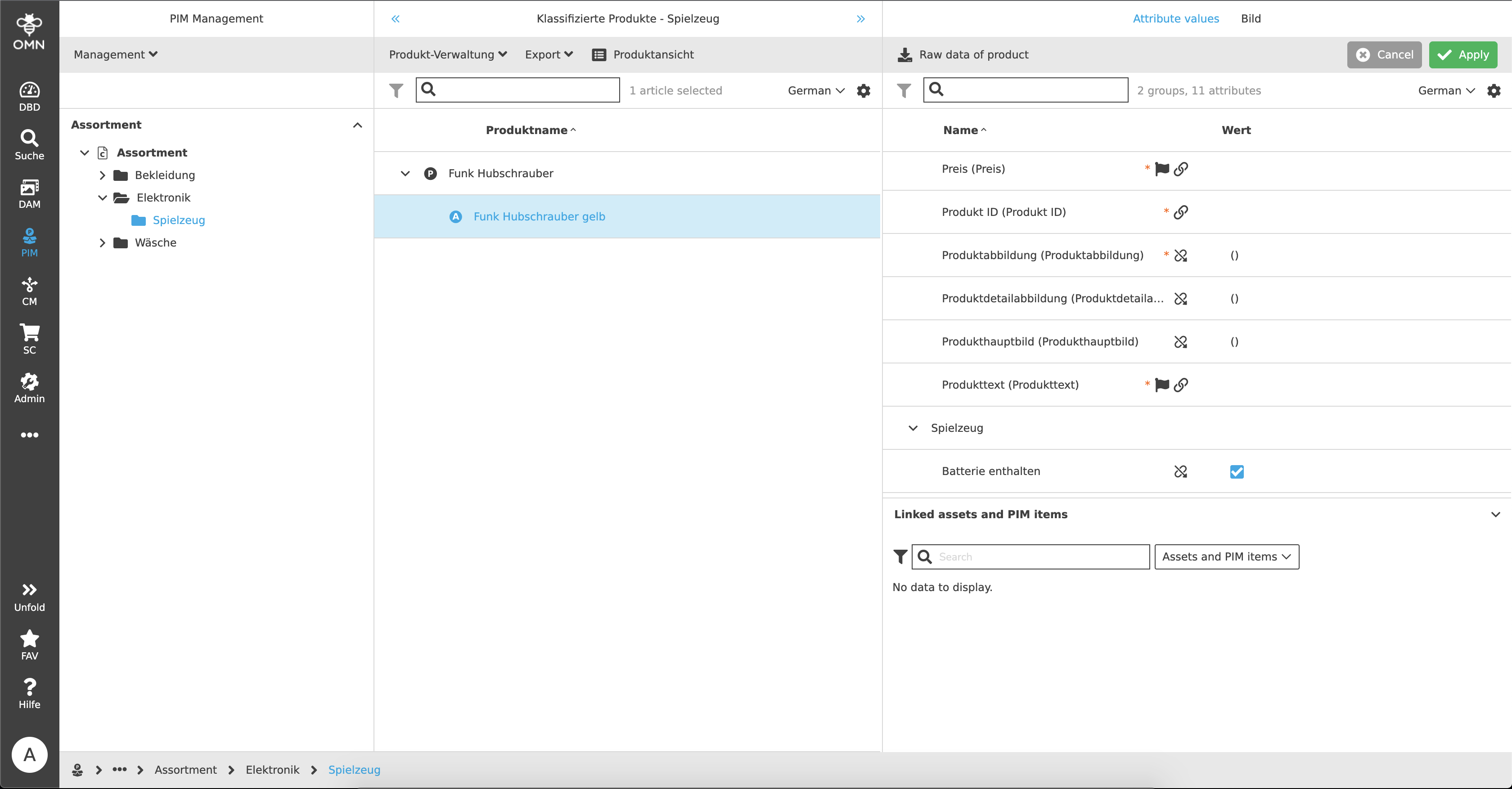
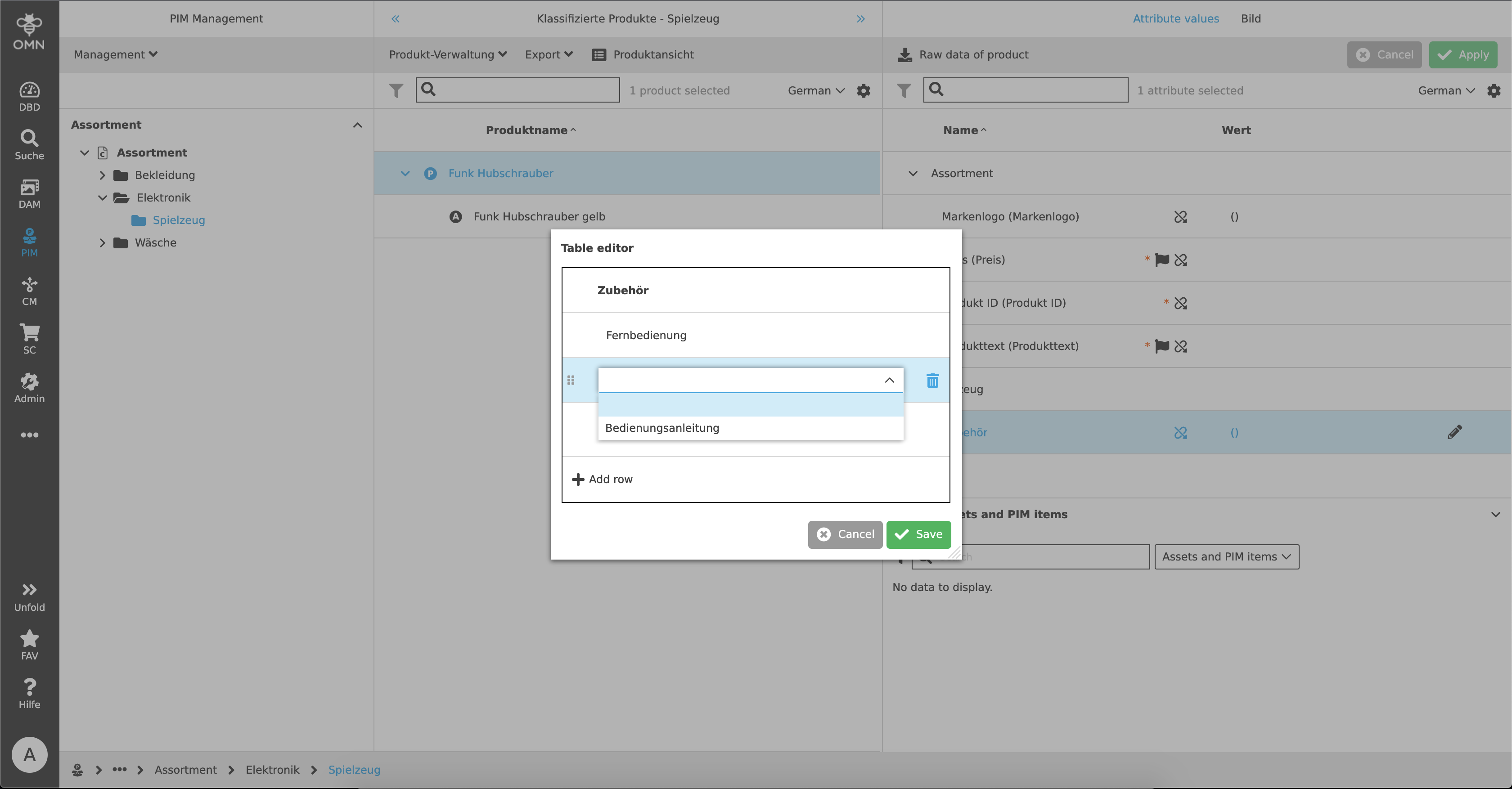
Table Editor
A Table Editor is used, for example, to maintain various values with listing in PIM. It can be opened, like the Text Editor, by hovering over the respective field and clicking the pencil icon that appears. The Table Editor modal opens.
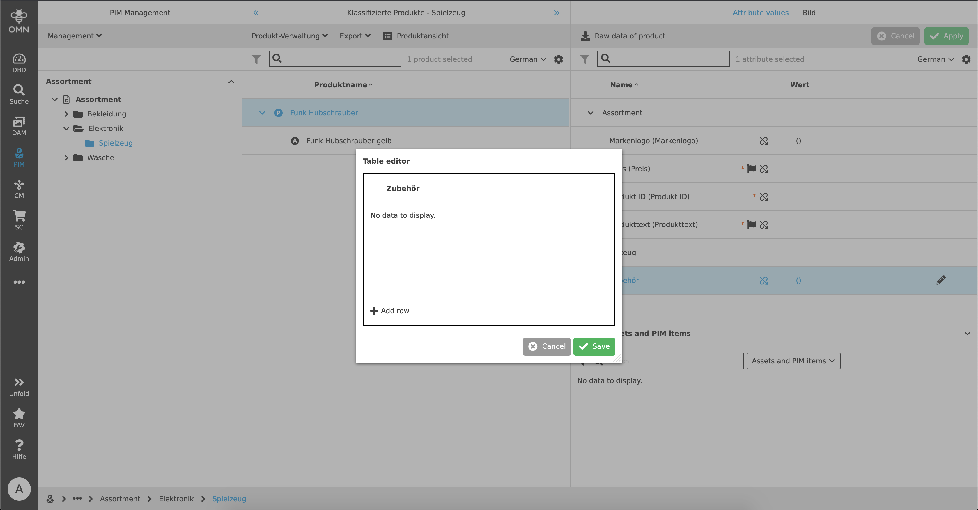
The Table Editor can be used to add already stored characteristics (domains) to the attribute. A new row is added for each domain. Using the example of a string attribute, a user could, for example, assign different accessories to a product, such as an instruction manual or remote control, in order to be able to identify later which accessories are included. More attribute types, such as Boolean, can also be opened and edited with the Table Editor.
Toggle Buttons
Toggle buttons are used to activate or deactivate a status. These can be, for example, filters or settings in the statusbar settings (e.g. checkboxes or show/hide information).
A toggle button always consists of a button (active or inactive) and a label that indicates the action to be performed (e.g. activate/deactivate filter). The active button is displayed in blue and the inactive button in gray.

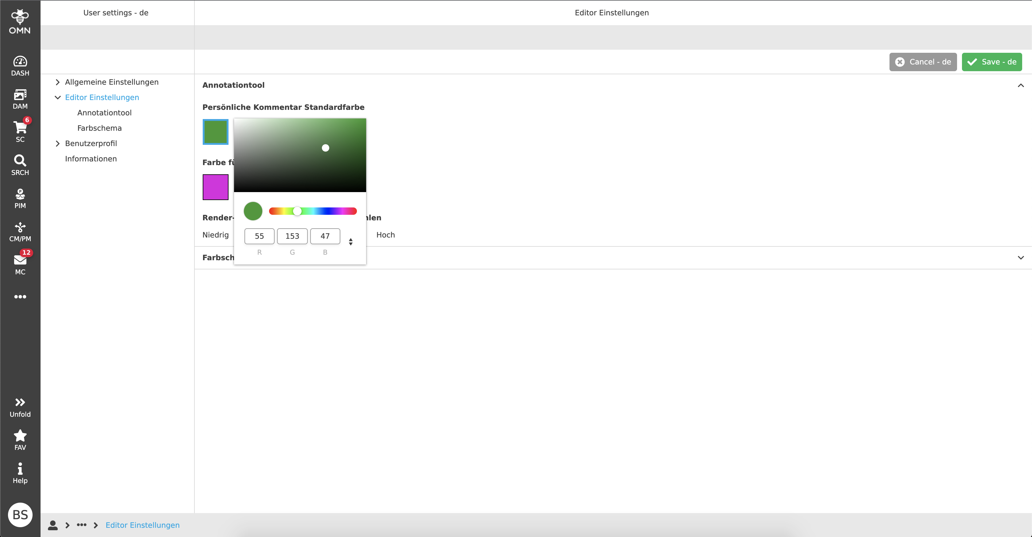
Color picker
With the color picker, a user can select a specific color, for example to be able to use individual comment colors for the Annotationtool. For this purpose, either a color field or RGB input fields are available to the user.