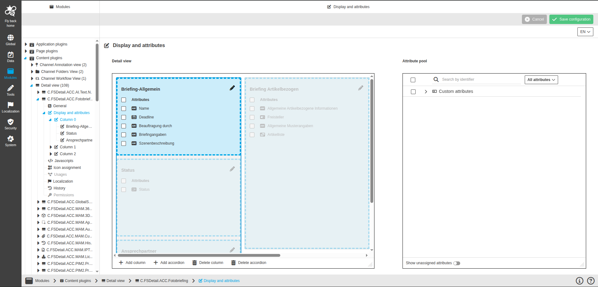
Display and attributes
This page provides the possibility to configure the Detail View layout and assign attributes that appear in the UI.
General behavior
-
The tab is available only when the configuration mode in the General tab is set to Manual.
-
If Automatic mode is selected, the tab is hidden in the left panel.
-
When accordions with assigned attributes are saved in the detail view arrangement, each accordion appears as a subentry in the left panel tree.
-
Selecting an accordion subentry opens its detailed attribute configuration.
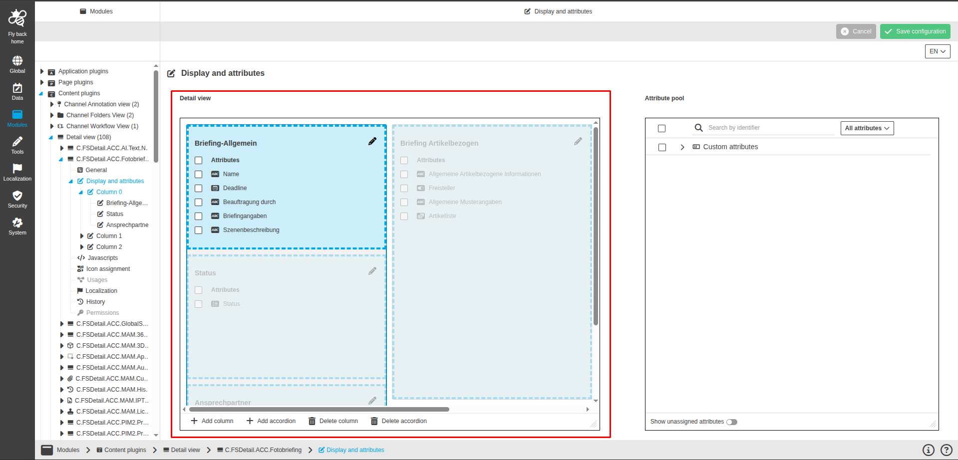
Detail view arrangement
The Detail view arrangement component defines the layout of accordions and assigned attributes. The layout can use several columns side by side. Accordions are organized within those columns and can be distributed across different columns. See Add column, Add accordion, and Delete column below.
The component contains the following elements:
| Name of option | Description | Note |
|---|---|---|
Accordion |
Area to place attributes using drag and drop from the Attribute pool. Accordions belong to a column. When multiple columns exist, each accordion sits in one of those columns. |
Each accordion shows its identifier. The pencil icon opens the Accordion settings modal. |
Assigned attributes list |
List of attributes assigned to the accordion, including a Select all checkbox. |
Each attribute has a selection checkbox. Long names are truncated with a tooltip. |
Drag and drop hint |
Guidance to add attributes via drag and drop. |
Displayed below the attribute list. |
The following functions are available:
| Function | Description | Note |
|---|---|---|
Add column |
Adds a new column to the layout. |
Available when at least one accordion exists. |
Add accordion |
Adds a new accordion to the layout. |
Available when no dropzone exists or when a dropzone is active. |
Delete column |
Deletes the column that contains the active accordion. |
Available when more than one column exists and an accordion is active. |
Delete accordion |
Deletes the active accordion. |
Available when more than one accordion exists. |
Delete selected attributes |
Deletes all selected attributes from the layout. |
Available when at least one attribute is selected. |
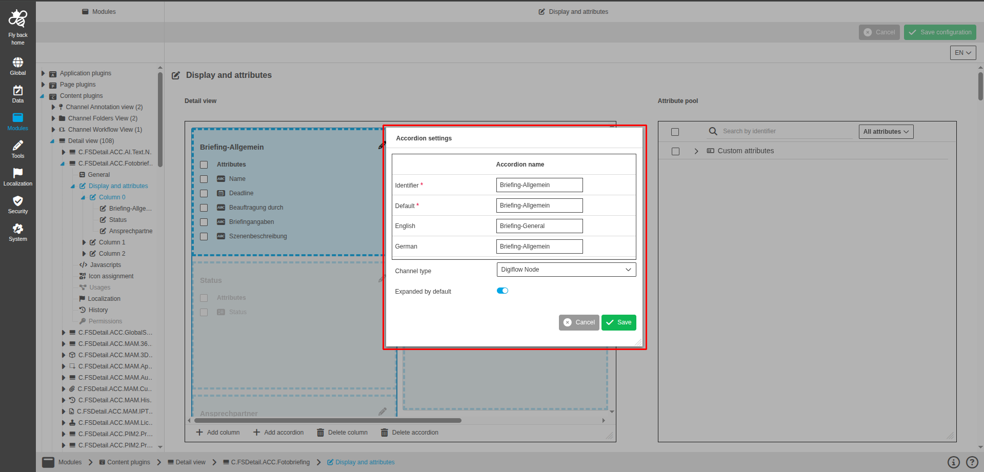
The Accordion settings modal can be opened via the pencil icon, Add column, or Add accordion.
Add column
Add column is used to insert a new column in the detail view layout and configure its accordion settings in a modal.
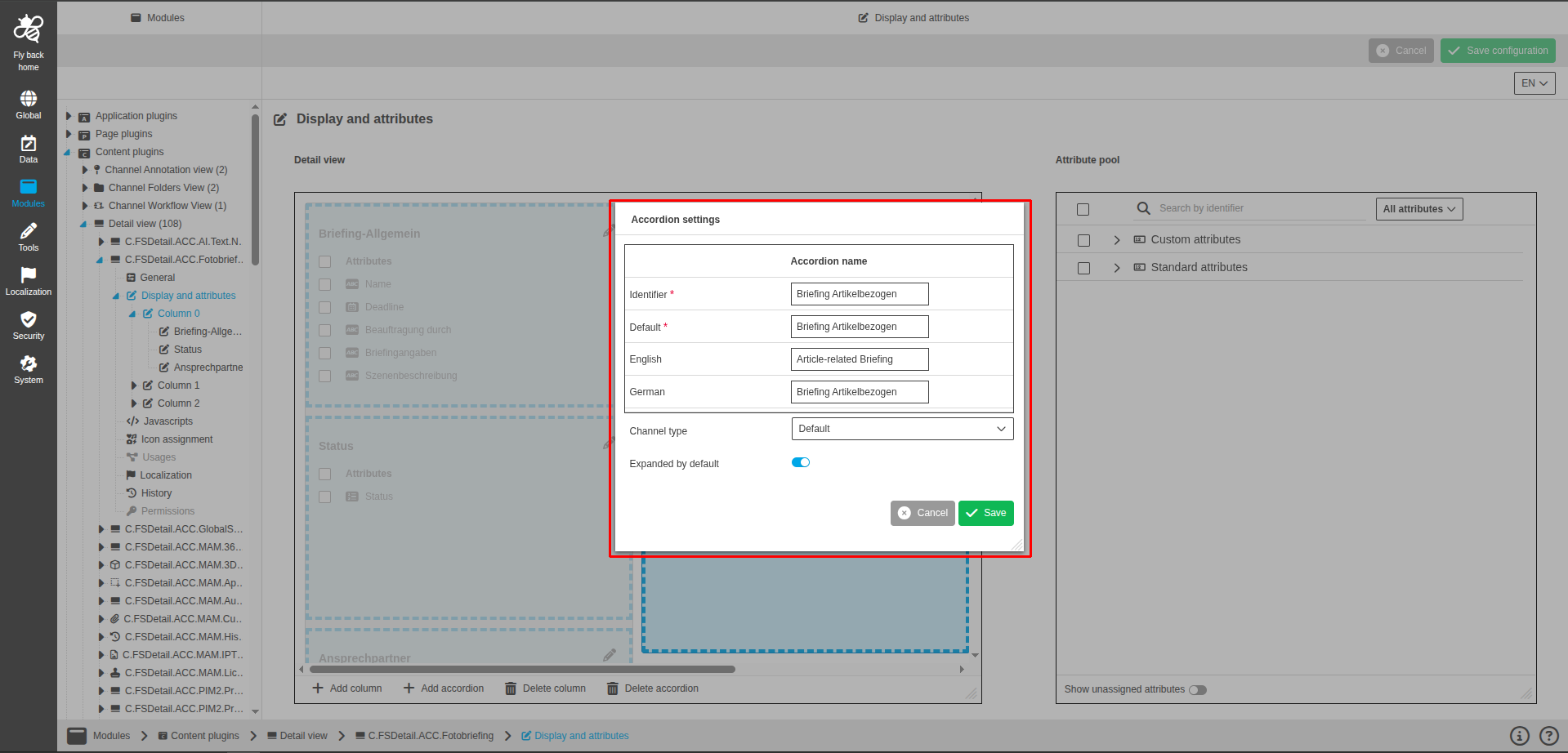
The Accordion settings modal contains the following configuration:
| Name of option | Description | Note |
|---|---|---|
Identifier |
Defines the accordion identifier. |
Mandatory and must be unique. |
Default |
Defines the default name of the accordion. |
Mandatory and must be unique. |
Localization entries |
Defines localized names for each active system language. |
One entry per active system language. |
Subobject type |
Selects the subobject type. |
Available only for DAM object type. |
Specialization |
Selects the specialization. |
Available only for DAM object type. |
PIM level |
Selects the PIM level. |
Available only for PIM object type. |
Channel type |
Selects the channel type. |
Available only for CM object type. |
Expanded by default |
Defines whether the accordion is expanded when the UI opens. |
Enabled by default. If turned off, the accordion is collapsed by default. |
Attribute pool
The Attribute pool component provides the list of attributes that can be assigned to the detail view. The attributes displayed in the attribute pool correspond to the object type set in the General tab.
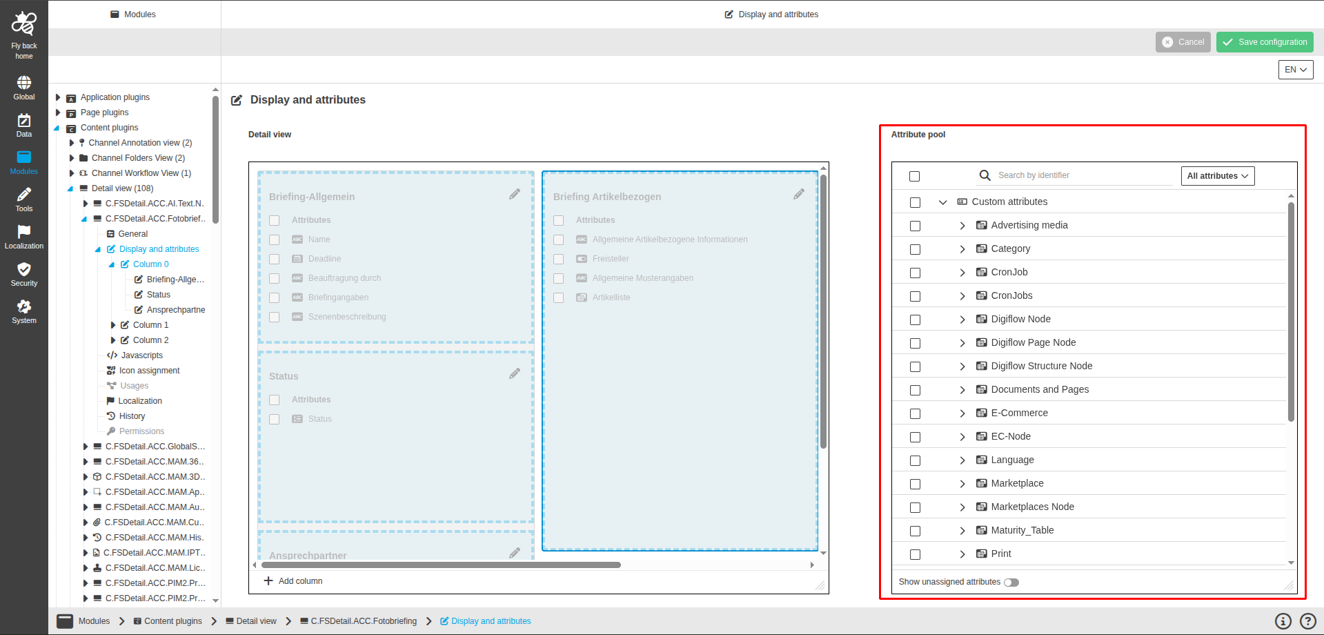
The component contains the following elements:
| Name of option | Description | Note |
|---|---|---|
Select all |
Selects all listed attributes. |
|
Search by identifier |
Filters attributes by identifier. |
|
Attribute type filter |
Limits the list to All attributes, Standard attributes, or Custom attributes. |
The list reflects the selected object type and hierarchy. |
Sorting |
Sorts attributes in ascending or descending order. |
Alphabetical order is the default. |
Attribute list |
Shows all available attributes for the selected object type in their hierarchy. |
Each attribute has a selection checkbox and a data type icon. Standard and custom attributes are grouped. |
Show unassigned attributes |
Controls whether only unassigned attributes are shown. |
Enabled by default. If turned off, all attributes are shown. |