Article Briefing
Opening of ArticleBriefing
ArticleBriefing editor can be opened following a click on a corresponding button in one of the views listed below:
Project Navigation
Expand CM/PM → ProjectNavigation
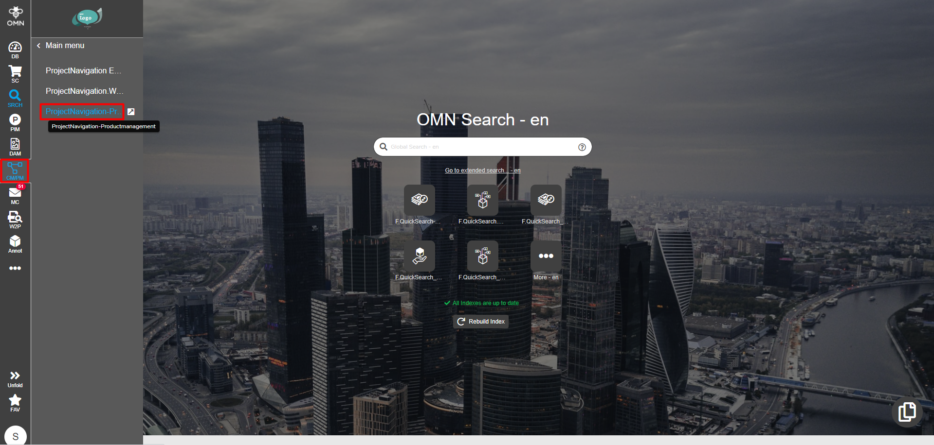
Select a required project from the left view. Click an ArticleBriefing plugin. If multiple functions are configured it may be hidden in the dotted menu icon.
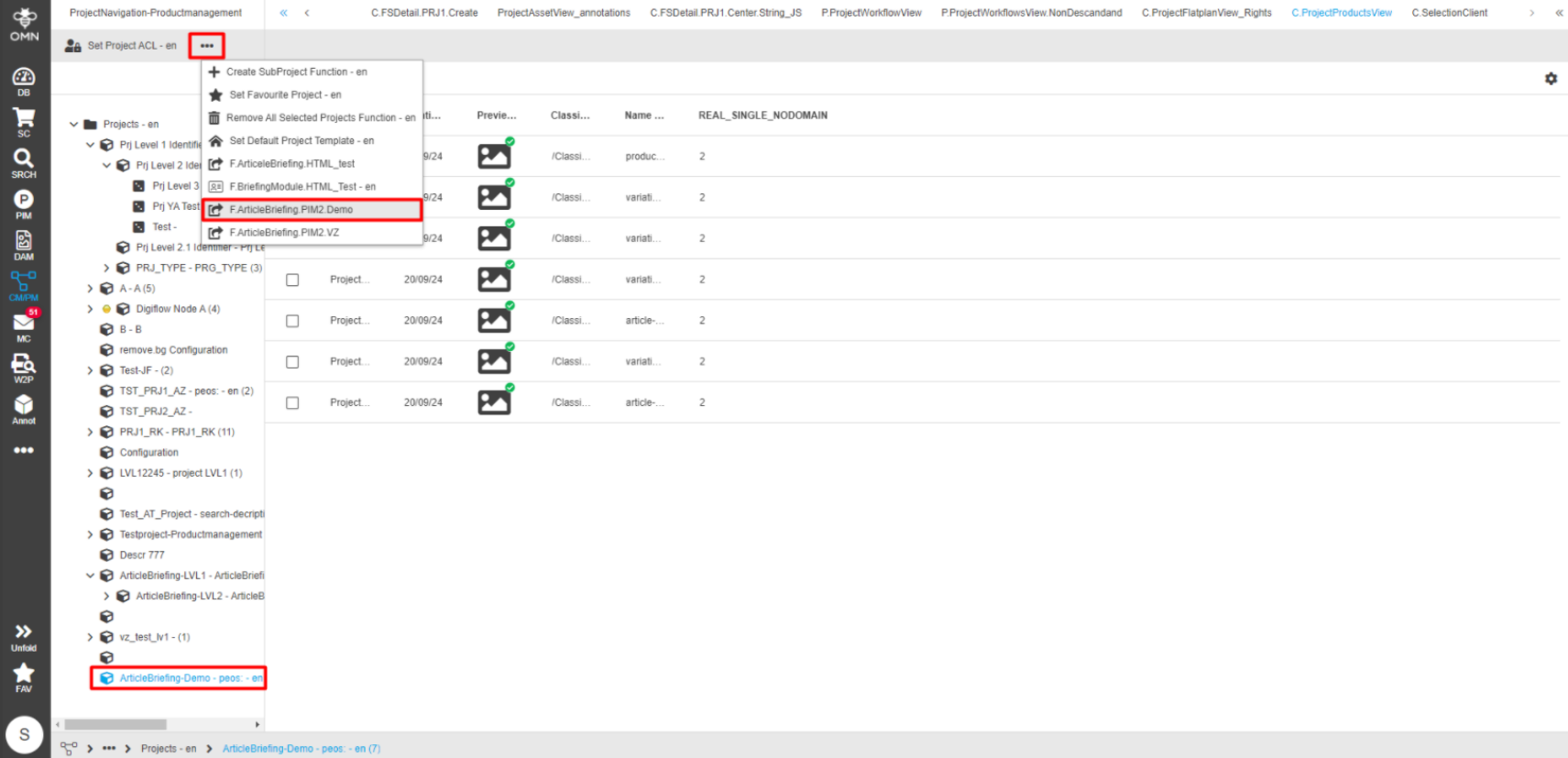
ProjectProductView
Expand CM/PM → ProjectNavigation
Select a required project from the left view. In the central view select a needed project product view content plugin so a list of products is displayed below. Select any product\product and click "Article Briefing" plugin button.
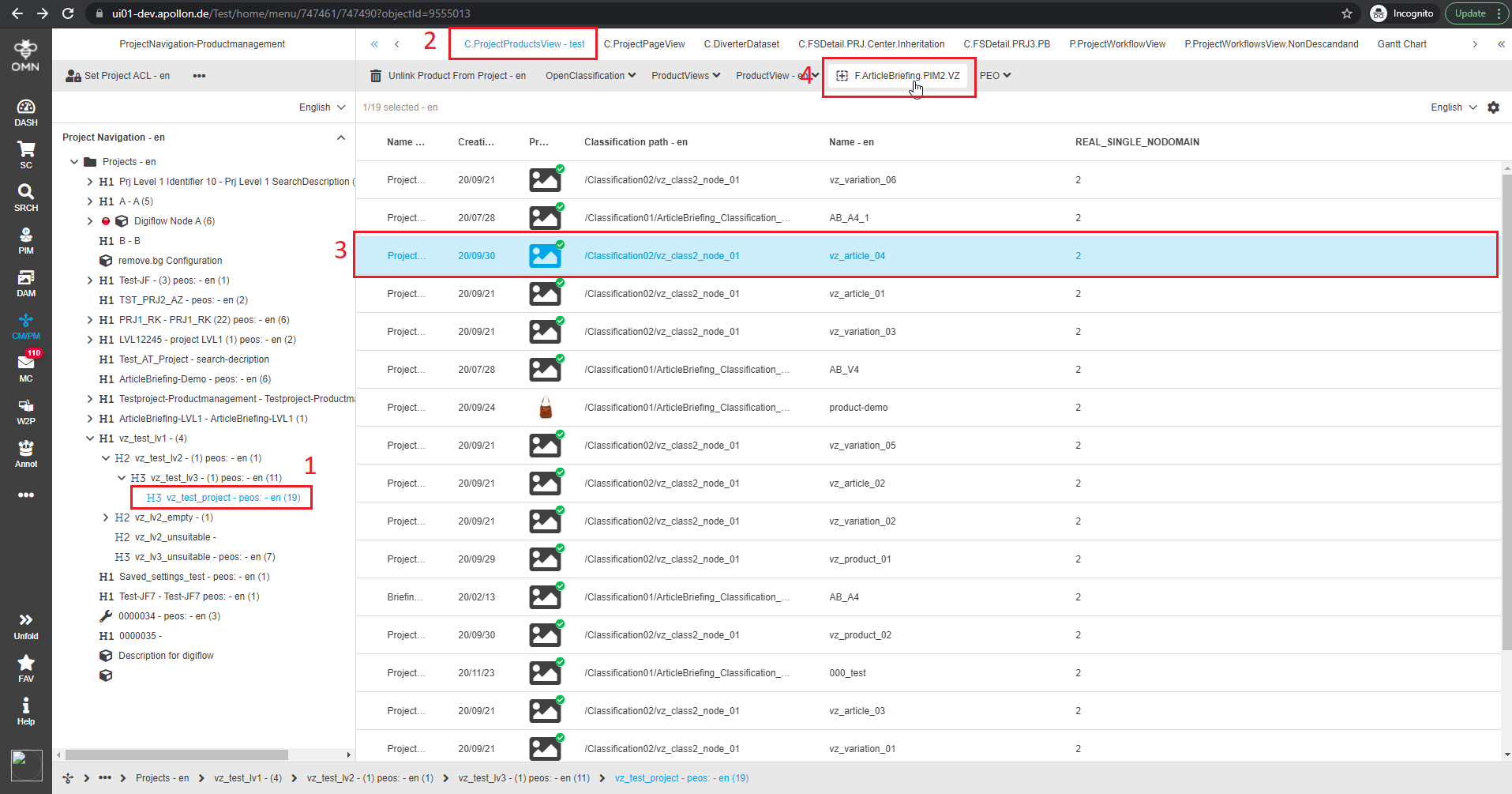
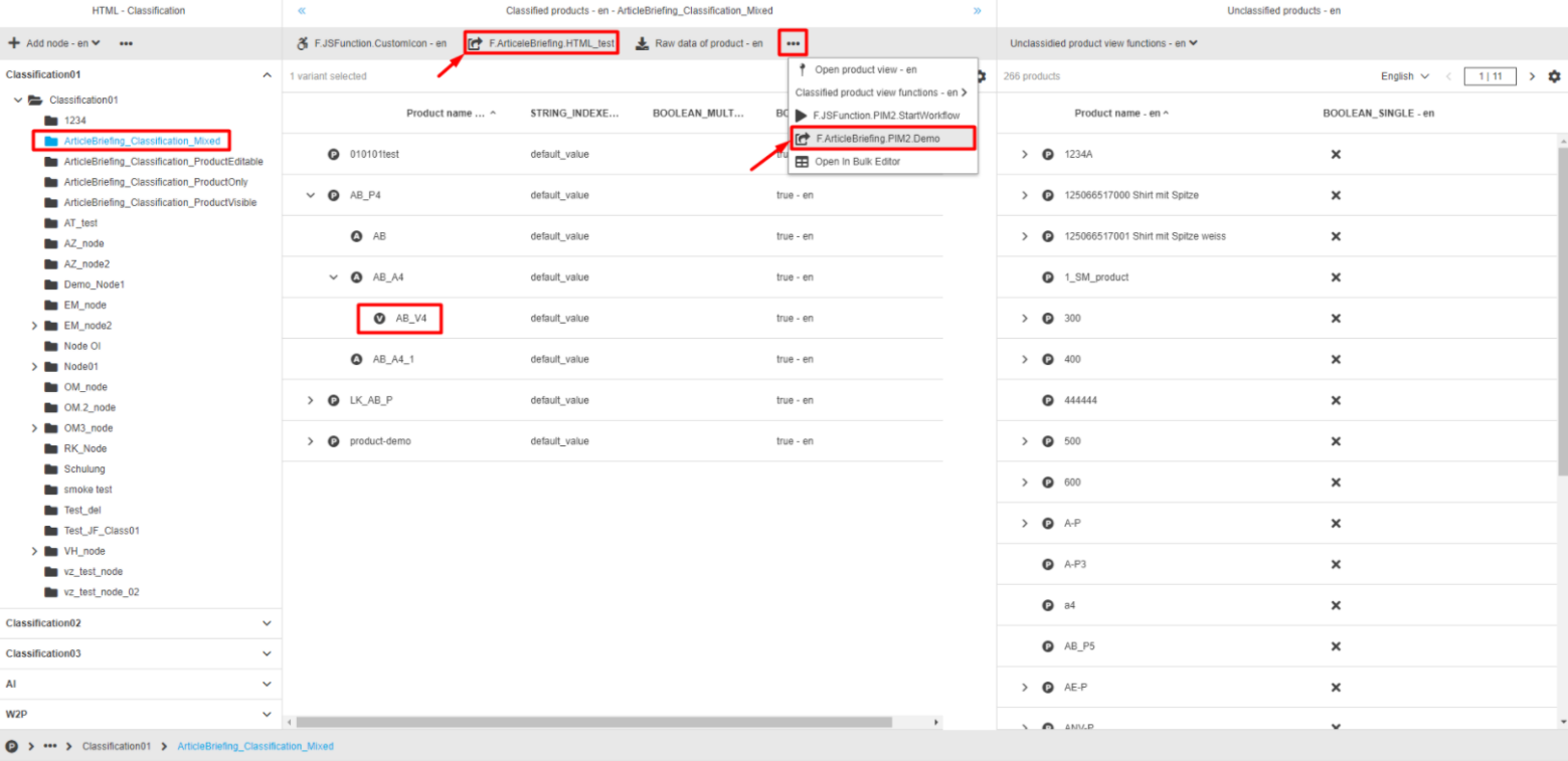
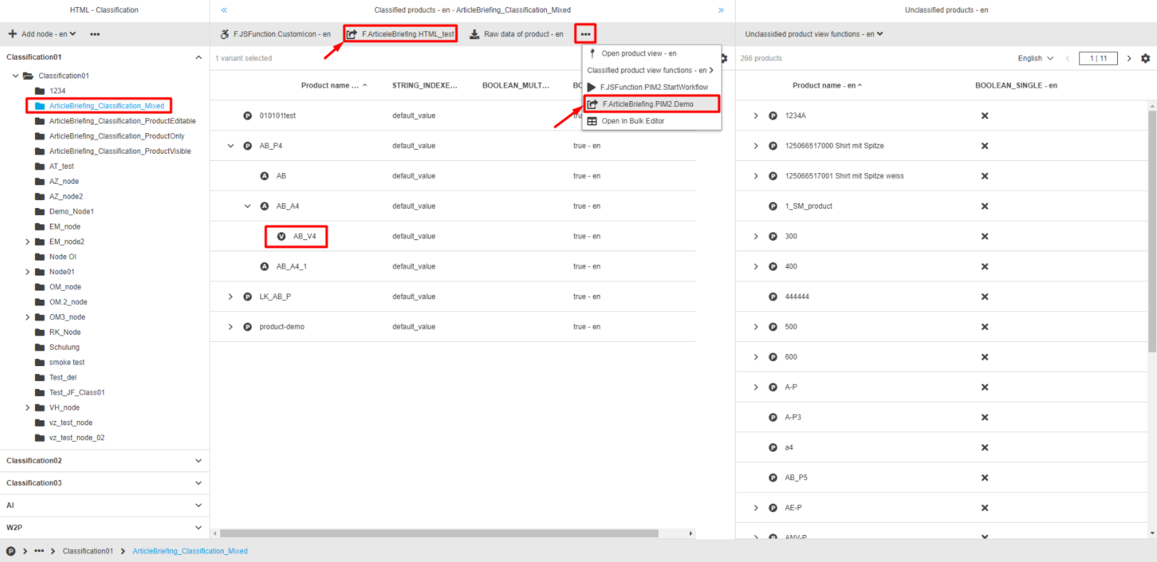
ClassificationView
Expand PIM → Classification
Choose the required Classification from the left view by expanding the tree and clicking on the Classification title.
In the central view expand and select the required product/article/variant.
Click on the "ArticleBriefing"-button in the toolbar of the central view.
Note that the "ArticleBriefing"-button can be behind the dotted menu icon or in context menu (dropdown).
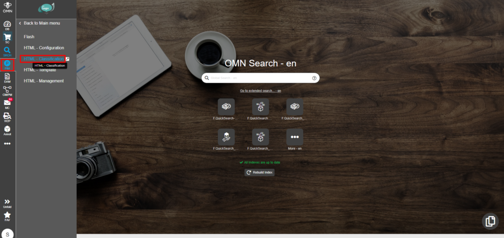
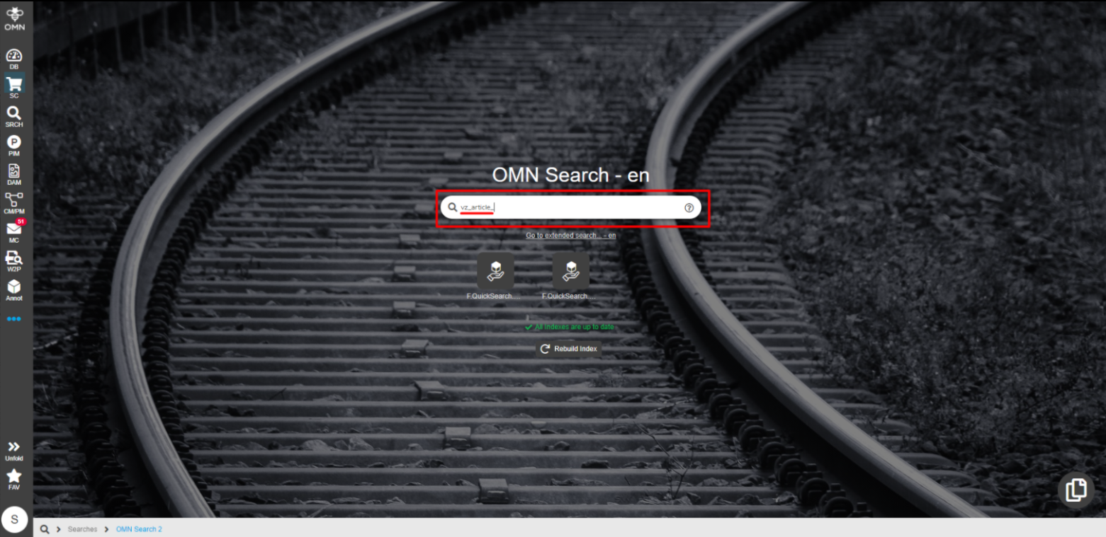
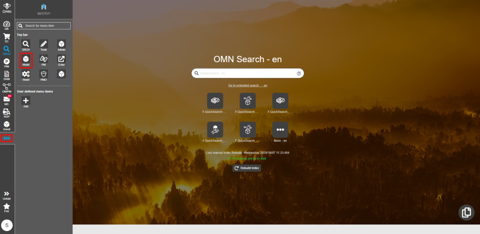
OMN Search
In the search bar of the home screen start typing the title of the object you are looking for. Choose the required option from the list that appears below or press enter when finished typing.
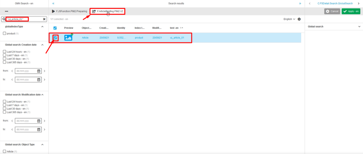
On the Search result page click on the checkbox of the required item and click on the "ArticleBriefing"-button in the top menu bar of the central view.
Note that the "ArticleBriefing"-button can be behind the dotted menu icon or in context menu (dropdown).
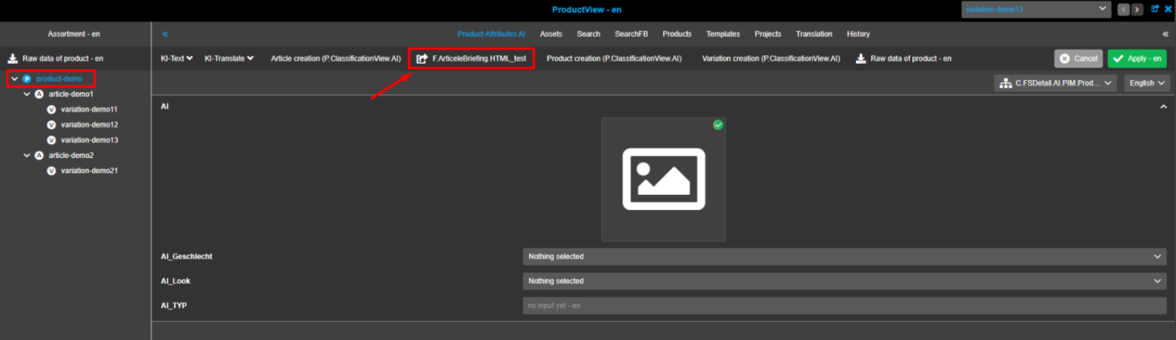
ProductView
Expand PIM → Classification
Choose the required Classification from the left view by expanding the tree and clicking on the Classification title. In the central view expand and select the required product. Click on the "ArticleBriefing"-button in the top menu bar of the central view. Note that the "ArticleBriefing"-button can be behind the dotted menu icon.
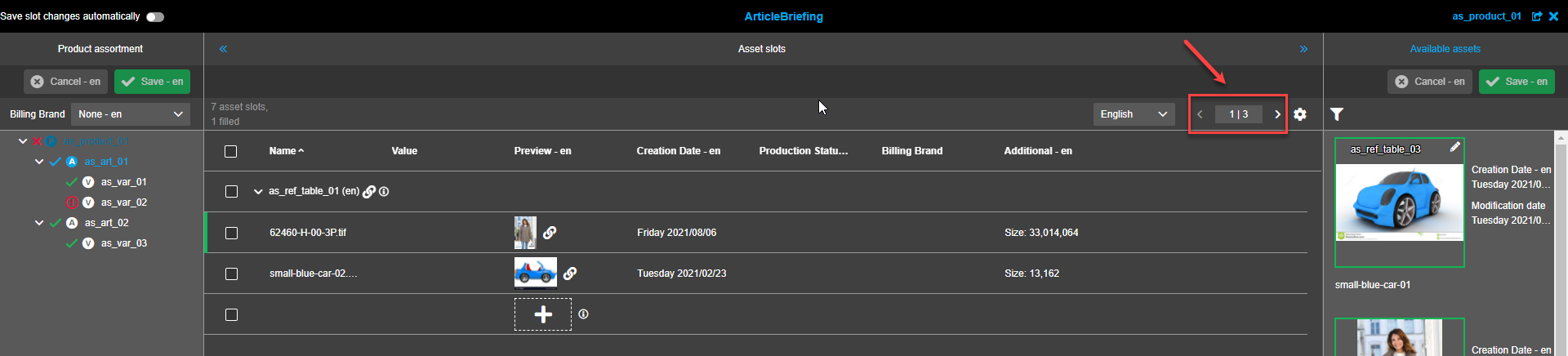
Working with ArticleBriefing
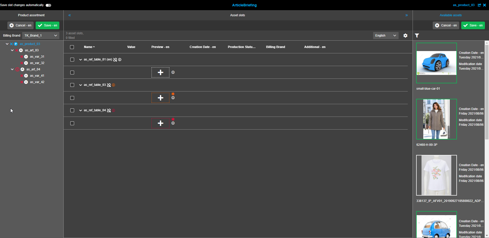
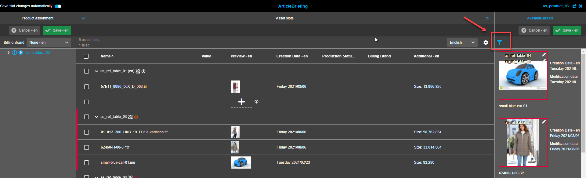
When ArticleBriefing has opened a user sees a header and 3 operational areas to work with:
-
Product assortment on the left
-
Asset slots in the center
-
Available assets on the right
Header
The header reflects the title of the plug-in for navigational convenience, product title, "Open in new browser tab"-icon (hint appears when hovered), and "Close"-icon.
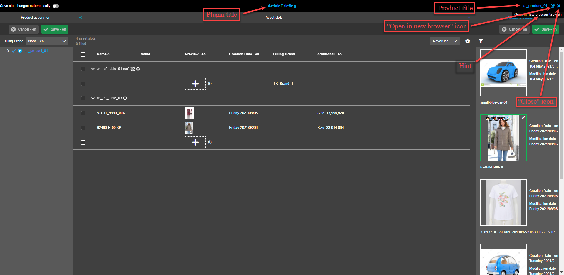
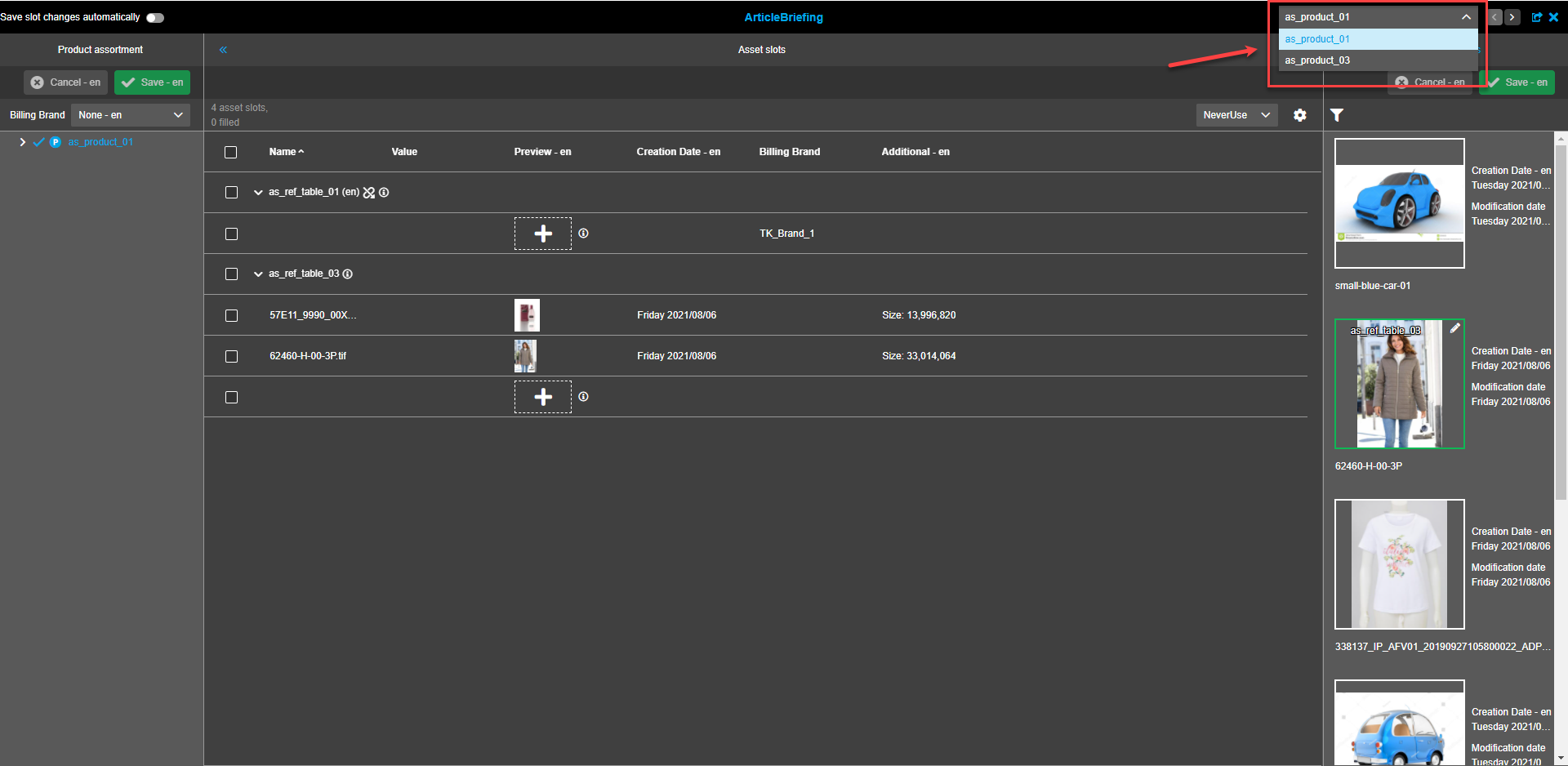
If more than one product is available for selection the Product title area has a dropdown menu to select the required product.
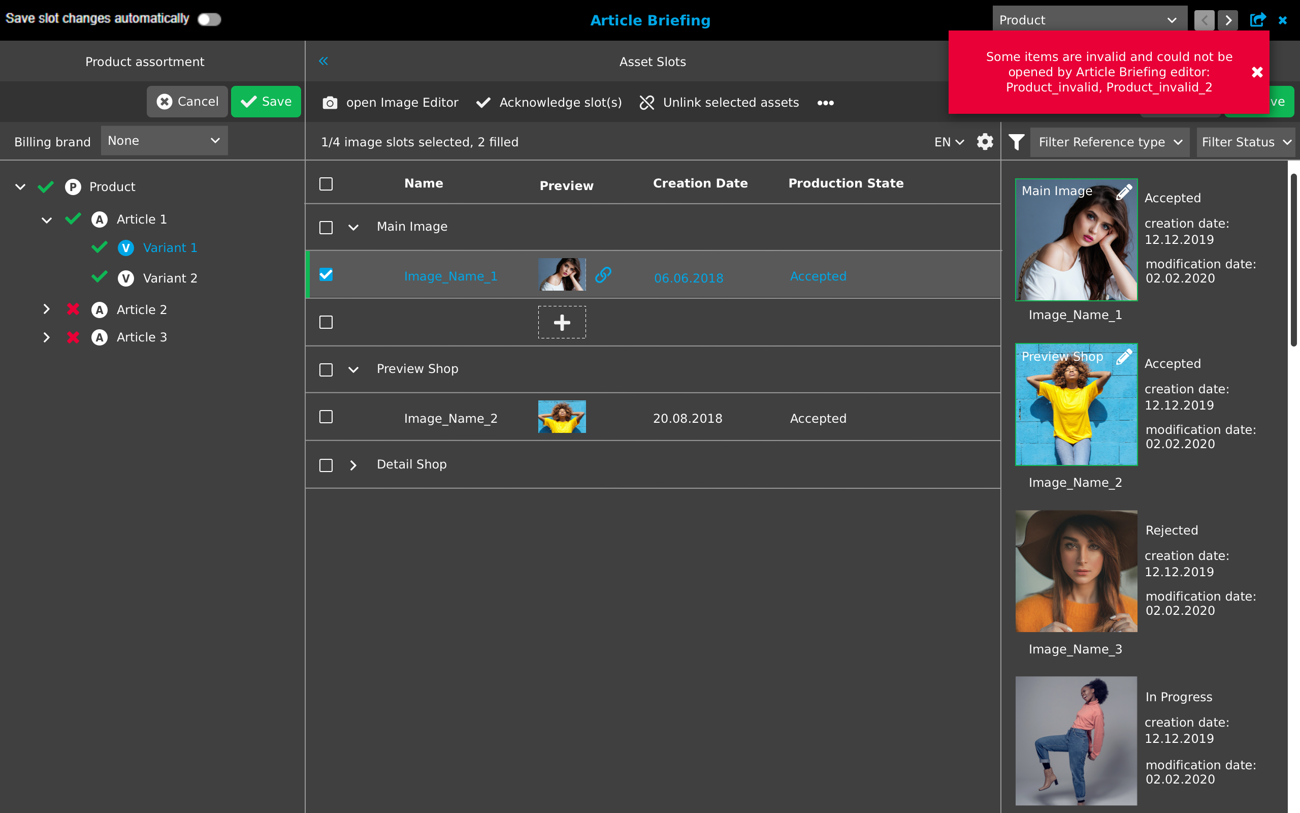
Product validation is performed and in case some products are not valid a red toast message stating "Some items are invalid and could not be opened by Article Briefing editor: (list of invalid items)" appears. Invalid products will not be on the list of the dropdown.
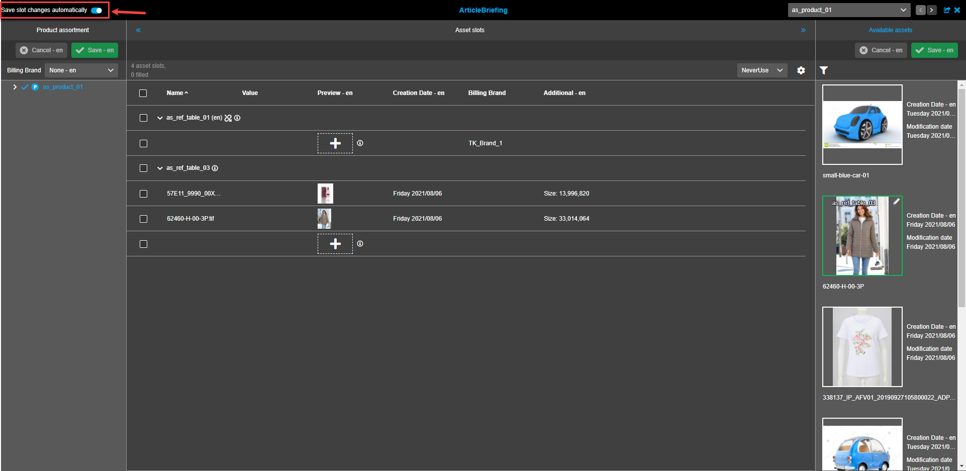
"Save slot changes automatically" toggle is placed on the left side of the header. By default the toggle is turned off.
-
If toggle is turned on, the operations with assets (DnD from right panel, external DnD, moving or copying from one central slot to another, unlink) will be saved automatically (Acknowledge, Unacknowledge and Unlink all references operations are not autosaved automatically) .
-
If toggle is turned off user should save changes manually.
Current toggle setting is saved to user settings and will be applied the next time the plugin is opened (page refresh).
Product assortment
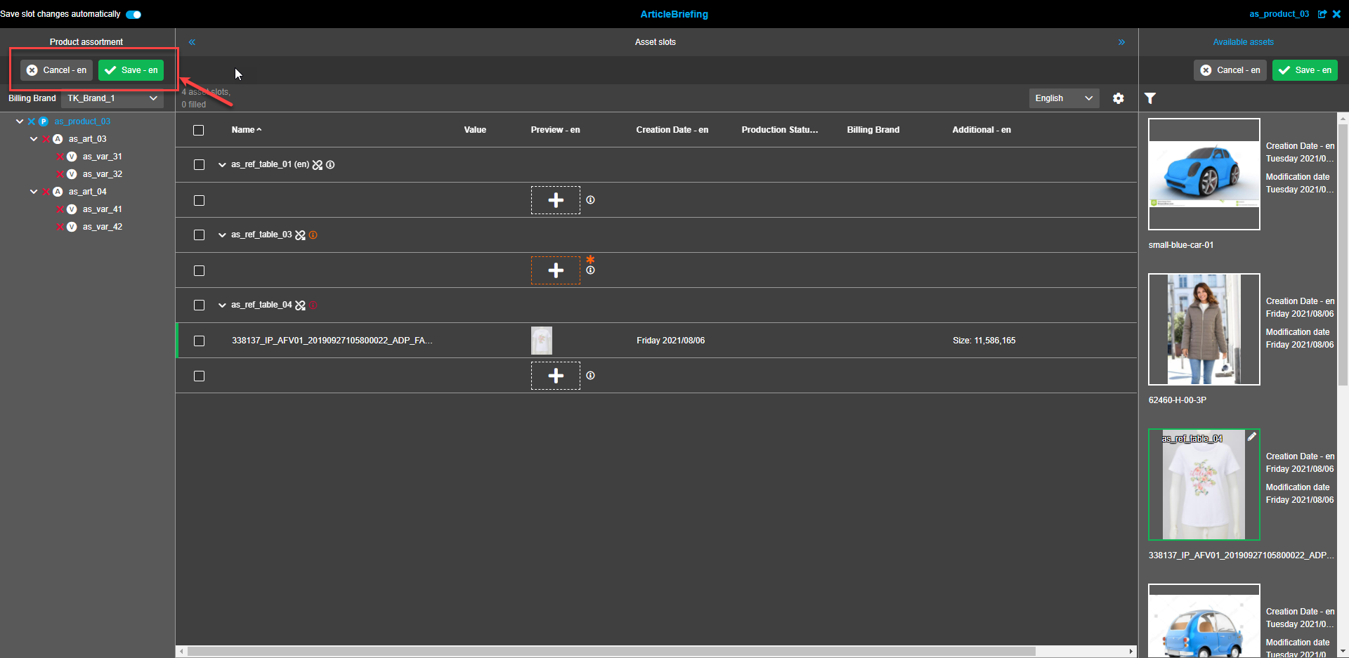
Save and Cancel made changes
-
"Save"-button.
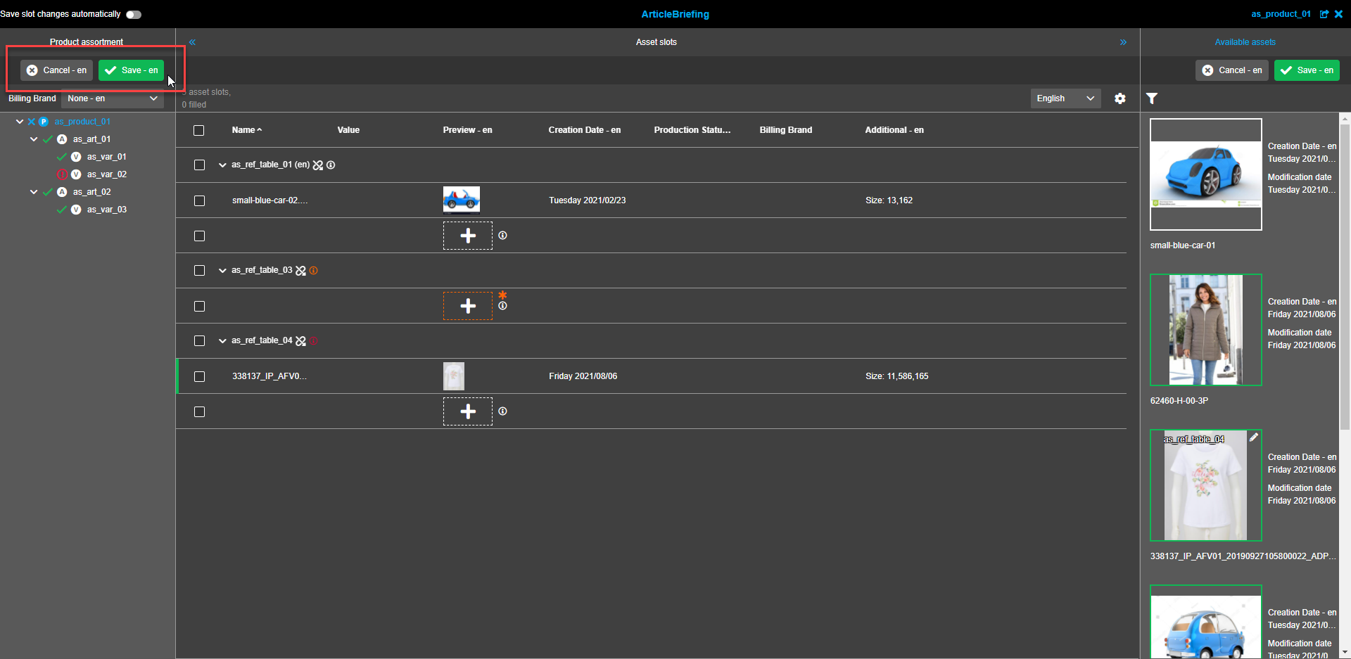
Changes made in the assortment are saved in the database following the "Save"-button click.
By default, the "Save"-button is deactivated and becomes active after changes (changes of products, image slots changes, adding/removing of image links) in ArticleBriefing are made.
If changes are saved successfully the green toast message appears in the right upper corner of the screen.

If changes fail to be saved a user sees a modal window.
Clicking on the "Discard"-button will discard all changes made in the current session of ArticleBriefing.
Clicking on the "Cancel"-button returns a user to the current ArticleBriefing session where all the changes made within the current session remain.

-
"Cancel"-button.
All changes made in the current session of ArticleBriefing are discarded and will be lost since the last time the assortment was saved successfully if the "Cancel"-button is clicked.
By default, the "Cancel"-button is deactivated and becomes active after changes (changes of products, image slots changes, adding/removing of image links) in ArticleBriefing are made.

Select the required setting for Billing Brand
"Billing brand" option can be configured in the back-end configuration ("Image conversion" tab).
-
If "Enable billing brands" is unchecked - "Billing brand" dropdown is not shown in the ArticleBriefing.
-
Values in the dropdown are determined by the back-end configuration settings for "Brand attribute".
-
If "Brand None by default" is checked - "None" is selected by default in the "Billing Brand" drop-down list.
To activate certain billing brand open the dropdown list and select the required option.
If "None" is selected Billing Brand is not activated and no brand will be billed.

If "Billing brand" options window is blank the red toast is shown when Article briefing opening.
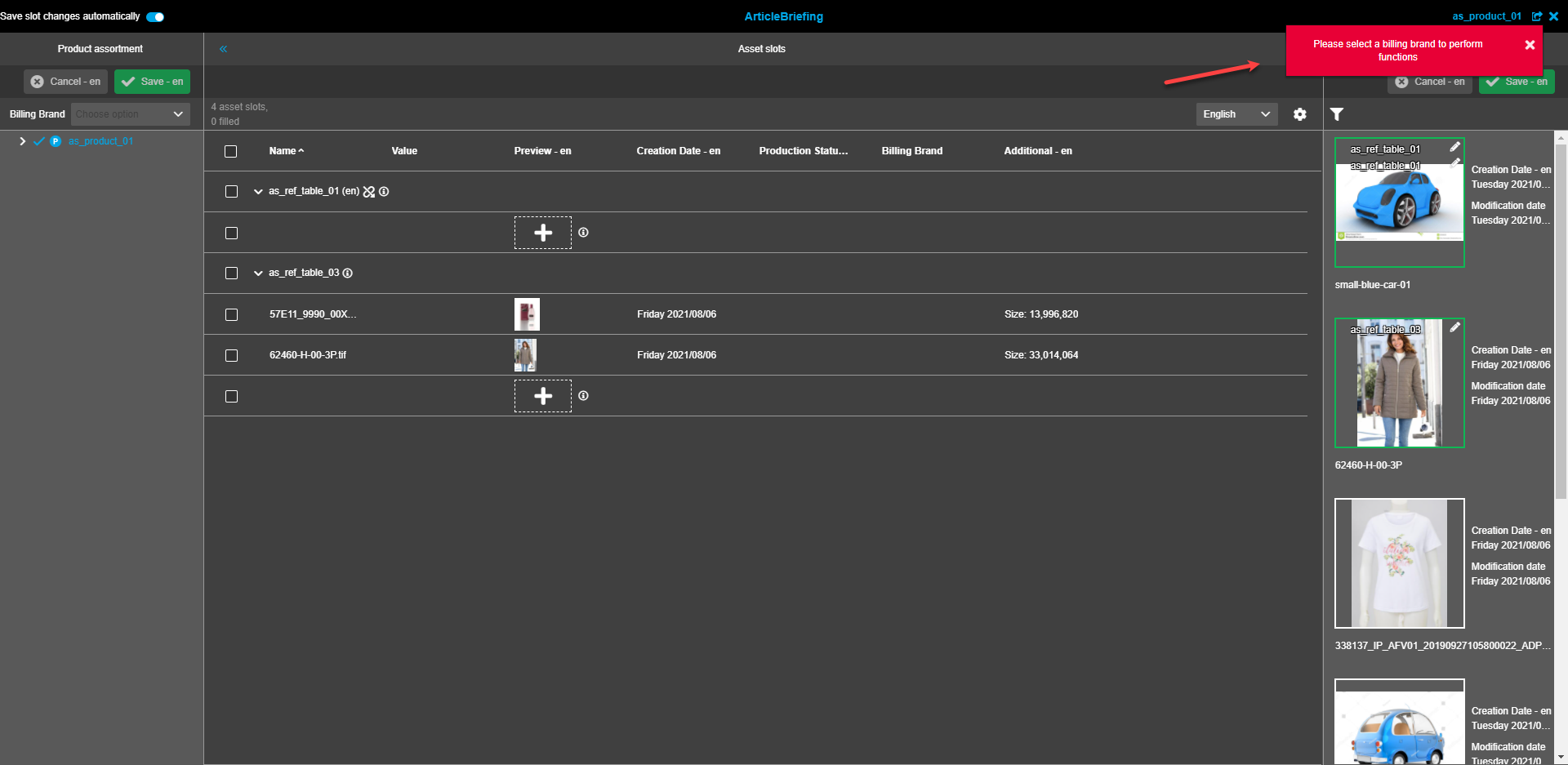
User will not be able to make changes in the ArticleBriefing editor. A red toast message will appear after every attempt to make changes.

If a user tries to save changes with the "None" setting for "Billing Brand" a popup will appear. If "None" is the required setting click the "Confirm"-button. If another "Billing Brand" setting is required click the "Cancel"-button and make changes in the "Billing Brand" settings.

Refresh Product Assortment
Refresh Product assortment in the navigation bar by clicking on the "Product assortment"-button that appears when hovered over.
Clicking on refresh button will refresh the whole page. (left, center and right views).

Expand/collapse assortment tree
To select required Products/Articles/Variants from the assortment tree click the "Expand" icons to reach the required depth.
To navigate to certain product level the user clicks on the name of the item → the whole content will be shown in the central view.

Item Status in assortment tree
Each item in assortment tree has its own status.
-
If an article of the assortment has satisfied linked assets constraints, it is marked with a green check icon (Means that the article is filled in accordance with its image role definition).
-
If an article of the assortment has unsatisfied linked assets constraints because of the constraints violation by reference types, it is marked with a red "X"-icon (Means that the article is NOT filled in accordance with its image role definition and there are required and mandatory asset slots left to link assets to).

-
If the cardinality setting is exceeded for a reference, a red icon with an exclamation mark appears. Read more about Cardinality

When a user hovers over the icons a hint message appears.
Quick filtering
The red icons (empty mandatory slots, exceeded slots) are clickable and work as filters for the central view:
-
if the user clicks on "exceeded slots" icon ("!" icon) - exceeded slots will be shown in the central view (filtered list). The column filter in column "Preview" is as well automatically set as "Cardinality exceeded".

-
if the user clicks on "empty mandatory slots" icon ("X" icon) - empty mandatory slots will be shown in the central view (filtered list). The column filter in column "Preview" is as well automatically set as "Mandatory slots" - "slots empty".

Already set filter in the center (e.g. by "Name" column) will be reset if the user clicks on icon filter in the left panel.
The quick filter can be reset:
-
by repeated click on the icon in the left panel
-
by deactivating the column filter in the central view
-
by switching to another product in the multiselect dropdown in the titlebar
To use quick filters the following preconditions should be met before:
-
the column 'Preview' is visible (activated in status bar settings)
-
the table is grouped by 'Reference Type'.
If at least one precondition is not met, the filter will lead to no result in the central view, an additional confirmation modal is shown right after clicking on the quick filter (!, X).
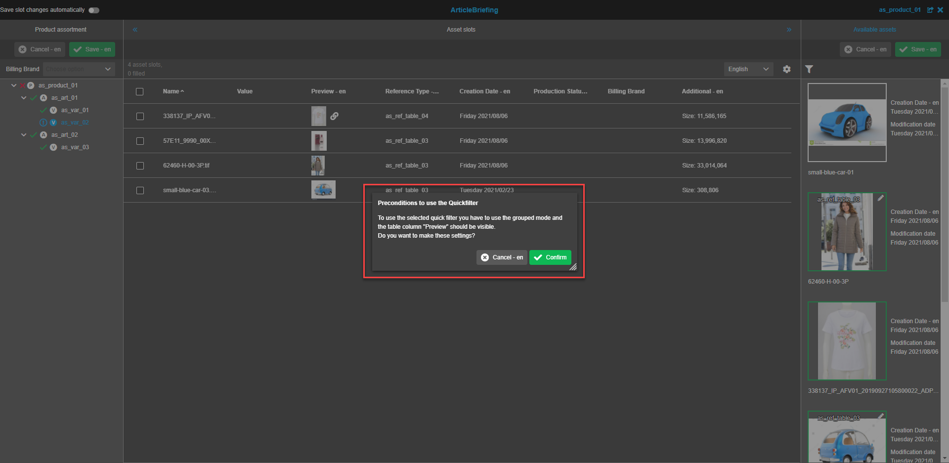
"Confirm" button
Precondition settings are applied to the table, selected filter is applied and visualized in the left and central view.
"Cancel" button
The settings are not applied to the table, the filter is not applied.


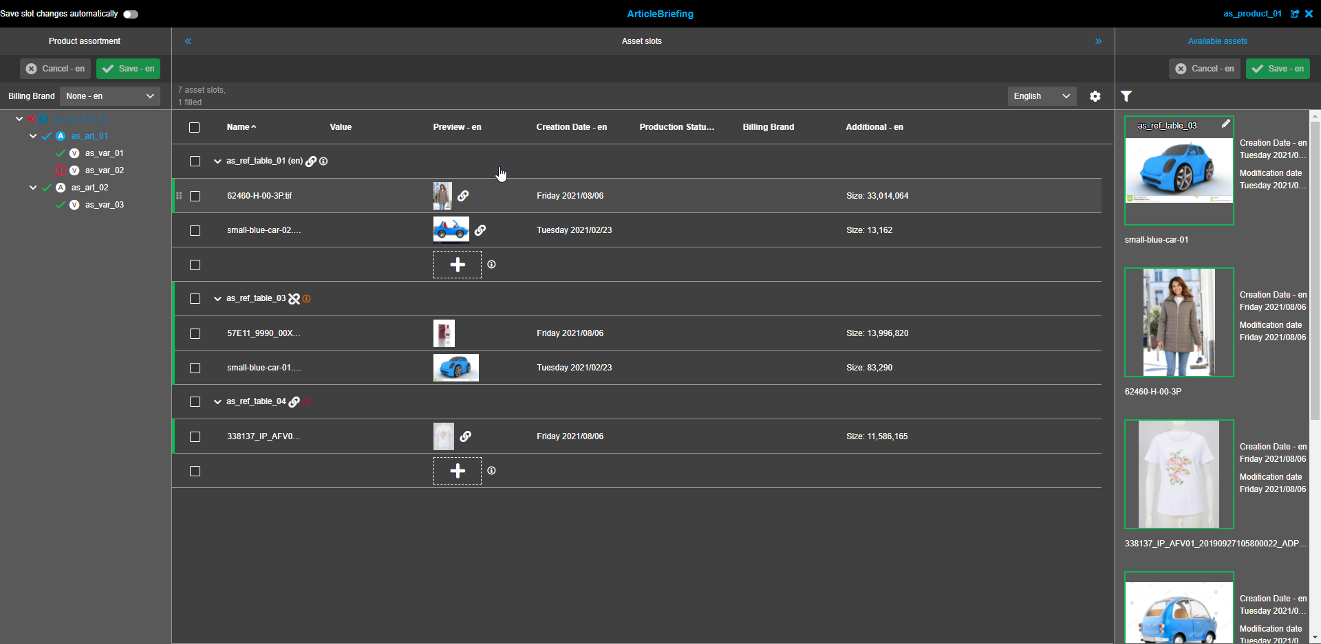
Asset slots (central view)
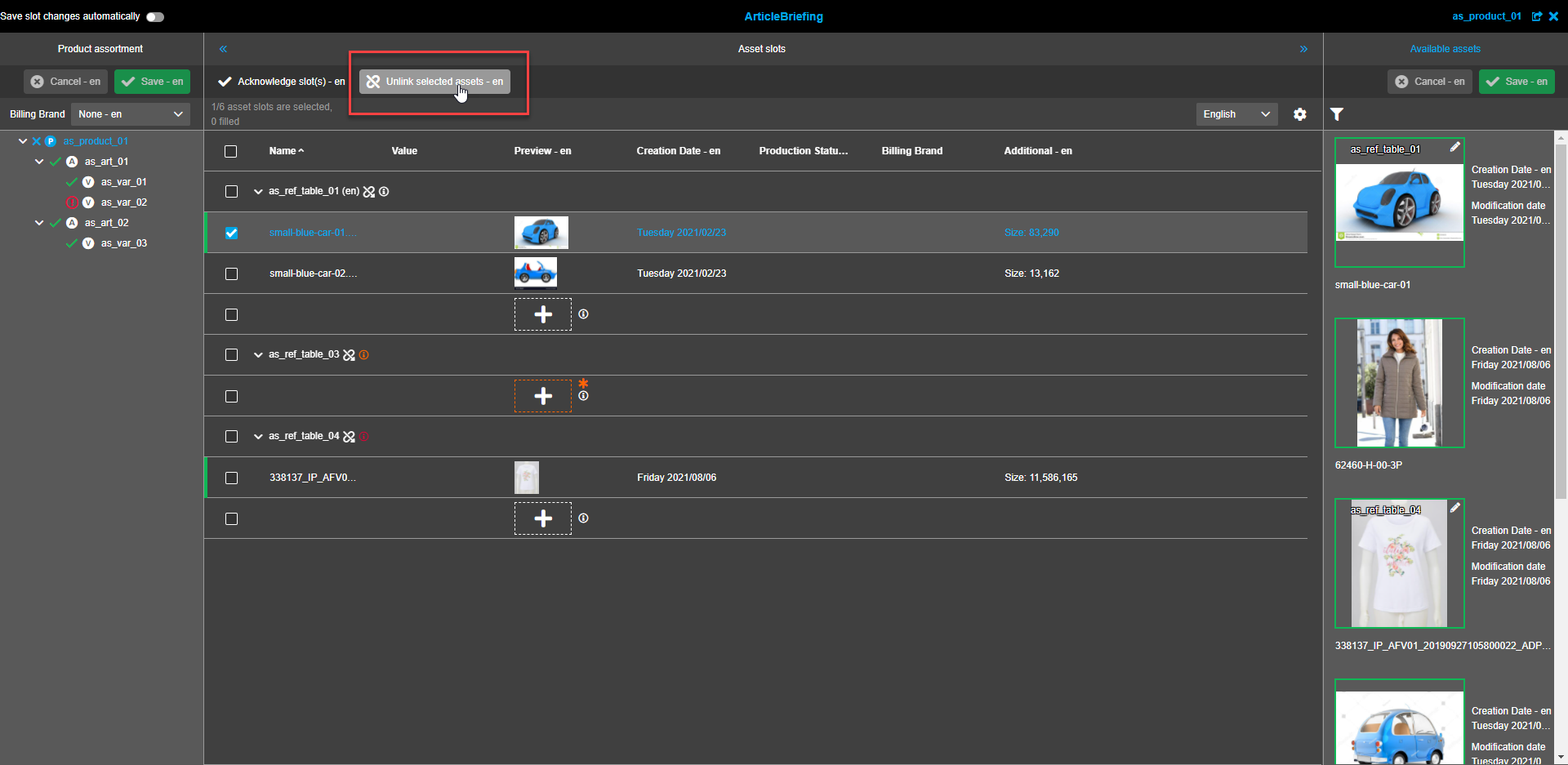
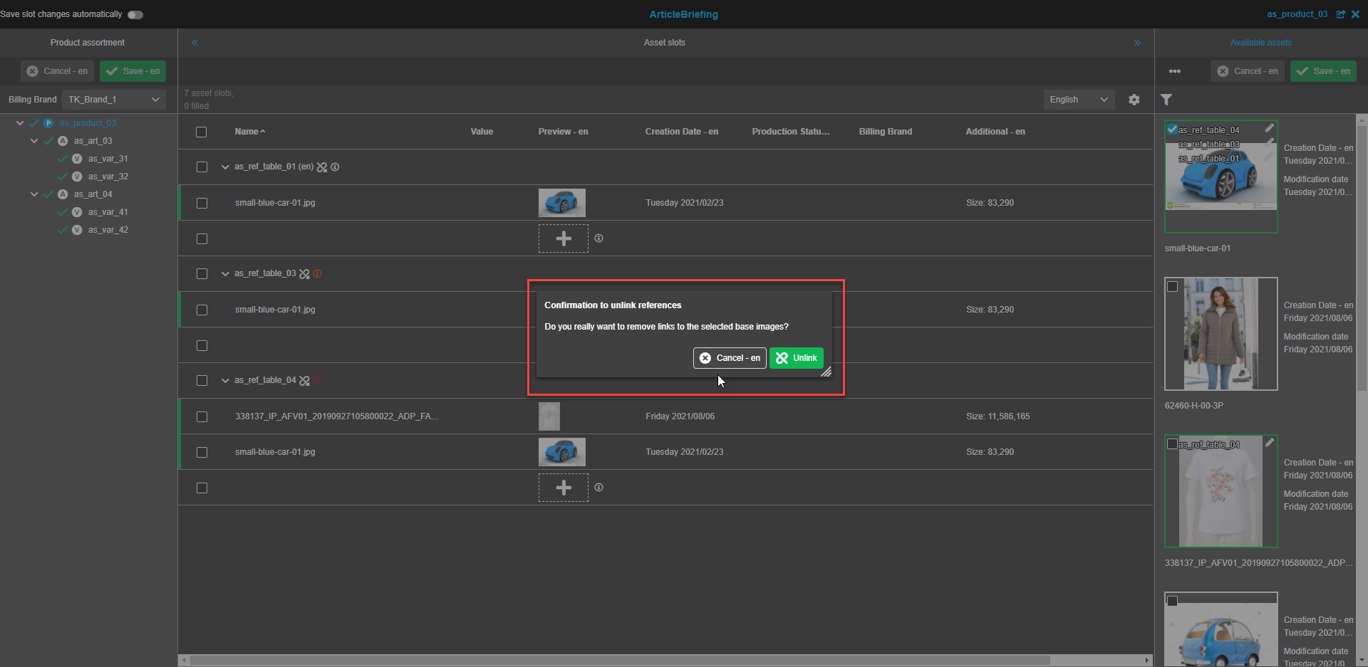
Unlink selected assets
To unlink assets choose the images to be removed by clicking on the image itself or clicking on the checkbox.
"Unlink selected assets" button appears in the toolbar on the top of the Asset Slots central view.
Several assets can be selected for removal. When all the required assets are selected click on the "Unlink selected assets"-button.
In the confirmation modal window press the "Unlink"-button to remove the selected assets.
Press the "Cancel"-button if assets should not be unlinked.
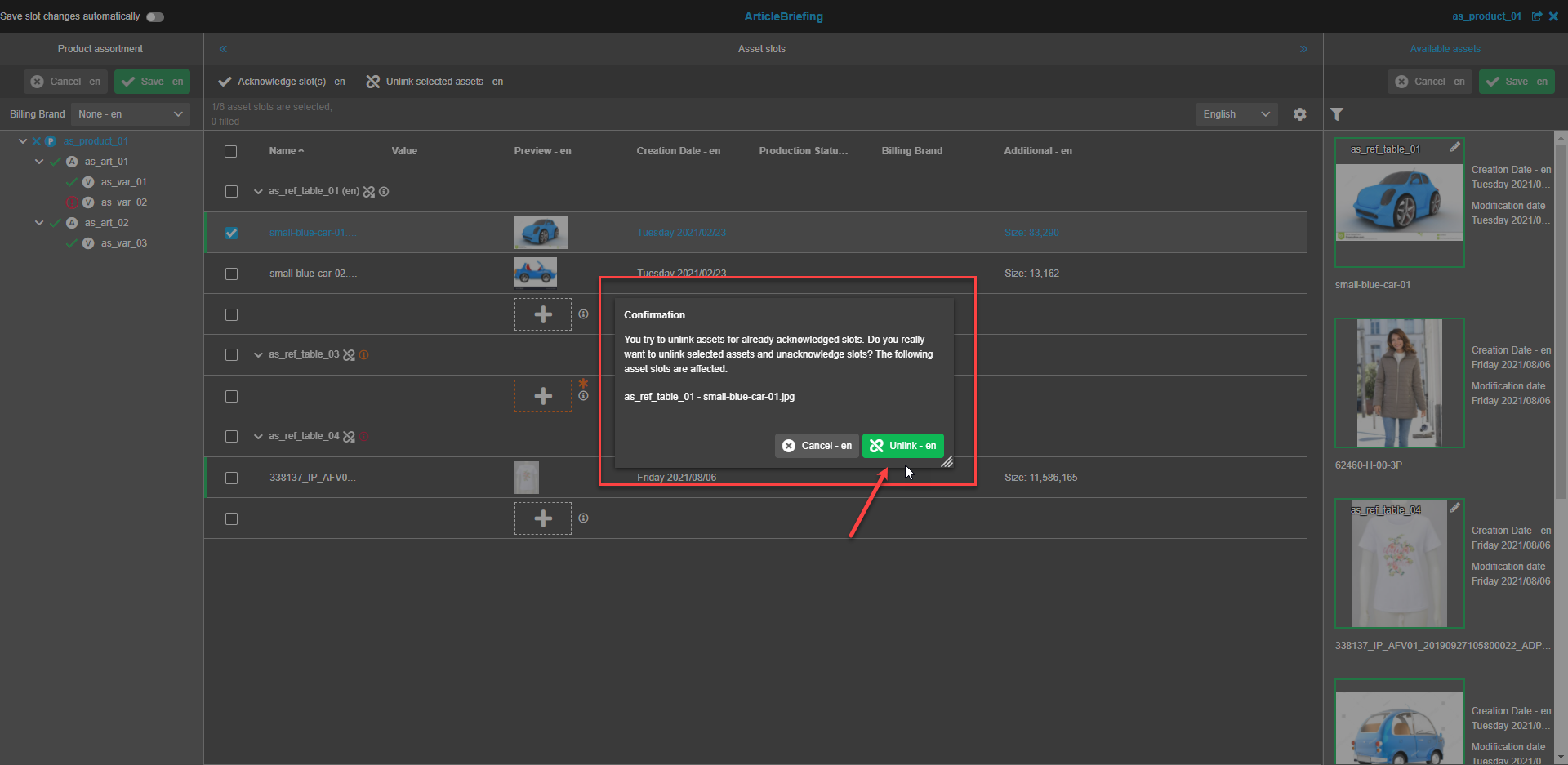
The unlinked asset is not shown on the list anymore. To save the changes press the "Save"-button in the left view.
Acknowledge slots
When the work with slots is finished and it is ready, the slots should be acknowledged.
Select one or several slots to be acknowledged and press the "Acknowledge slot(s)"-button in the toolbar on the top of the Asset Slots central view. The "Acknowledge slot(s)"-button becomes available if at least one slot with a linked asset is selected. If the table is grouped by "Reference type" slots belonging to the whole reference type can be selected at once by selecting the reference type slot.
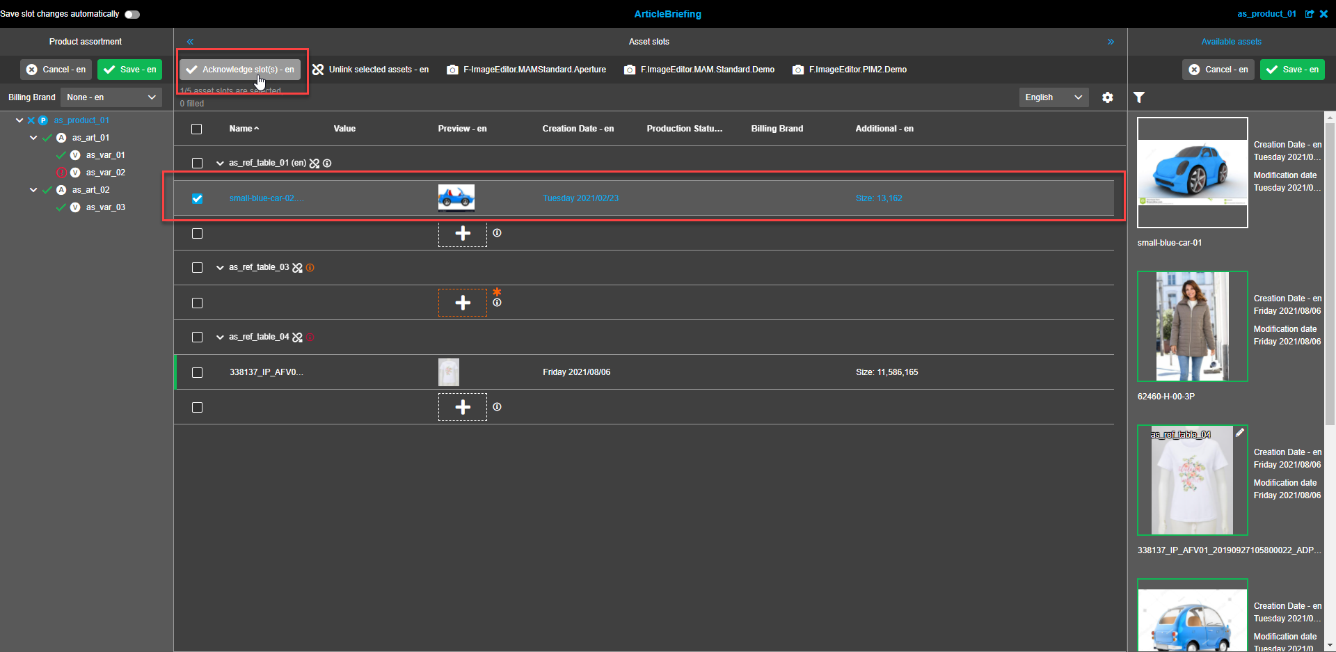
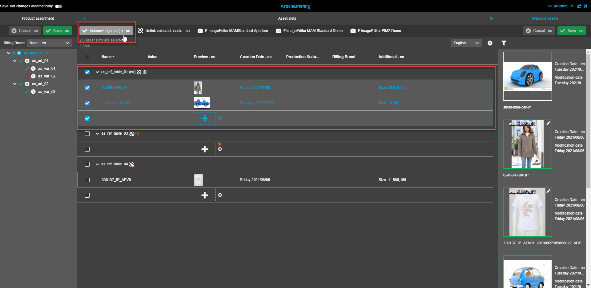
Following acknowledgment, a slot is visualized with a vertical green bar at the beginning of the row of the acknowledged slot. The green bar will extend to the group header and all child elements if all child elements are acknowledged and the reference type is full-filled in accordance with cardinality.

Acknowledged slots can be unacknowledged if it was configured on backend.
Steps are identical to acknowledgment. The vertical green bar disappears after unacknowledgement.
| The button 'Acknowledge slot(s)' is present only if "Enable image conversion" is enabled / ImageEditor is configured. |
| When the backend option 'Automatic acknowledge for newly linked slots' is activated (in addition to "Enable image conversion"), automatic acknowledge is done after the image is linked to the slot. |
| If "Enable image conversion" is disabled, each slot is automatically acknowledged (in this case there is no need to highlight the slot as acknowledged) |
| "Acknowledge slot(s)" operation should be saved by user manually (even if "Save slots changes automatically" is activated) |
Status bar
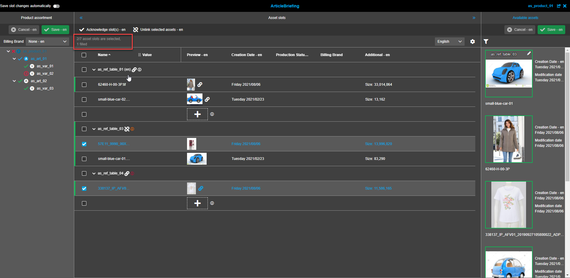
Statusbar contains information about the number of asset slots available/selected and the number of filled slots. If no slots are selected the total number of slots and the number of filled slots is shown. If one or more slots are selected the status bar shows the number of selected slots of the total number and the number of filled slots.
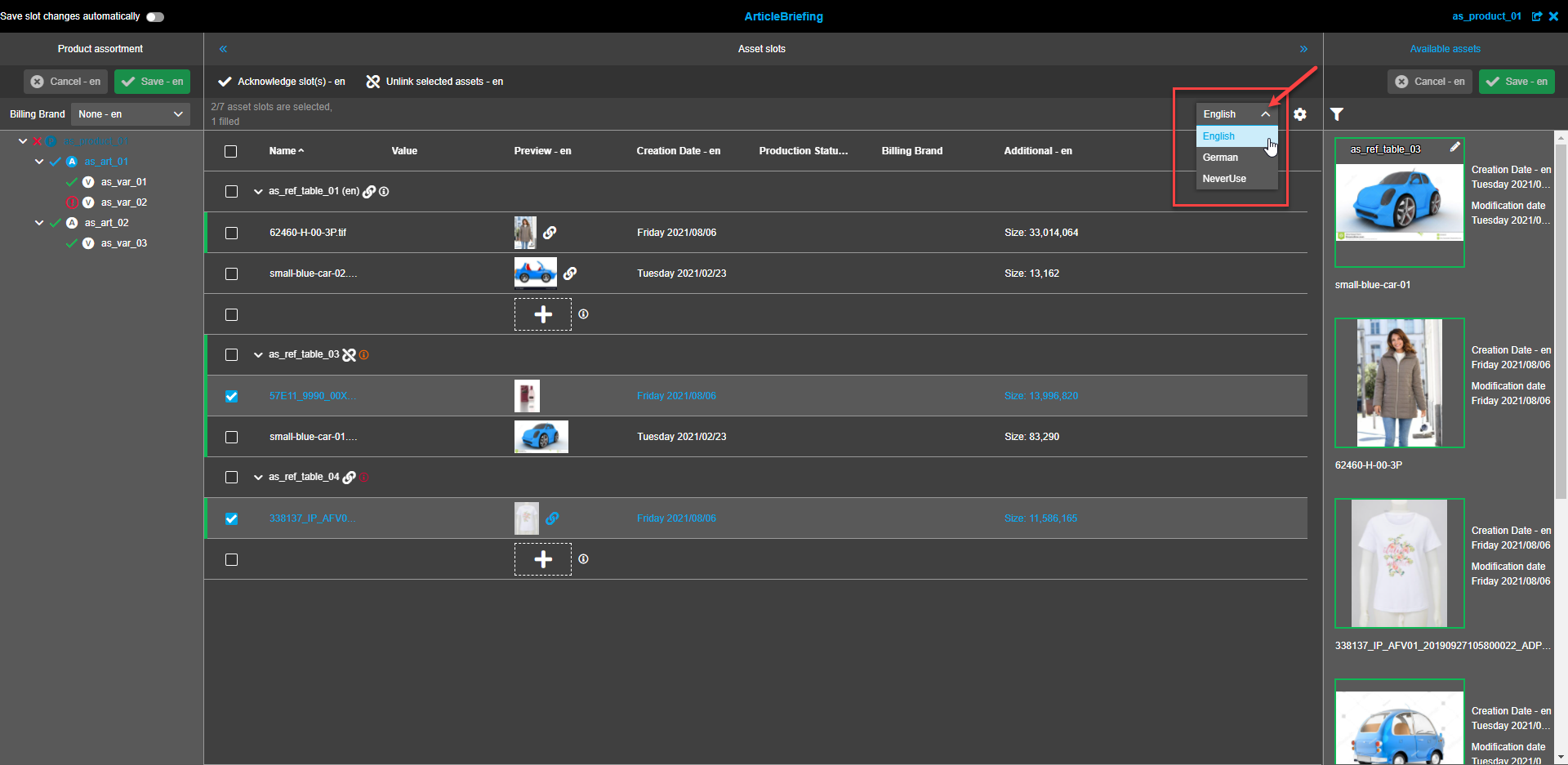
Language selector
Selected language depends on user settings. To change the language expand the dropdown list and select the required language.
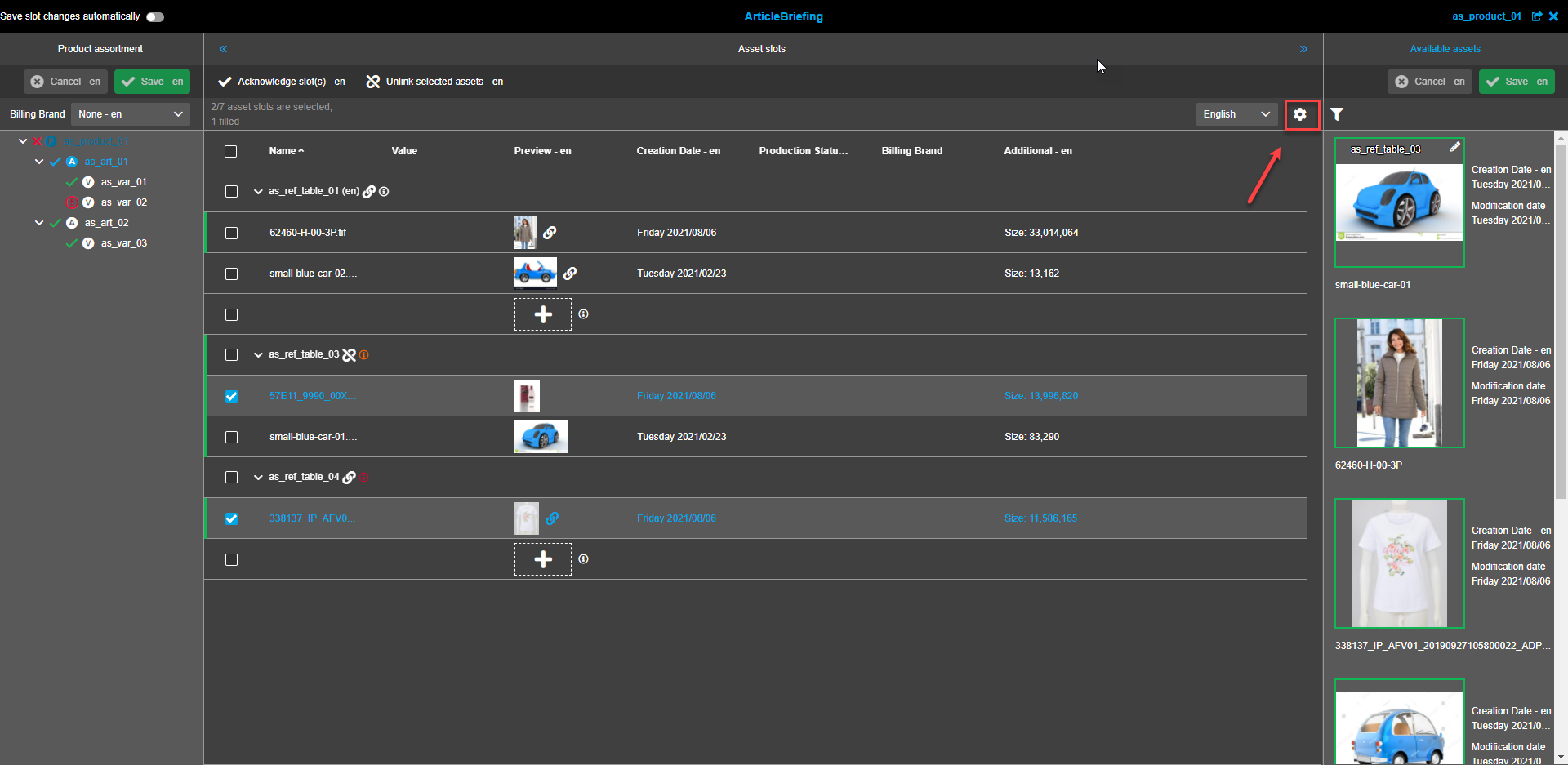
View settings
To set the required view click on the "Gear"-icon.
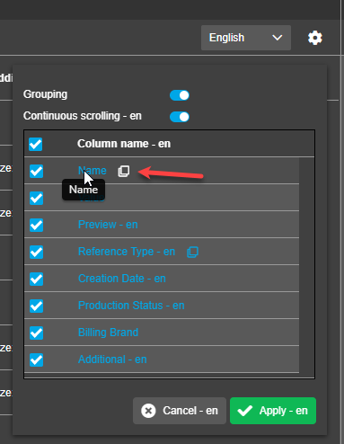
Grouping
Grouping is enabled by default. To switch it off click on the toggle.
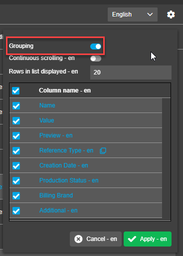
By default Grouping is set by the "Reference type" column.
To change grouping column user should hover the mouse on an appropriate column name and click on the grouping icon appeared after the name.
"Reference type" is, in general, a column in slots area, but in case this column is a criterion for grouping the table header is not present, the content of this column is present at the beginning of table row, each Reference Type with the same values builds a logical group with corresponding child elements inside, and child elements are sorted by the index of the reference table.
A group is also visualized inside a table with an arrow, which can be expanded and collapsed (child elements can be shown or hidden). Сardinality info is shown.
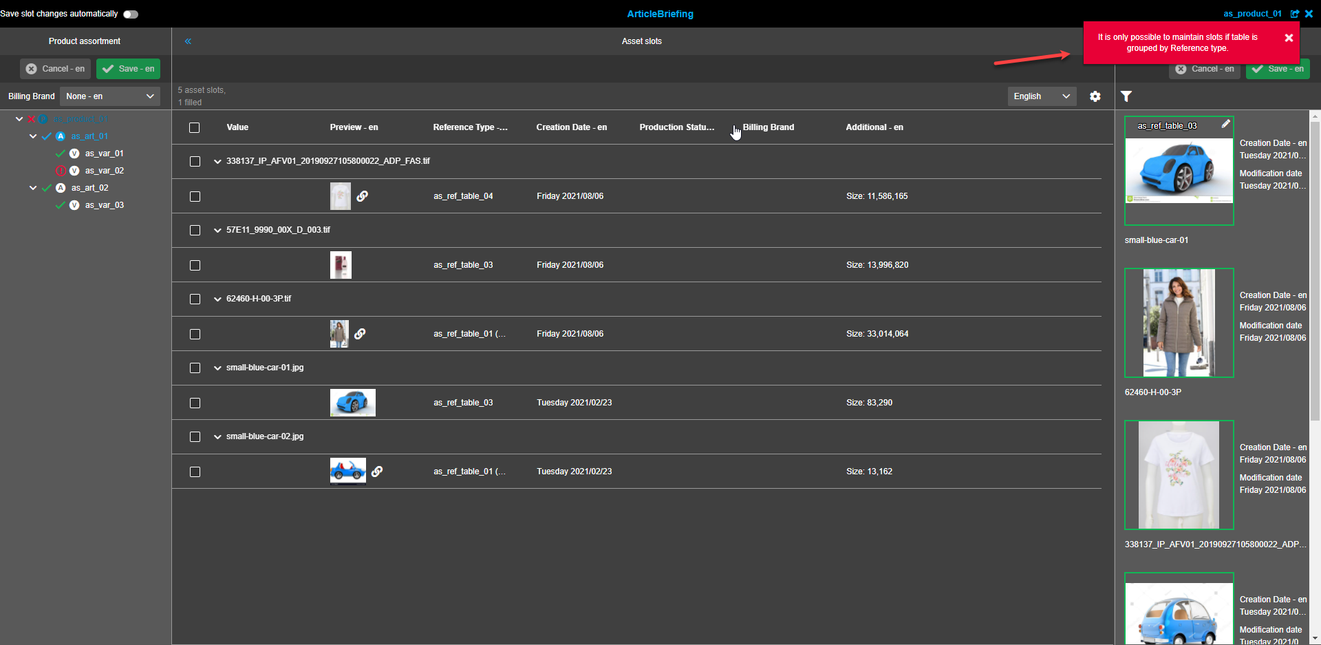
It is not possible to group table by column "Preview", all other columns can be grouped (static columns as well as dynamic columns).
If grouped differently differences in column behavior will include:
-
Cardinality info is not shown.
-
It is not possible to drop "available assets" inside slots, the table is not visualized as a possible dropzone and it is only possible to drag "available assets" into another browser tab. A red toast message stating "It is only possible to maintain slots if table is grouped by Reference type" will appear following an attempt to drag and drop assets within the table.
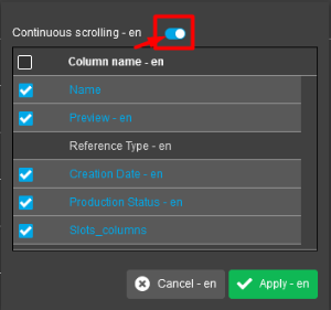
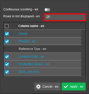
Continuous scrolling
Continuous scrolling or list view is available. Pagination is set by default. The default setting for rows on a page is 25. To change the default value for pagination type in the required number of slots to be displayed on one page into the corresponding textfield. To change to continuous scrolling mode click on the corresponding toggle.
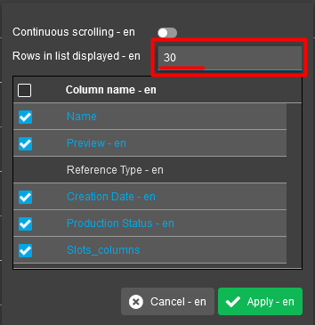
When the Pagination mode is enabled, a user can navigate through the pages using the left and right arrows or entering a necessary page number to the pagination panel near the "Gear" icon.
Pagination always counts first level:
-
when no grouping is active - amount of asset slots
-
when grouping active - amount of grouped elements
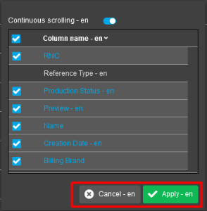
Columns
Columns can be displayed or hidden. All avalable columns are displayed by default. To hide a column, uncheck the checkbox. At least one column should be selected otherwise the user gets a warning message.
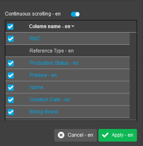
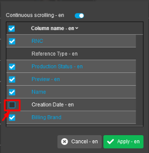
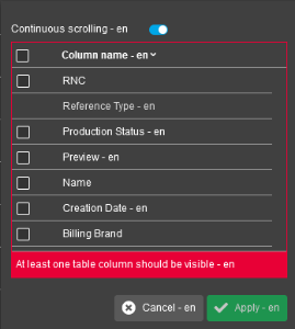
Click the "Apply"-button to apply changes or the "Cancel"-button to discard changes and close the column settings modal.
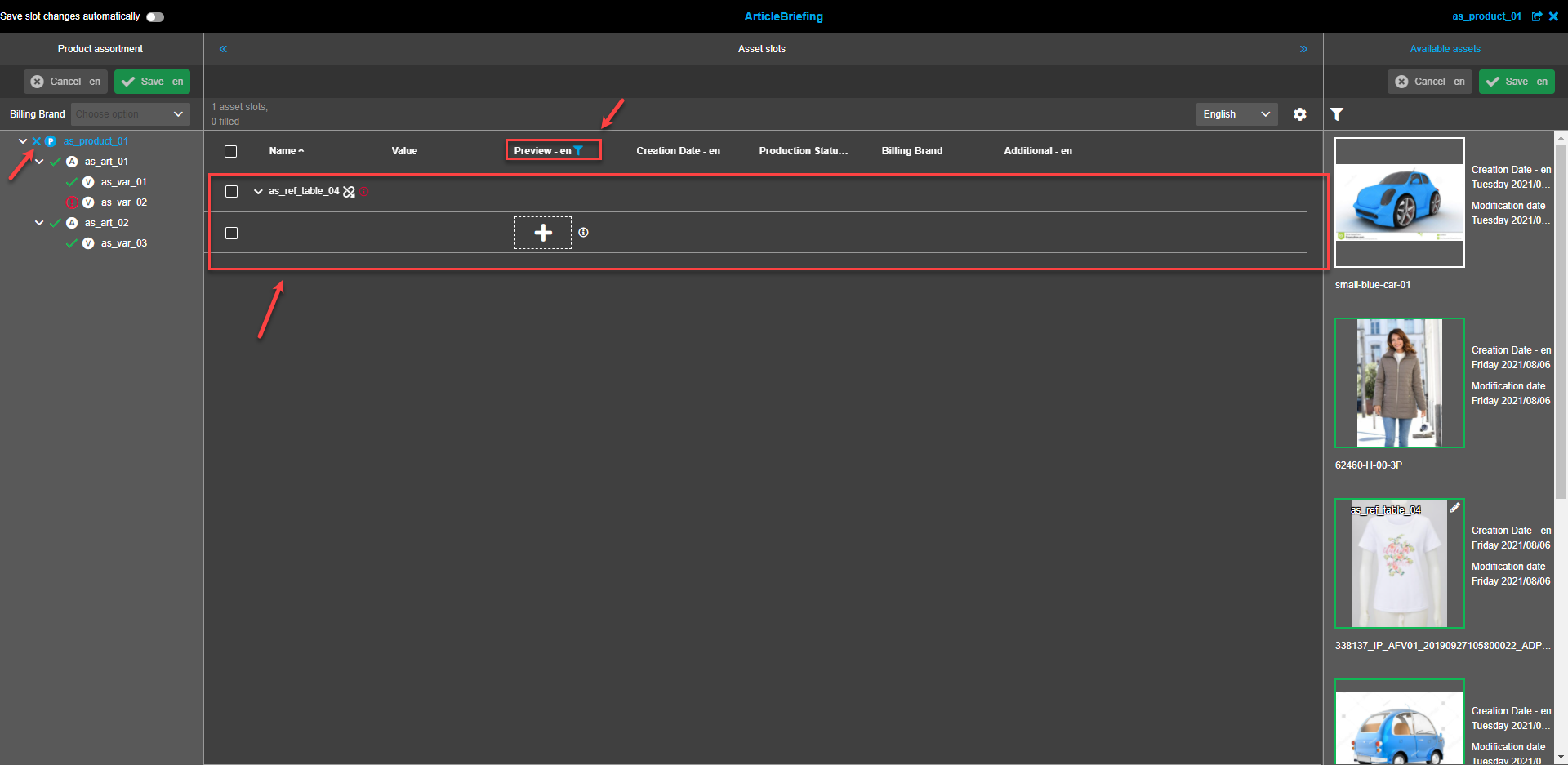
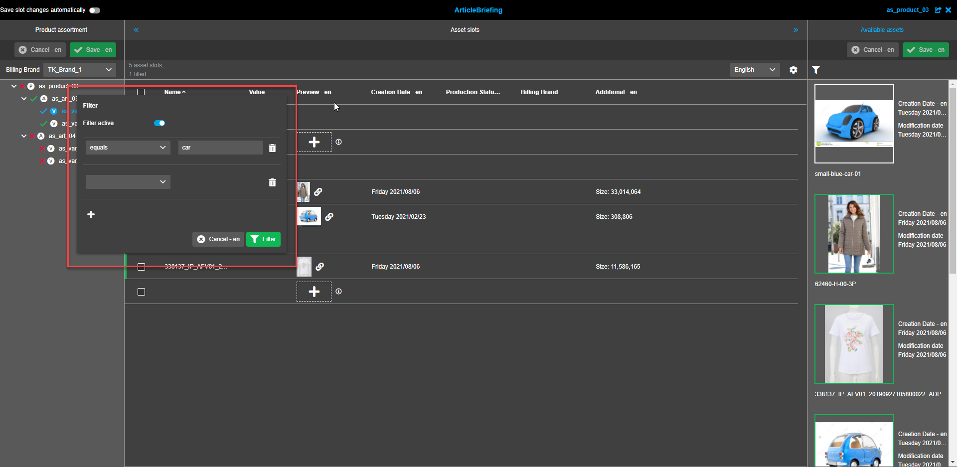
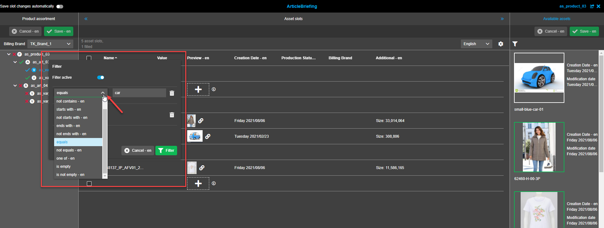
Column filters for image slot table
To apply a filter hover the mouse cursor on a column title until the "Funnel"-icon appears. Click on the "Funnel"-icon to open the filter modal window.
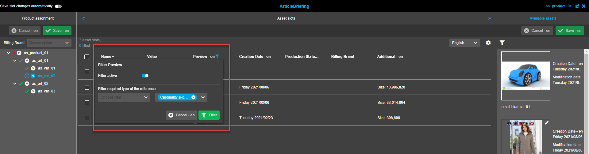
A filter can be applied to every column except "Preview". The filter modal has a toggle to activate/deactivate filtration, a dropdown to select the required rule, a "Trash bin"-icon to remove unnecessary filters, the "Plus"-icon to add one more filter to be applied, the "Cancel"-button to close the modal or discard made changes, and the "Filter"-button to apply filters. After a rule is selected another textfield appears to the right. No value entry is needed to be able to click the "Filter"-button.
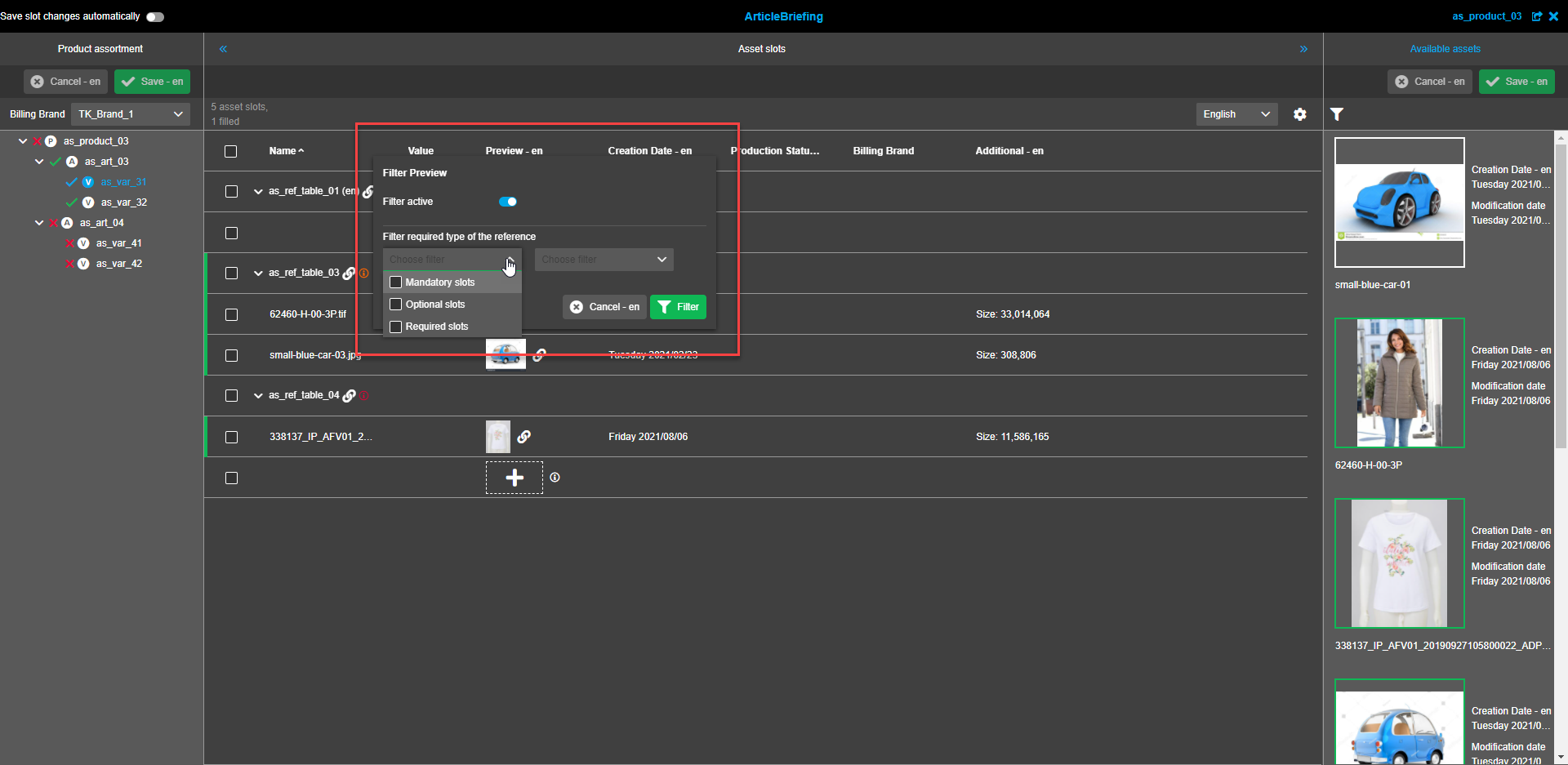
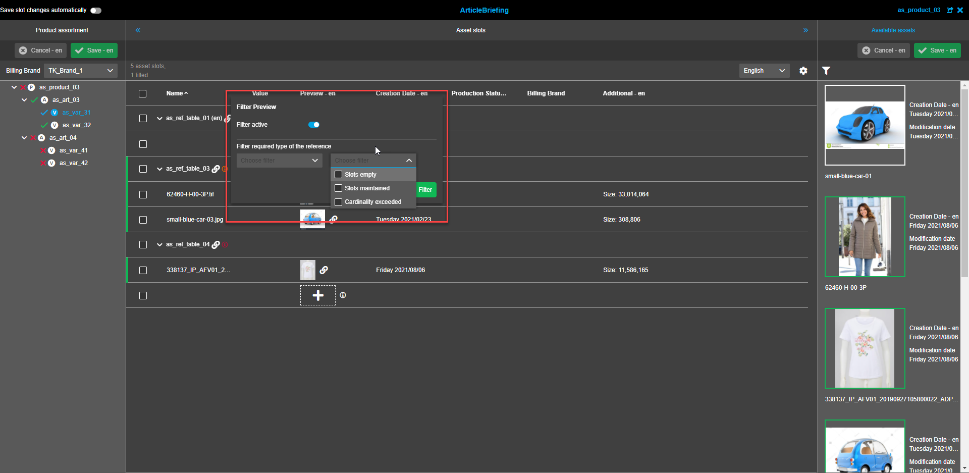
The "Preview" column filter enables to filter by required type of the reference.
This is only possible if a table is grouped by "Reference type" (the "Funnel"-icon doesn’t appear if a different grouping is applied).
The filter modal has a toggle to activate/deactivate filtration, two dropdown windows to choose filters, the "Cancel"-button to close the modal window or discard made changes, and the "Filter"-button to apply filters.
First dropdown has options "Mandatory slots", "Optional slots" and "Required slots".
Second dropdown lets select from "Slot empty", "Slots maintained" and "Cardinality exceeded".
Columns sorting
It is possible to sort slots in ascending or descending order by any column except "Preview".
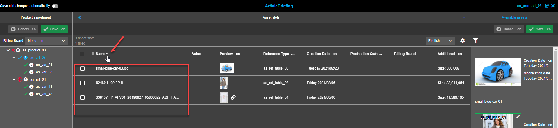
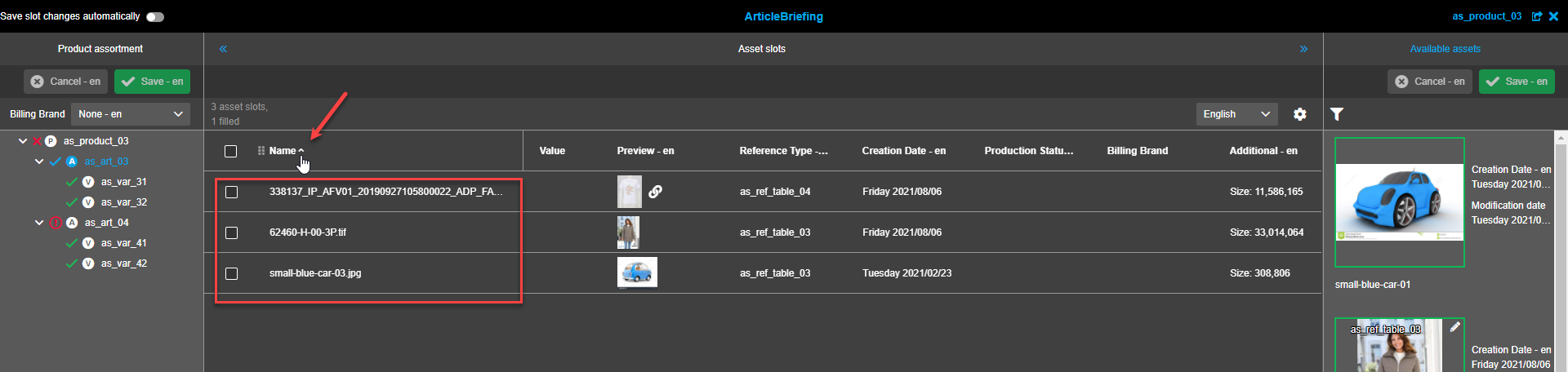
It is possible to sort slots by multiple columns.
When the grouping is enabled, sorting is only possible inside the groups (groups themselves remains on their positions)
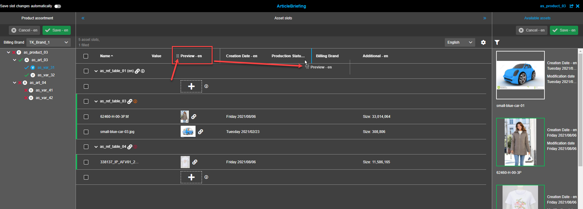
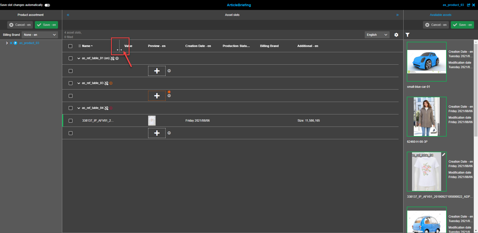
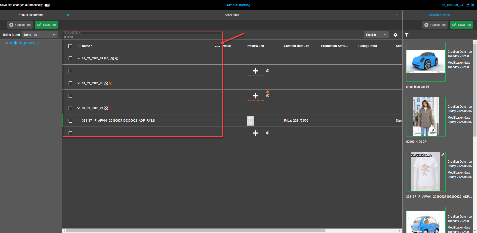
Columns width
Columns width can be changed.
|
All the changes in settings from the client-side are applied at the moment they were set
and are saved up to the next changes in settings. The user-based settings are applied when opening the plug-in or refreshing a page. |
The following user settings’ options are supported: columns' width, selected content language, columns’ order, columns’ visibility, continuous scrolling enabling/disabling (if available), pagination option settings (rows per page) - if continuous scrolling is disabled, applied sorting and sorting order (ascending/descending), applied filters, applied grouping.
Slots
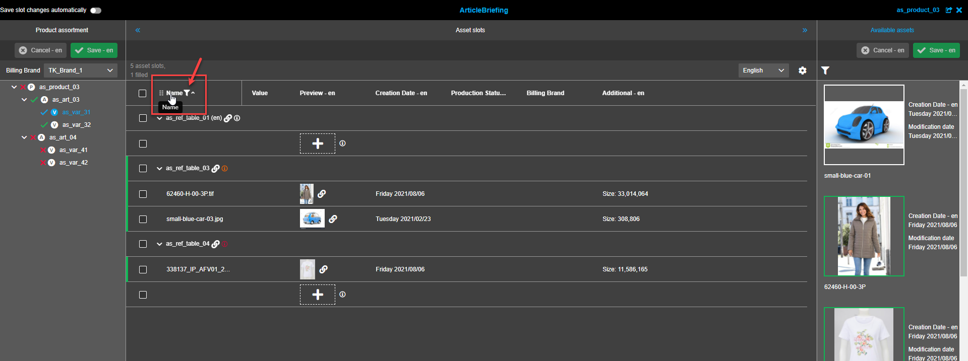
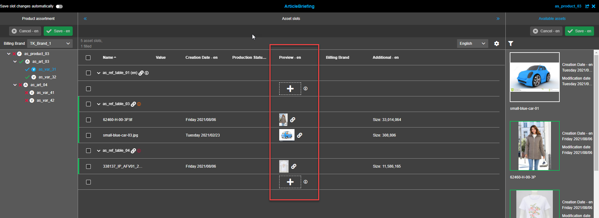
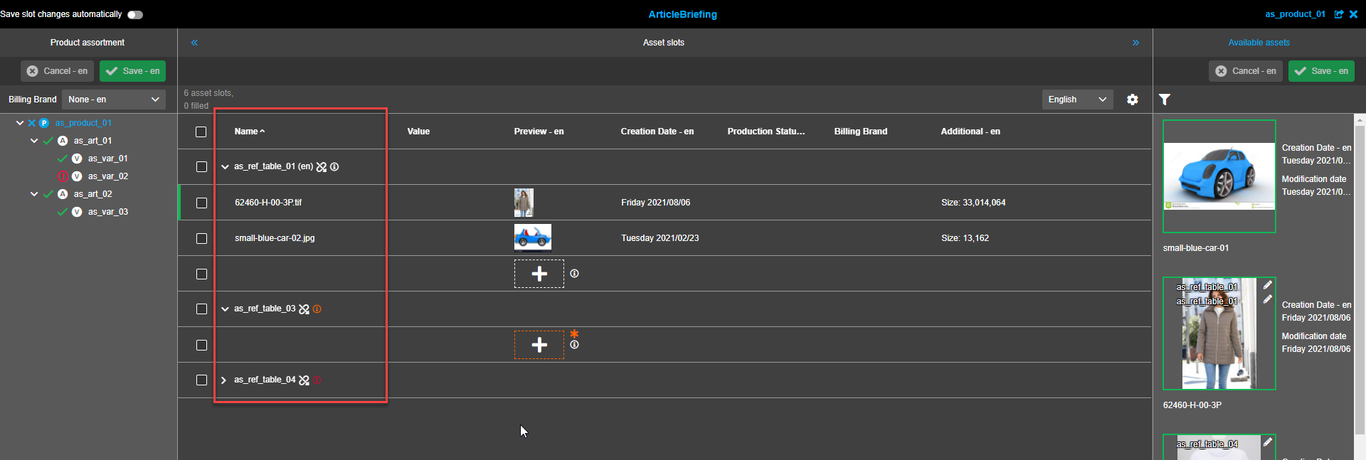
Attributes are presented in the form of a table. By default, the table contains the following columns:
-
Name.
This column contains the name of the linked asset. If required, titles can be collapsed so that only titles are shown without asset image and information.
-
Preview.
Presents images of the linked assets.
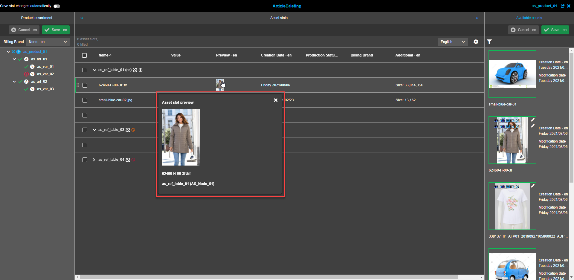
The image modal window expands when hovering over the image in the Preview column. It contains information about the name of the image and the linked reference type. The modal window is not resizable. To close the modal window click on the "close"-icon in the right upper corner of the modal window or on any empty space on the screen.
Preview column should contain info about inheritance
-
Creation date. The creation date of the asset is presented here.
-
Production state. Shows applicable production states.
-
Billing brand. Shows applicable billing brands.
Slots changes
Assets can be added to slot by drag and drop from "Avaiable assets" (left panel) or from external sources (eg. FSNavigation or Search).
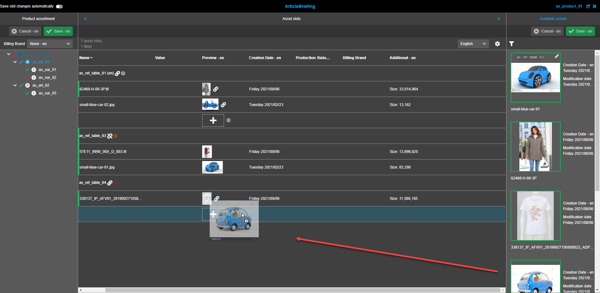
Asset can be moved to empty slot by drag and drop.
Asset can be copied to empty slot by Mac: CTRL + DnD, Windows: STRG + DnD.
If Source slot contains original base image (no composition info):
-
the original base image from source slot is additionally linked in target slot (new reference is built and shown in available assets)
-
in this case, no composition is copied
If Source slot contains composition info and calculated image:
-
the composition information is copied
-
the reference to the base image is copied
-
the calculated image will be copied to the target slot
| Copied asset is saved automatically immediately after it dropped to slot independent of "Save slot changes automatically" settings. |
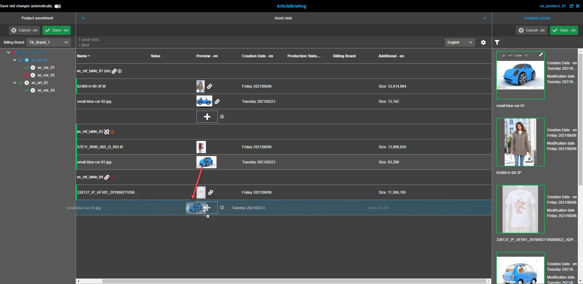
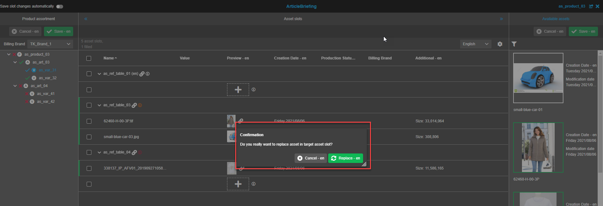
Assets can be replaced from one asset slot to another by drag and drop (moving or copying of asset).
A confirmation modal window appears after an asset is dragged and dropped to another slot. Press the "Replace"-button to confirm the replacement. Press the "Cancel"-button if the replacement is not needed.
Meta information
Cardinality
To set cardinality navigate to PIM → Classification → Configuration, select the required node from the Classification list and set the required number for cardinality in the corresponding column of the central view.
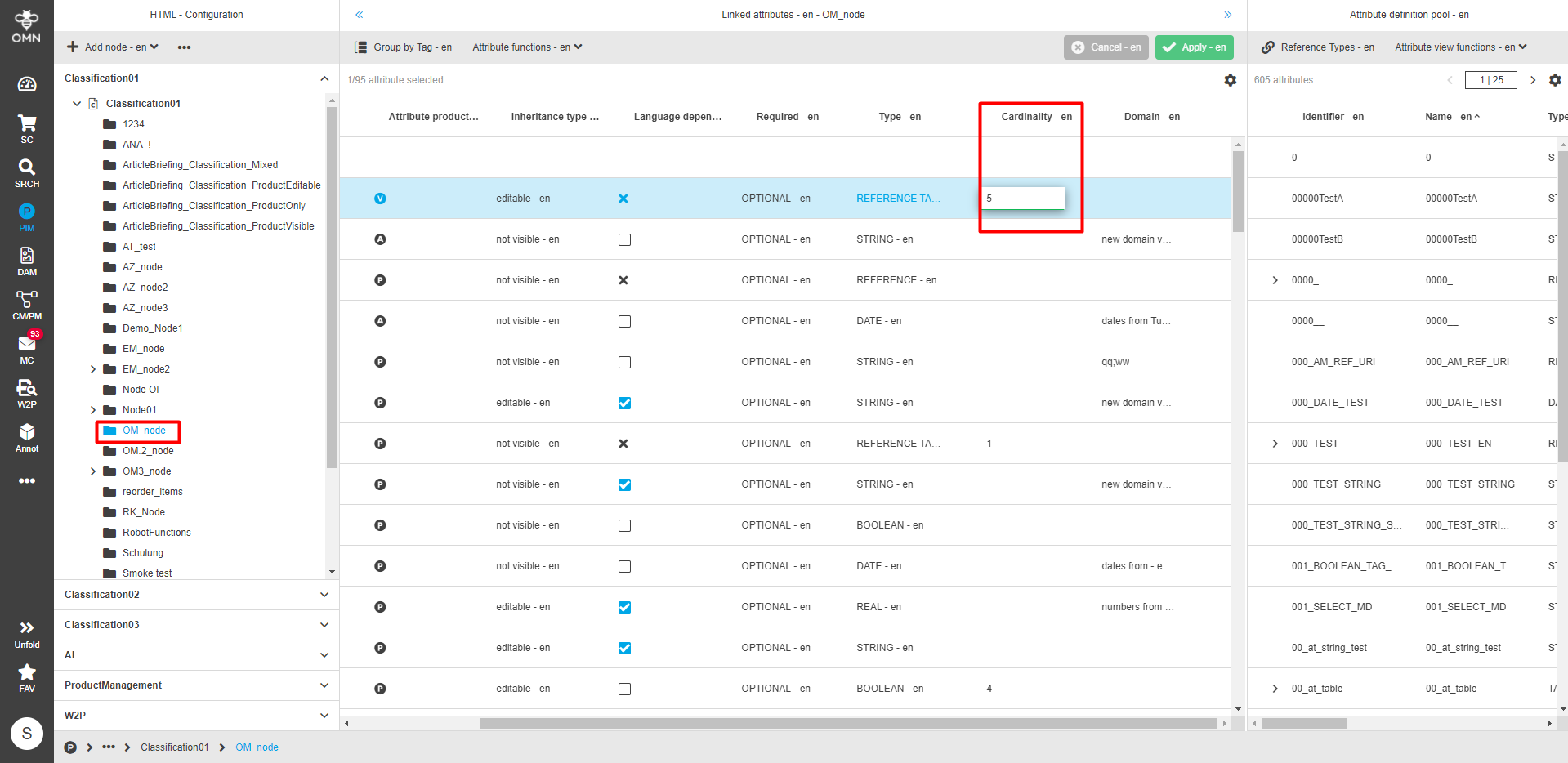
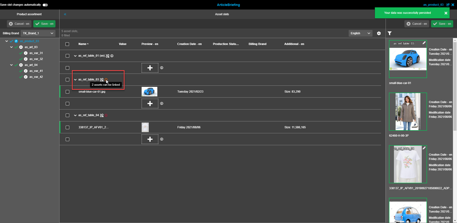
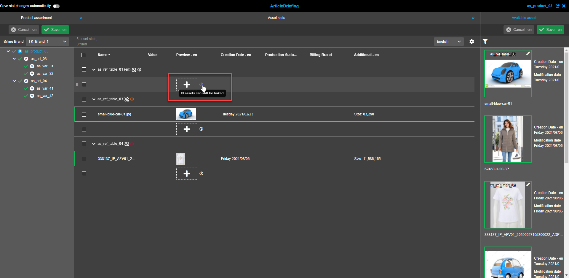
The "Info circle"-icon tooltip on the reference table level states the number of assets that can be potentially added to this table - "(allowed amount of asset slots according to cardinality) assets can be linked".
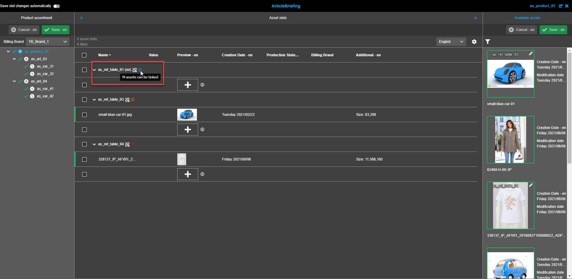
| If the cardinality is not set the tooltip states "N assets can be linked". |
The "Info circle"-icon tooltip on the asset level states the remaining number of assets that can be added to the reference table - "(allowed amount of asset slots according to cardinality - amount of already linked asset slots for this Reference type) assets can still be linked"
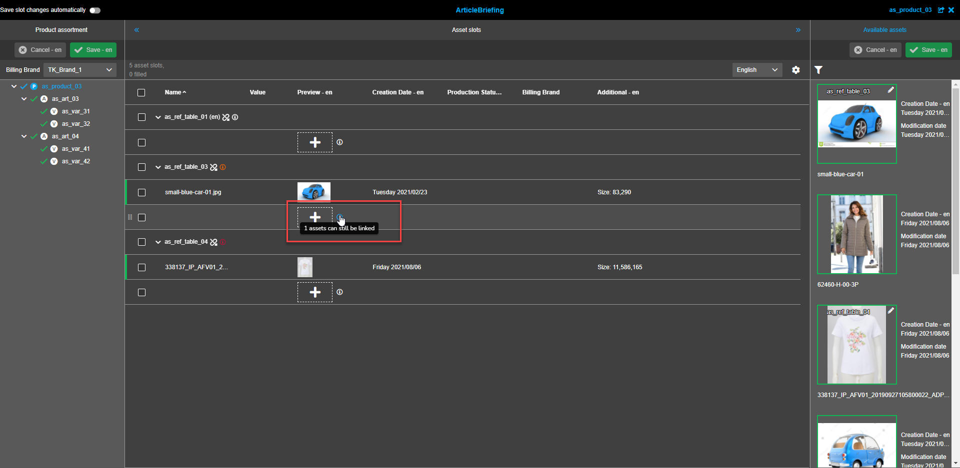
| If the cardinality is not set the tooltip states "N assets can still be linked". |
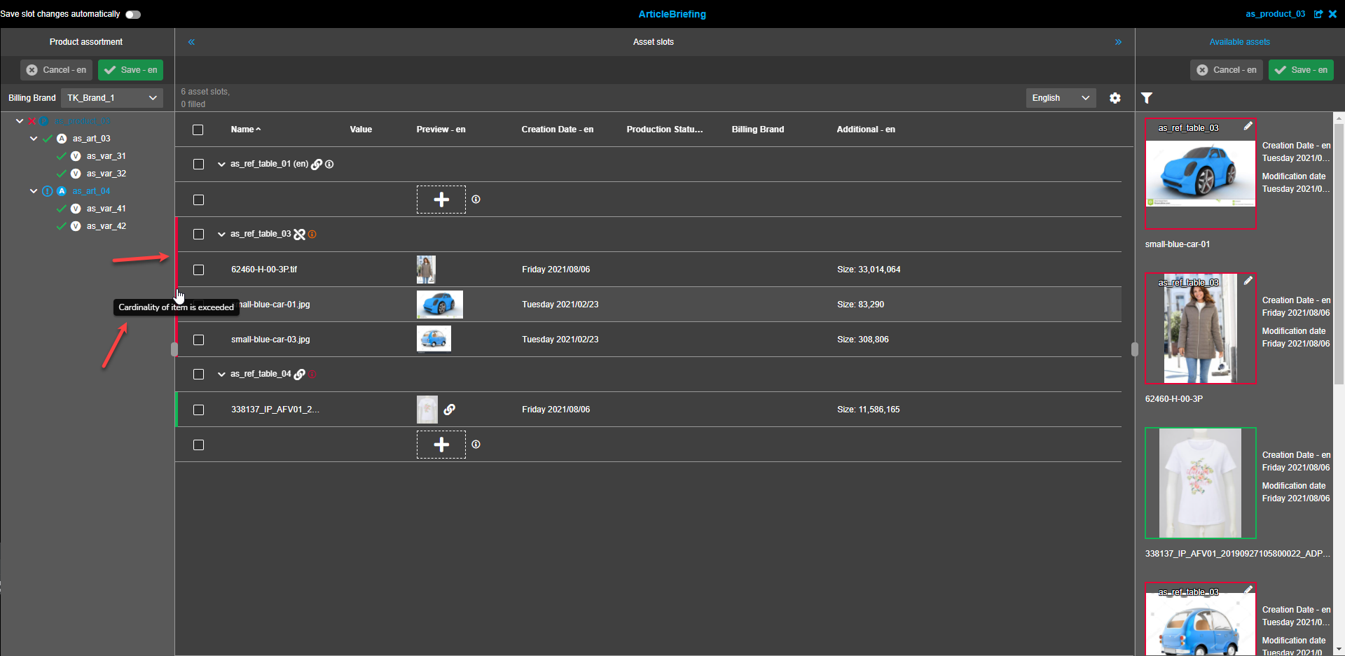
If the cardinality is exceeded because of wrong import logic or manual handling in DB all affected table rows and all child elements
inside nested rows are marked with a red rectangle at the beginning of the row, "Cardinality of the item is exceeded" tooltip if
hovered over the rectangles.
The information and tooltip are also duplicated with the "Info circle"-icon tooltip in the left assortment tree panel.
Linked "available assets" in the right panel have a red border if linked while cardinality is exceeded.
Mandatory, required, and optional fields
To set a reference requirement navigate to PIM → Classification → Configuration, select the required node from the Classification list, and set the reference requirement for certain reference type in the corresponding column of the central view. Three options are available: Mandatory, Required, and Optional.
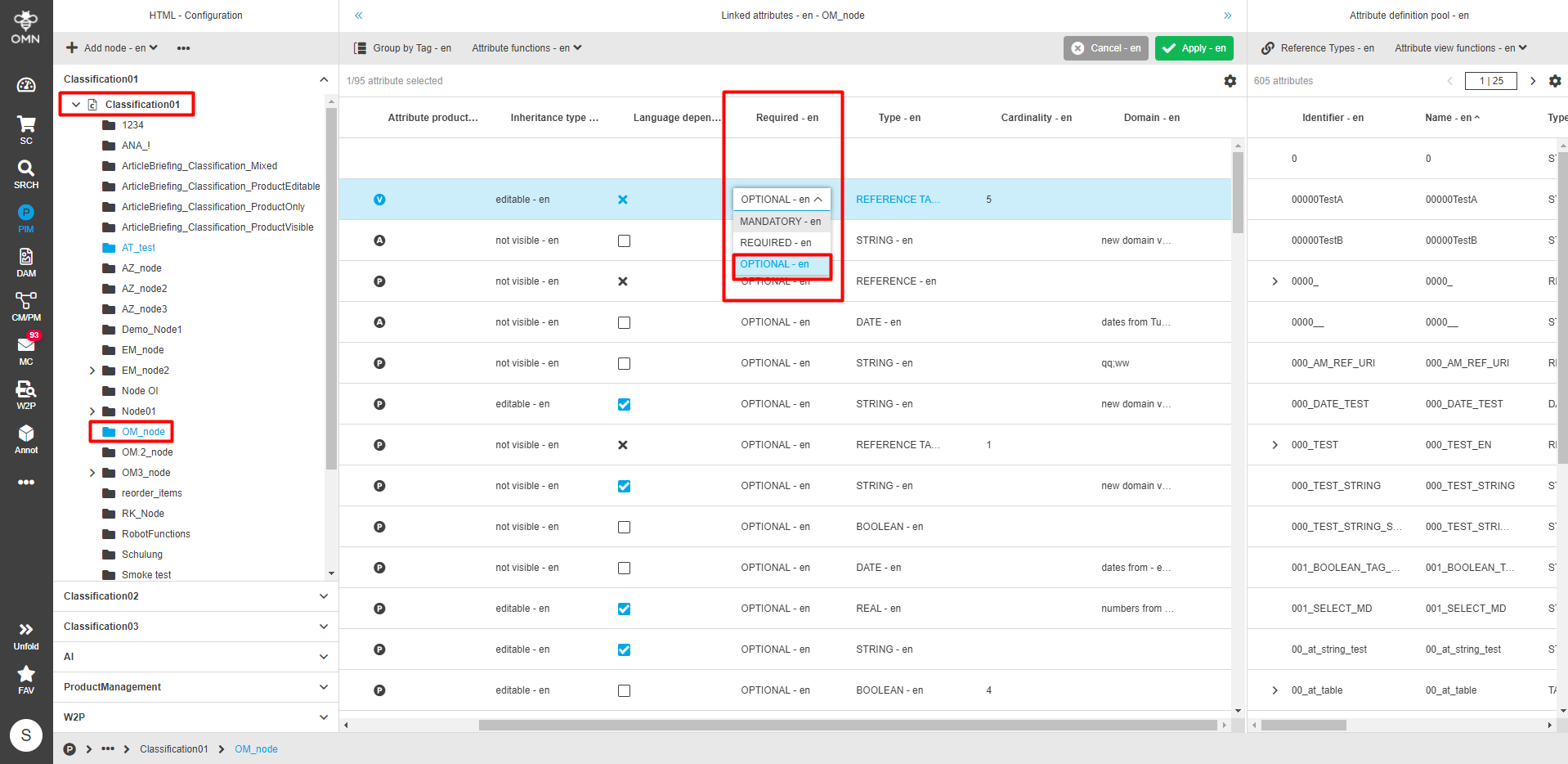
An Optional asset slot has a default white (dark mode) or dark grey (light mode) border and no asterisk icon on the top right. Assortment can be saved without linked optional assets. The absence of linked optional assets doesn’t change product status in the Product assortment tree.
A Required asset slot has an orange border and an orange asterisk icon on the top right. Assortment can be saved without linked required assets. The absence of linked required assets doesn’t change product status in the Product assortment tree.
A Mandatory asset has a red color and a red asterisk icon on the top right. If there is at least one reference configured for ArticleBriefing with property "mandatory" which has no linked asset, it is not possible to save the assortment. Until all mandatory assets are linked the article of the assortment tree is marked with a red "X"-icon and a tooltip "Article is not filled in accordance with its image role definition" if hovered.
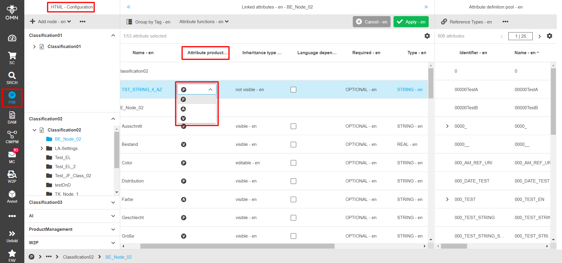
Inheritance
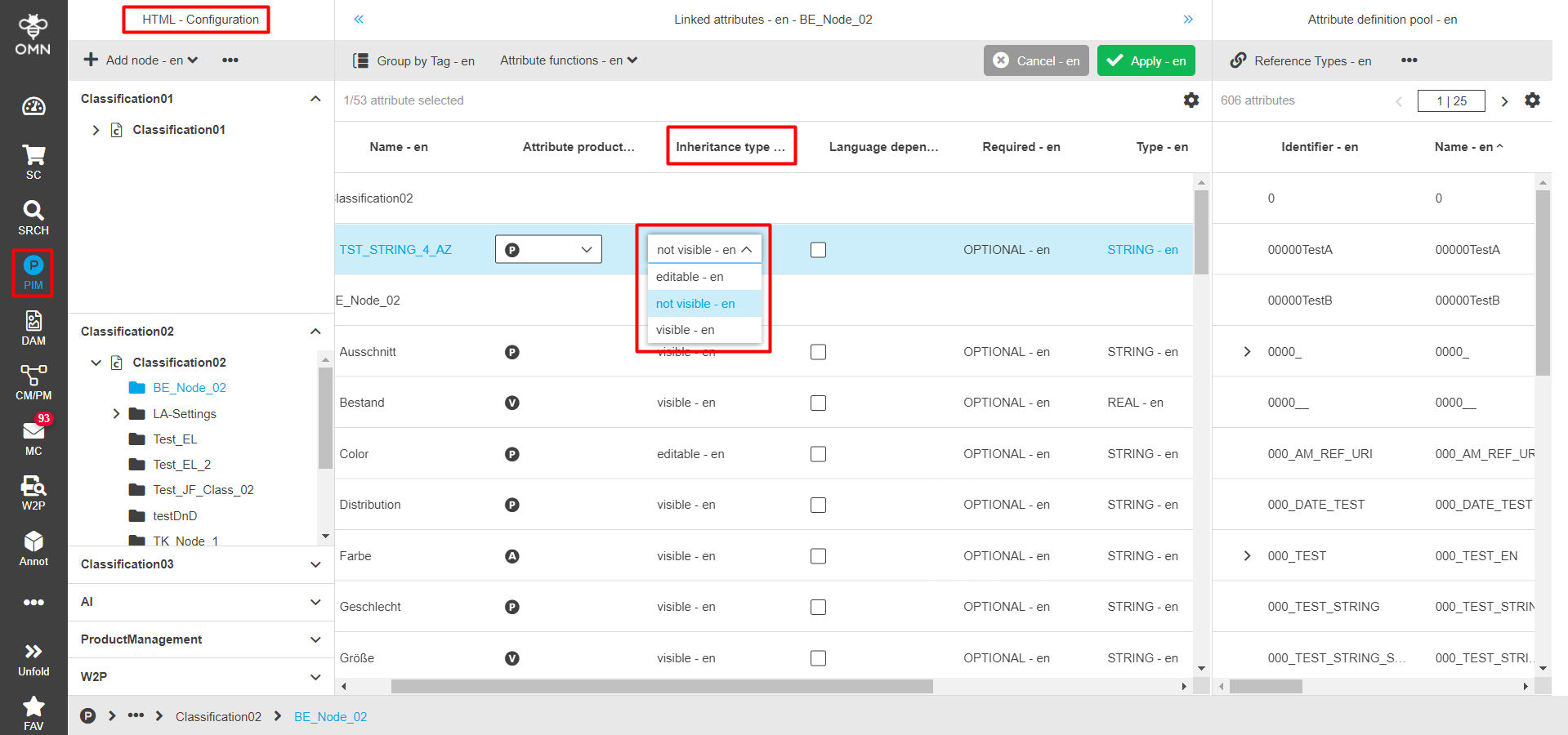
There are two properties used for inheritance inside PIM. To set the inheritance properties navigate to PIM → Classification → Configuration, select the required node from the Classification list and choose the required "Attribute product type" and "Inheritance type" in the corresponding columns of the central view.
Three options are available for "Attribute product type": "P" - Product, "A" - Article, "V"- Variant.
-
If inheritance starts on the product level all descendants (article and variant) inherit attributes and values of the product
-
If inheritance starts on the article level only variant inherits attributes and values of the article.
Options to choose from for the "Inheritance type" are: editable, visible, not visible.
-
Editable "Inheritance type" means that the value for the attribute can be maintained on the defined item type and all descendant items. In case the descendant item has not maintained the attribute, the system tries to get it from an ancestor item. If a value is maintained on a descendant item, it loses all values from the ascendant item (important for cardinality).
-
Visible "Inheritance type" means that the value for the attribute can only be maintained on the defined item type. Attribute and value are shown at all descendant items via label (cannot be maintained).
-
Not visible "Inheritance type" means that the value for the attribute can only be maintained on the defined item type. Attribute and value will not be shown on descendant items.
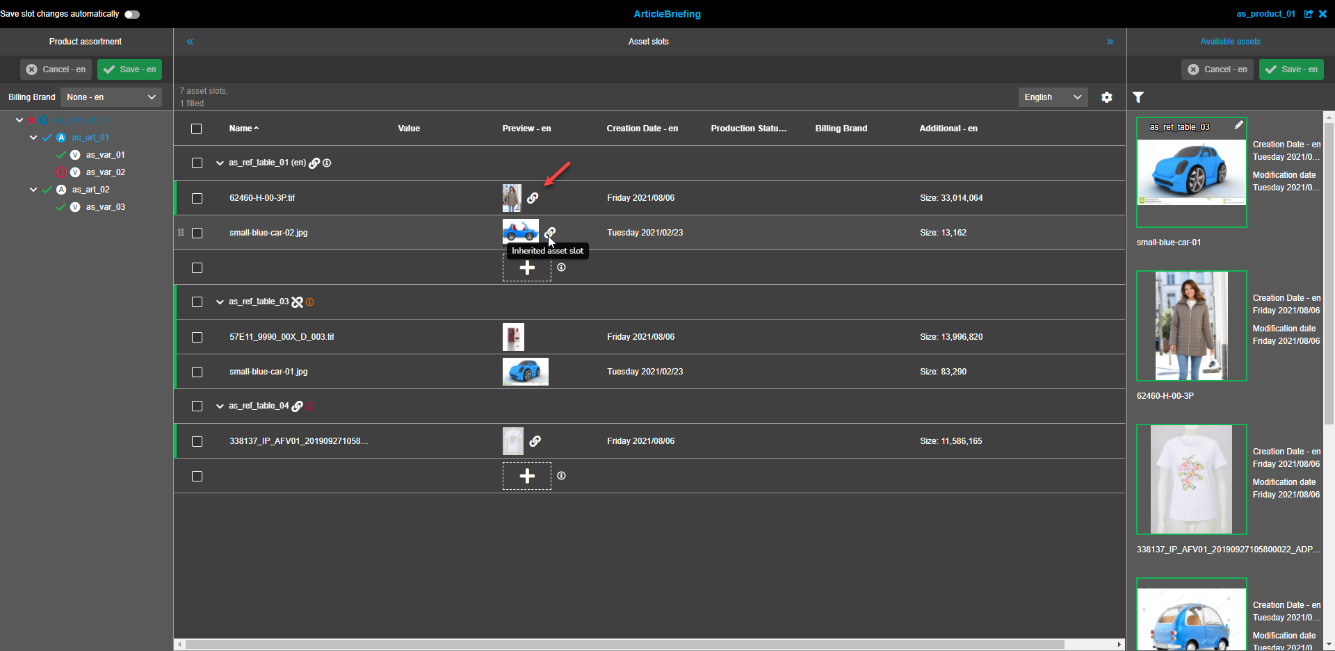
If an asset is inherited from a higher level this is visualized with a "Link"-icon. Note that in the "Preview" column this icon has no functionality and is always visible if an asset is inherited (independent from grouping). The "Link"-icon has a tooltip "Inherited asset slot" that appears when hovering over it.
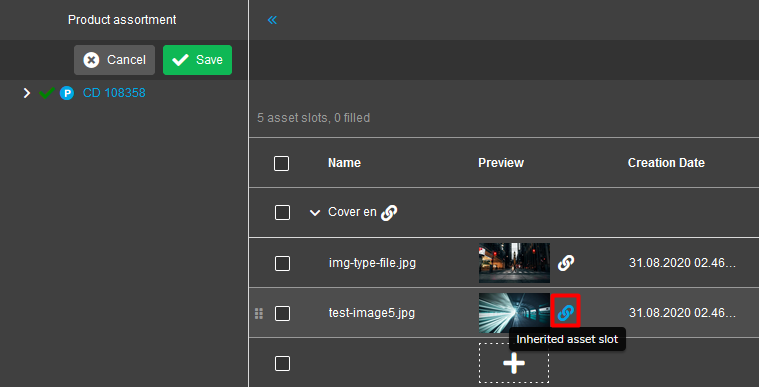
If the table is grouped by Reference type (default setting) there is an additional "Link"-icon for inheritance in the table row of Reference Type(s).
The "Link"-icon has a tooltip "Resolve inheritance" that appears when hovering over it.
Unlike the "Preview" column icon this icon is functional if the inherited level contains its’ own slots.
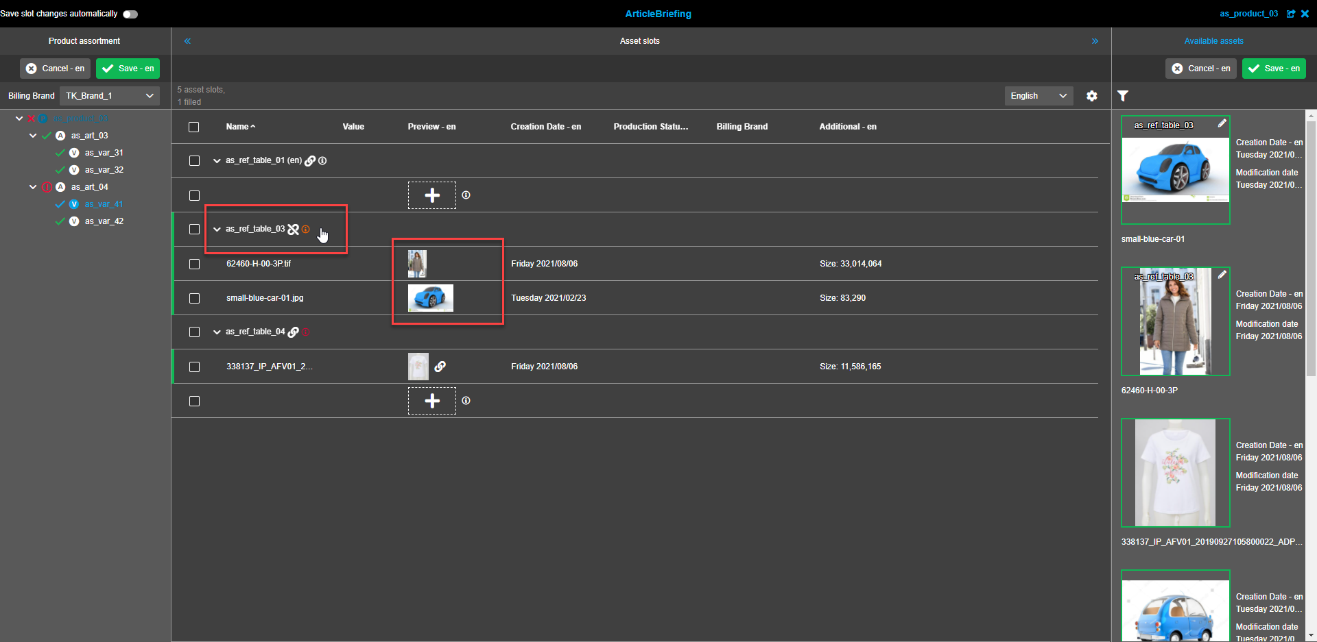
If clicked the inheritance connection to the superior level will be disconnected and the "Link"-icon will be replaced with the "Unlink"-icon in the "Preview" column.
The "Link"-icon next to image previews disappears as well.
When the inheritance for a selected item is considered and if to add a new slot or replace an existing one, the inherited slots disconnect from the superior level and link to this particular item.
Lower level items in this case inherit changed slots from this item as a superior level.
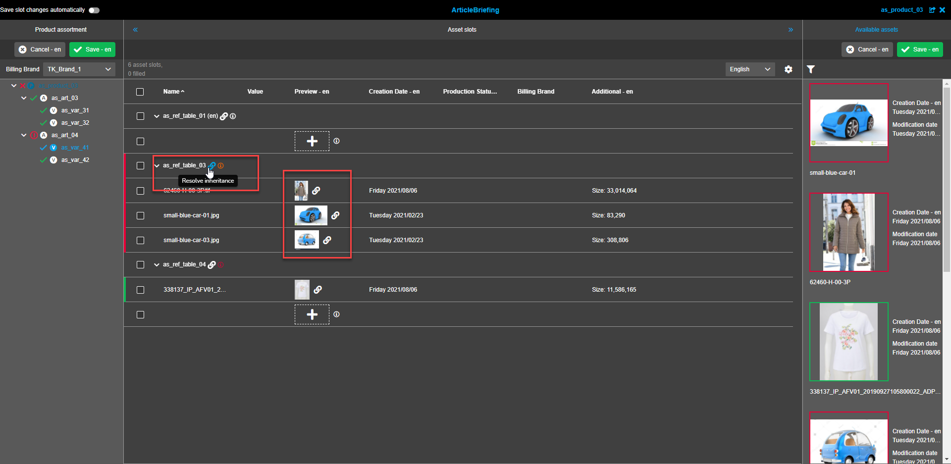
If the "Unlink"-icon is clicked on, the connection to the superior level is restored and the assets from the superior level are inherited and shown.
The "Unlink"-icon has a tooltip "Consider inheritance" that appears when hovering over it.
Note that all already available assets in child asset slots will be overwritten with assets from a superior level.
Available assets
Available assets refresh
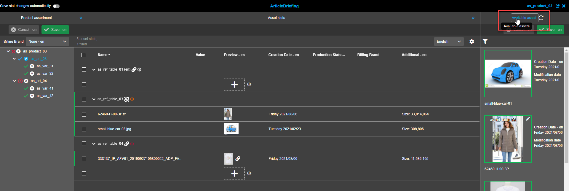
Navigation bar of the right view contains the title which is clickable and can be used to refresh available assets. To do so hover over the "Available assets" in the navigation bar. The "Refresh"-icon will appear to the right. Click on the "Available assets".
Unlink references from assets
To unlink the required asset from references click on the asset(s) in the right view. The "Unlink all references"-button will be shown in the toolbar or will be hidden behind the "Dotted menu"-icon following the selection of at least one asset.
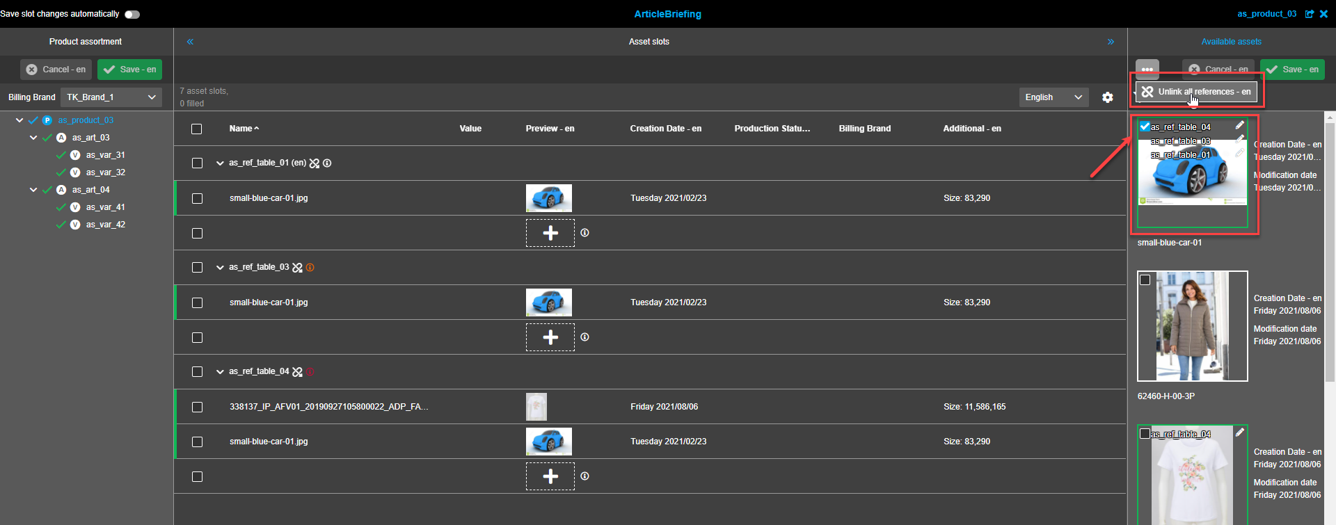
Click on the "Unlink all selections"-button. A confirmation modal appears.
Click on the "Unlink"-button to unlink asset(s) or the "Cancel"-button if the asset(s) shouldn’t be unlinked.
The unlinked asset(s) will disappear from Asset Slots view following confirmation.
| The "Unlink all references" action is not saved automatically (even if "Save slot changes automatically" is enabled). So user should save changes manually. |
Right view canvas
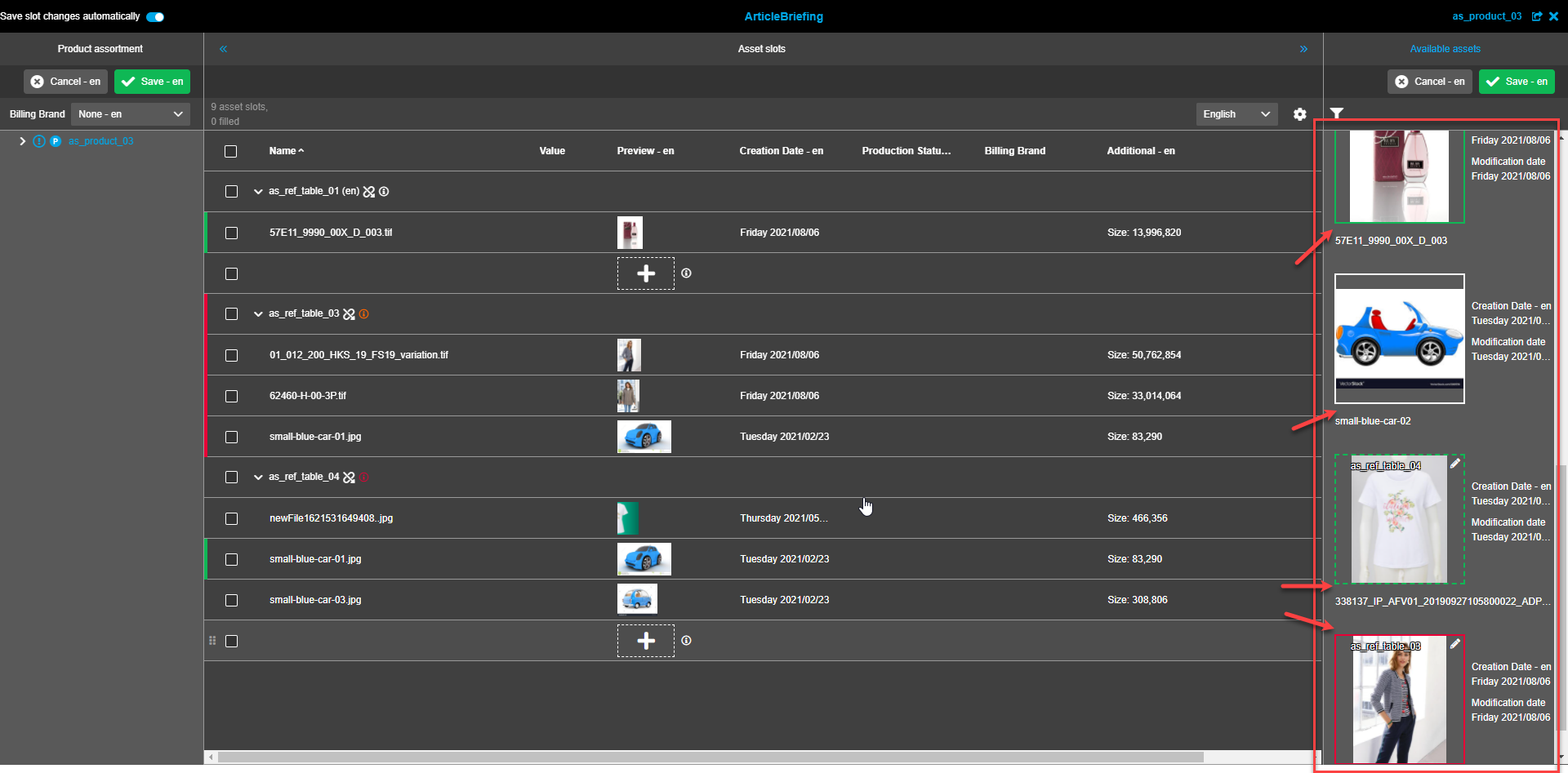
The right view canvas contains area for showing images (from item and project):
-
base image roles - all images which are linked to the currently selected item.
-
base project image folders - all images which are linked to the current project and exist in base project images folders (only available if ArticleBriefing was opened from a project).
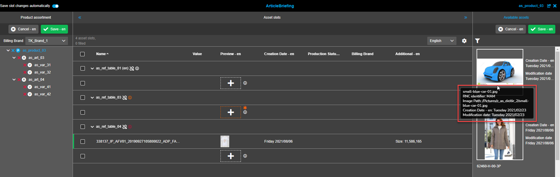
A tooltip for every image shows:
-
image name
-
image path (with RNC information)
-
production status (configurable attribute for asset - only if set)
-
creation date
-
modification date
All reference types by which the image is linked are displayed at the top of the image.
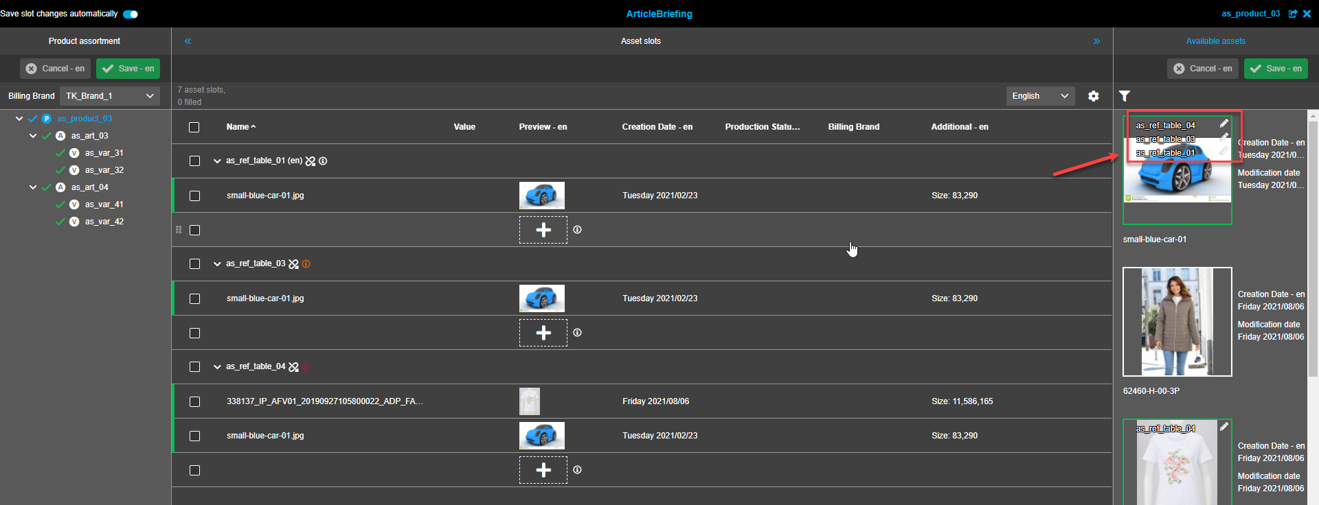
An icon to edit an image is displayed next to the reference type on top of the image. The "Trash"-icon is shown following a click on the "Edit"-icon and the reference type can be unlinked. Steps are the same as described in "Unlink references from assets". Each reference type is displayed in a new line. If there is not enough space, the "…"-icon is used in the last possible line. Multiple selections are not available. If the "Show child base images" option is enabled, assets linked on the successor level will be shown.
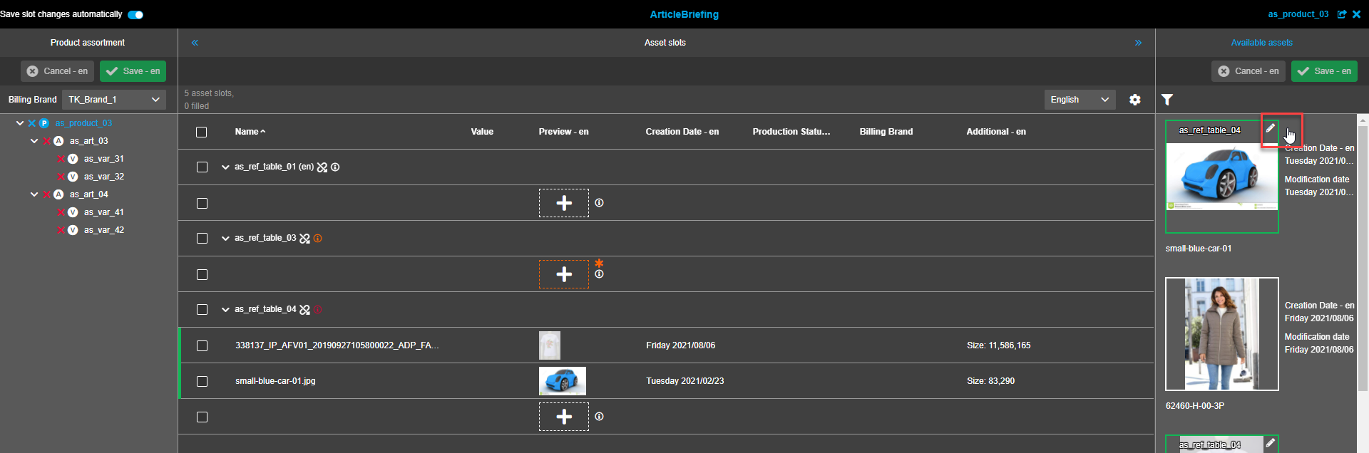
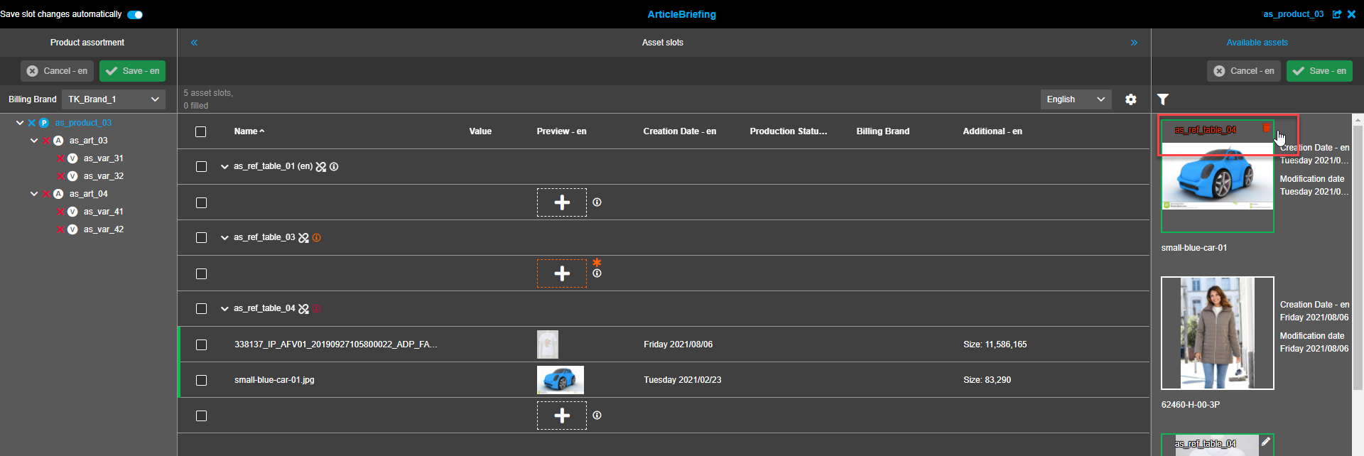
Base images are displayed with border:
-
in case that available asset is not added to slot - solid border in white color (dark mode) or grey color (light mode)
-
in case that available asset is added to slot - solid border in green color
-
in case that available asset is added to slot and changed (has composition) - dashed border in green color
-
in case that available asset has cardinality exceeded in slot - solid in red color.
Filter
To facilitate relevant linked assets search filter can be applied. The "Filter"-icon is shown in the status bar. The "Filter"-icon is white if no filters are selected.
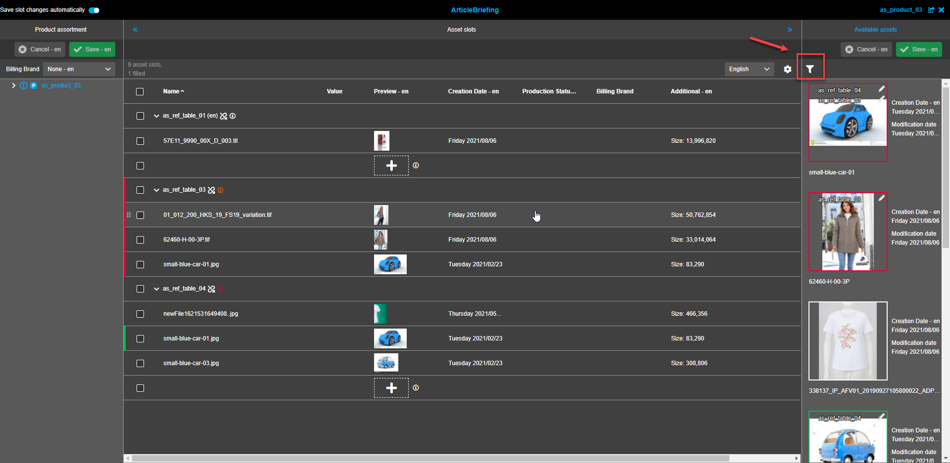
If filtration is applied the "Filter"-icon has a blue color. To see the applied filter settings hover over the icon and the tooltip with filter details will appear.
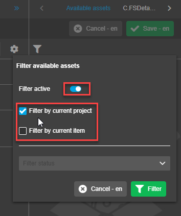
The filter modal window appears following a click on the "Filter"-icon. Different sections of the filter are separated by a thin grey line splitter.
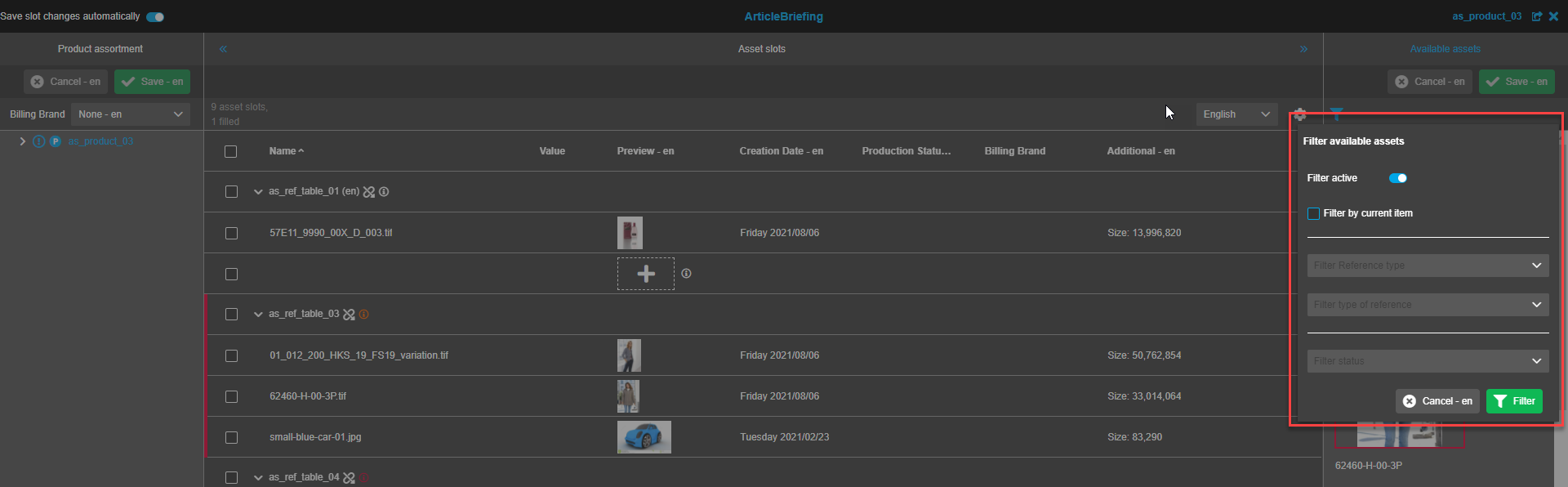
Filter activation
To activate the filter click on the "Filter active" toggle. Filtering options are now available.
"Filter inactive" is shown when the toggle is in the "off" position.
"Filter active" is shown when the toggle is in the "on" position.
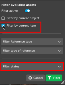
The first section of the filter enables a user to limit visibility by:
-
Objects that belong to a project level by checking the "Filter by current project" checkbox;
-
Objects that belong to an item by checking the "Filter by current item" checkbox;
-
Both object types when both checkboxes are to be checked. To uncheck the box(es) repeatedly click on it.
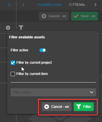
Saving changes
To save changes made click on the "Filter"-button. This will apply filter settings and change visible available assets in the right view accordingly.
To cancel changes click on the "Cancel"-button. This will cancel changes made in the current session. Previous filter settings will remain.
Filtration options
Filters can be combined (work with intersection). For example, it is not possible to combine the filter "Filter by current project" with filter "Reference type".
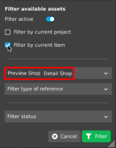
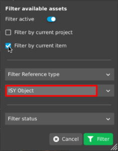
If only "Filter by current item" is checked the second section enables filtering by reference types and type of reference.
If the "Include" option is used (see configuration for more details)
-
only references that are listed in the configuration can be filtered
-
only available references for which an asset is linked to can be filtered
| if "Filter by current project" is checked separately or along with the "Filter by current item" option filtration by reference types and type of reference is unavailable. |
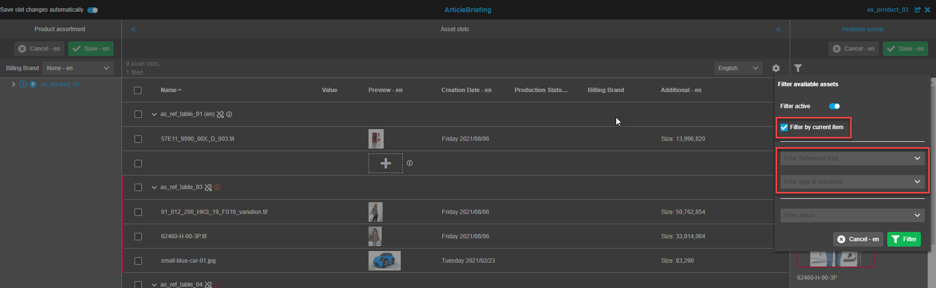
Reference type
The multi-select dropdown is used to filter reference type(s). It is possible to filter multiple reference types. By default, nothing is selected in the dropdown.
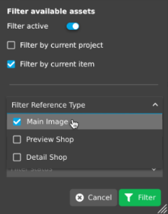
If nothing is selected in the dropdown, "Filter Reference type" is shown in the box in the closed position
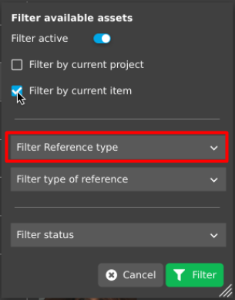
If reference types have been selected in the dropdown, "Reference type A, Reference type B, Reference type C" is shown in the box in the closed position.
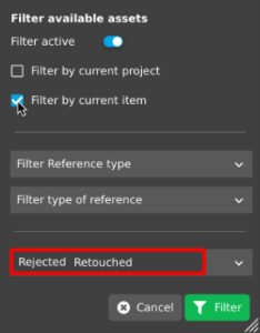
Type of reference
The multi-select dropdown is used to filter by type of reference. It is possible to filter multiple types of references. By default, nothing is selected in the dropdown.
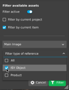
If nothing is selected in the dropdown, "Filter type of reference" is shown in the box in the closed position.
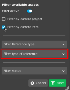
If types of references have been selected in the dropdown, "Type of reference A, Type of reference B, Type of reference C" is shown in the box in the closed position.
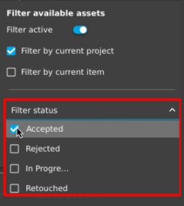
Production status
In the third section it is possible to filter by production status (only if configured in the backend)
Production status filtration is always possible (independently from checkboxes "Filter by current project" and "Filter by current item")
The multi-select dropdown is used to filter production statuses. It is possible to filter multiple production statuses. By default, nothing is selected in the dropdown. If nothing is selected in the dropdown, "Filter status" is shown in the box in the closed position. If one or several production statuses are selected in the dropdown, "Status A, Status B, Status C" is shown in the box in the closed position.