Preparing usage
Preparing tool is a part of the Web-to-Print module.
In Preparing you can prepare the InDesign documents for further individualization in DocEdit tool.
Here it is possible to:
-
enable additional functions for DocEdit for the document, e.g. Size adaption function
-
customize the editing capabilities for content boxes of the document
The prepared document can then be released to individualize it in DocEdit tool.
Open Preparing tool
Preparing can be opened for InDesign documents from:
-
MAM context → on the InDesign document itself
-
PIM context → on the product that has linked InDesign document
-
Workflow context → on the defined step of the process for Indesign document via workflow function
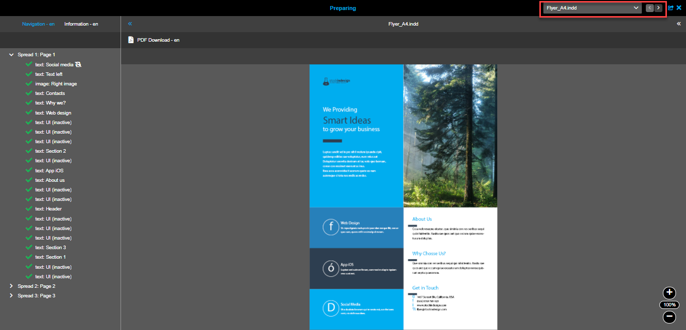
It is possible to open Preparing tool for several documents at once. In this case, a special navigator appears in the top right corner.
|
Structure
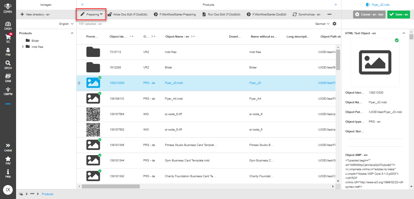
The Preparing tool is divided into three areas:
-
left panel → here you can see the structure of the document. Also, you can define general properties of the document and enable additional functions.
-
central panel → here you can always see the actual preview of the document’s page after made changes. In addition, the boxes on canvas are selectable for editing. Work with image placement is also done on canvas. Additionally, all general document’s functions are placed in the toolbar of this panel.
-
right panel → here the special editors for content elements are shown.
These areas and their contents are described in more detail below.
Information tab
Information tab in the left panel of the opened Preparing tool consists of two panels: general and size adaption. They allow you to:
-
view and change the general information of the document
-
configure specific DocEdit functions:
-
Business-Card mode
-
Digital Signage
-
Size adaption
-
General panel
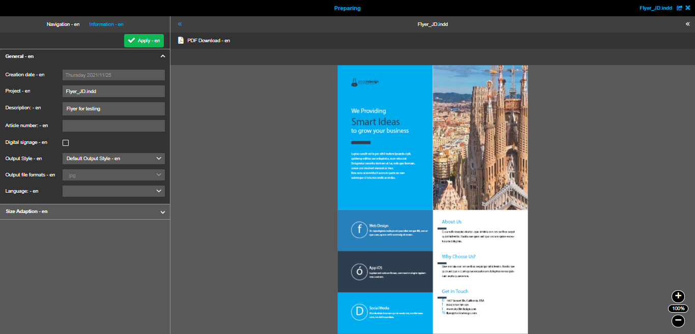
The following attributes of the document are available here:
-
Creation date → you can only view the date and cannot change it
-
Project →
-
Description → you can add a text description for the document
-
Article number → you can set here the article number to which the document belongs, to differ between them in terms of one product
-
Digital signage → you can activate a special feature of Digital Signage
-
Output Style → you can select the needed output style for a document. Important: it is possible to select output style only when 'Digital signage' is not active
-
Output file formats → relates to Digital signage functionality, detailed description is available below
-
Language →
-
Business cards enabled → you can activate a special BC-mode, the detailed description is available below
Size adaption panel
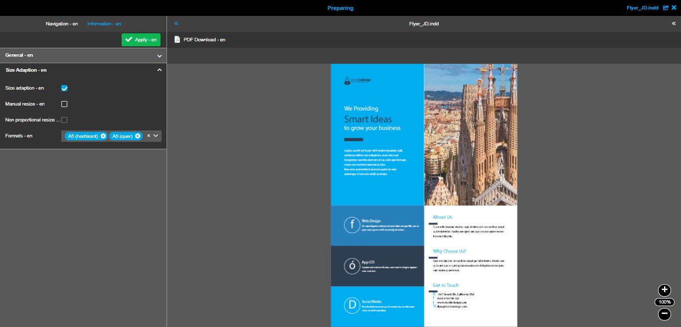
Size adaption is a function that allows the users of DocEdit to transform the documents to different sizes (for example, in accordance with paper sizes) without losing the content.
You can configure the function in a following way:
-
Size adaption → you can activate the function for the document in DocEdit
-
Manual resize → you can allow the users define their own sizes for the documents. Important: after manual change of height or width the second dimension will be set automatically in a proportional way
-
Non proportional resize → by activating this option, you can allow the user to change both width and height of the document’s size
-
-
Formats → you should select the formats that will be available for the DocEdit user to select from.
BC-mode
Business-Card mode is a special function available in Web-to-Print to give the users a faster way of filling in the information into the documents. This mode is a good tool for any document’s type where the users of DocEdit don’t need to change the text appearance, but only need to change the values.
More details on configuration details can be found here.
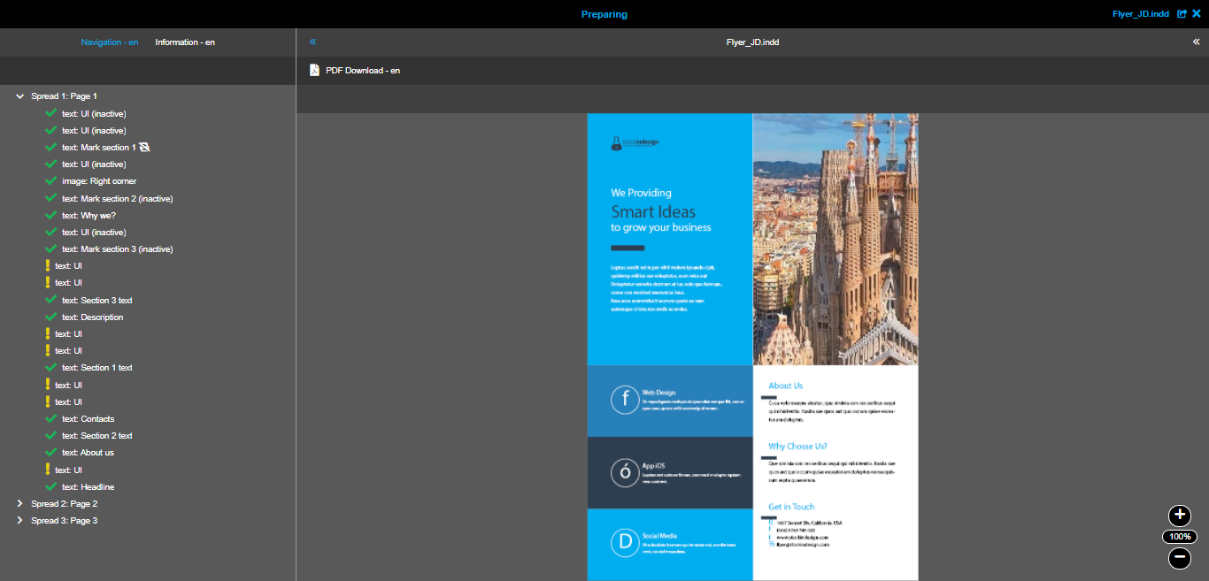
Navigation tab
Navigation tab in the left panel of the opened Preparing tool contains the same structure as was done in InDesign. Here you can always see all document’s pages, boxes available on pages and input form contents (if BC-mode is activated).
In the navigation you can:
-
check the whole structure of the document
-
switch between different pages of the document
-
select needed content box
-
check the overall status of the preparation of the document
-
manage input form’s entries
As stated before, the navigation shows a lot of useful information in the entries themselves. Navigation with activated 'BC-mode' differs from the navigation with not activated 'BC-mode', so that the following sections describes their common parts and differences.
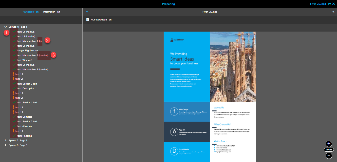
'BC-mode' deactivated navigation
When you have not activated 'BC-mode' in 'Information' tab, the navigation looks like this:
Navigation entries
The following entries are available in navigation:
-
Page entry → not selectable. Click on the entry changes the preview to a specific page and expands the list of page’s boxes
-
Text box entry → selectable. Click on the entry opens the text box editor in the right panel
-
Image box entry → selectable. Click on the entry opens the image box editor in the right panel
-
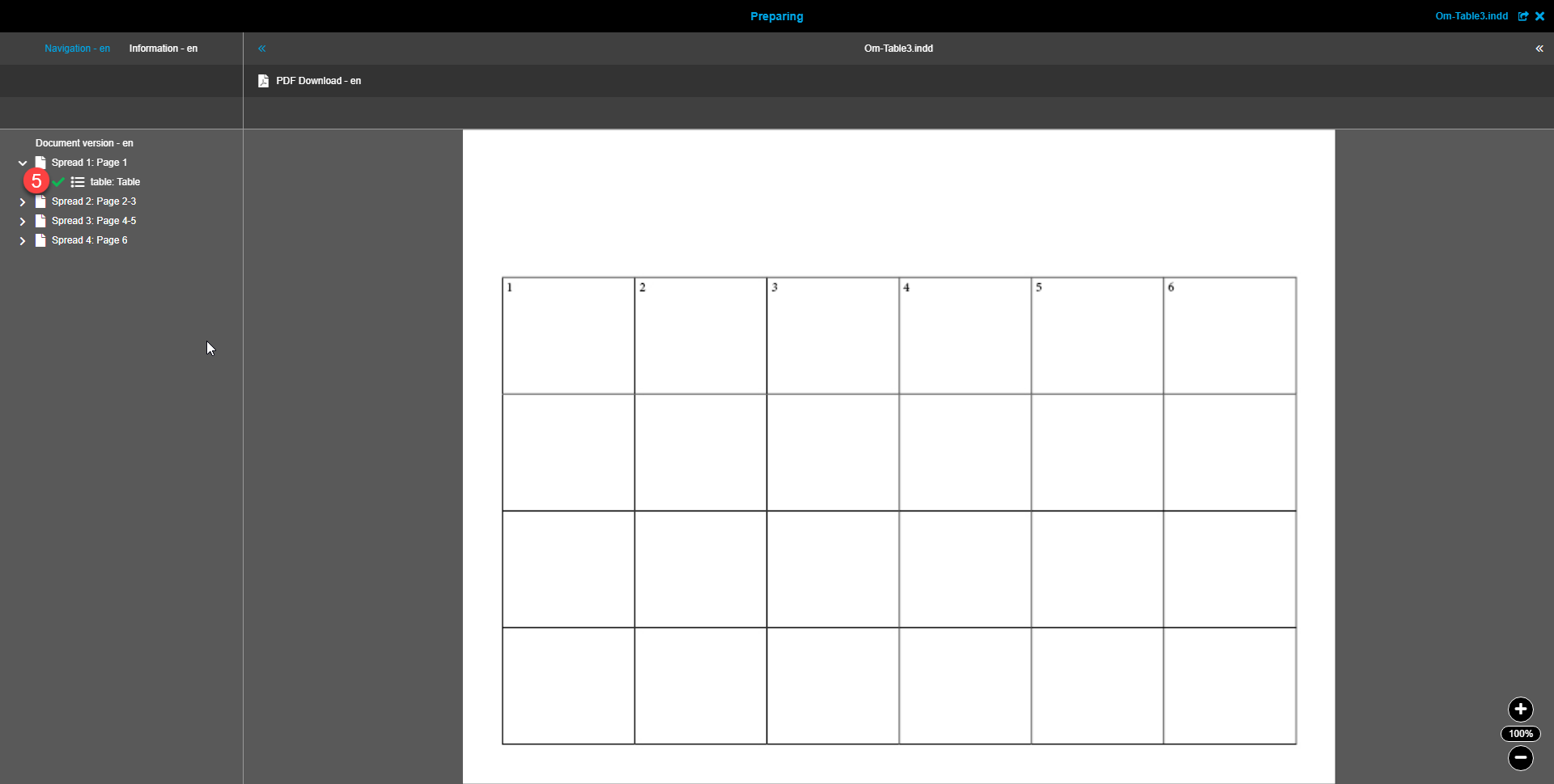
Table box entry → selectable. Click on the entry opens the table box editor in the right panel
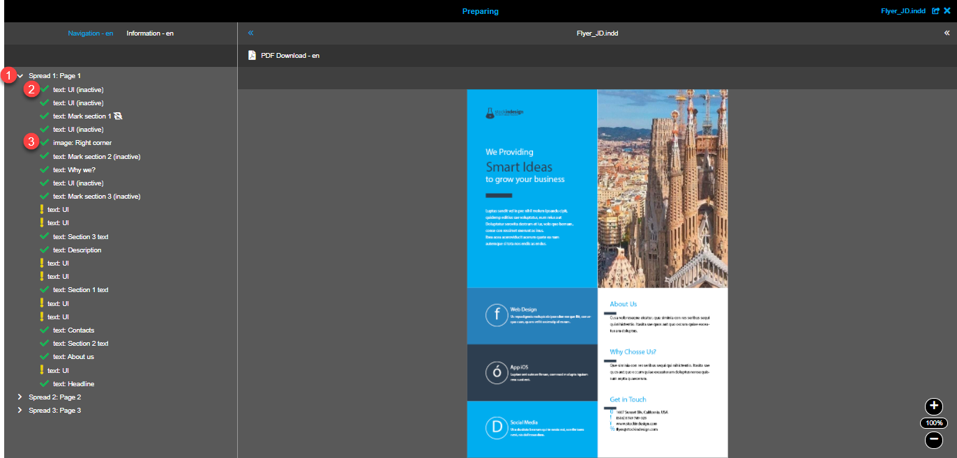
Visual hints for navigation entries
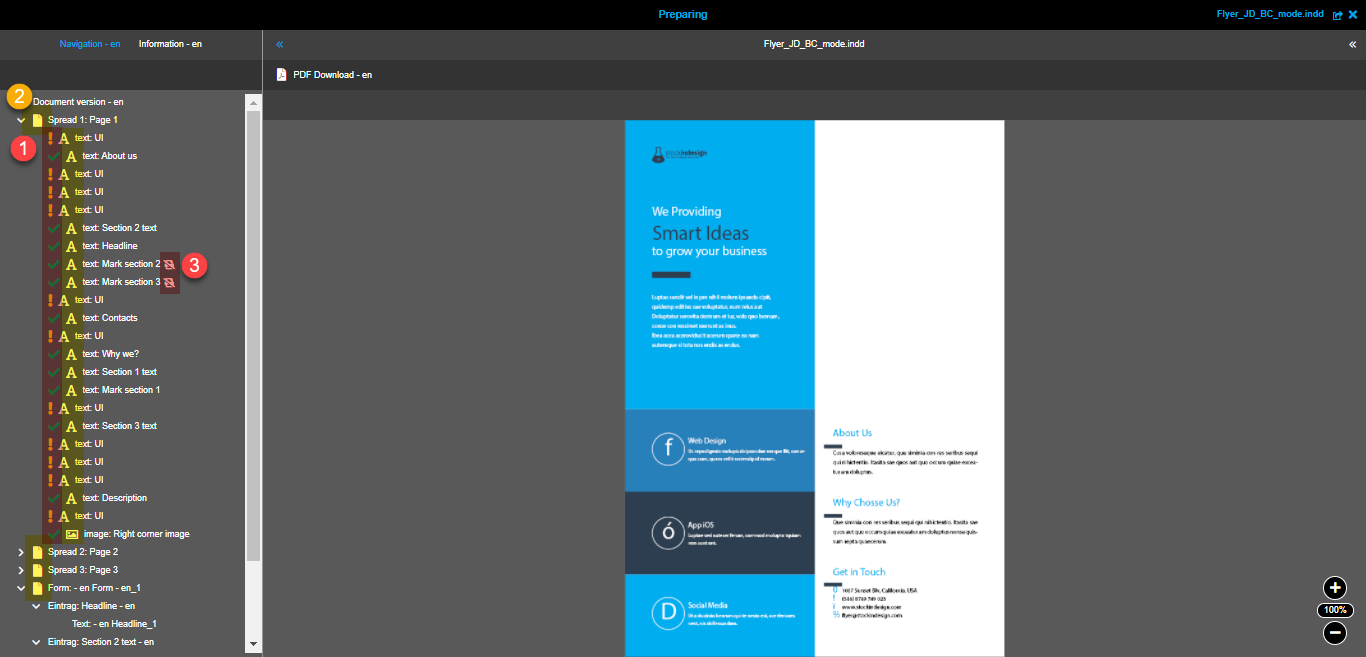
Since one of the purposes of the navigation is to have an intermediate state of the document’s preparation, there are the following visual hints:
-
Box state icon
-
→ the box configuration was not changed yet
-
→ the box configuration was changed already
-
-
 → means that 'Delete on print' option is activated for the box. In this case the box with its content will not be present in the output document (e.g. downloaded PDF)
 -
Label (inactive) after the name of the box → means that the box is marked as not editable - it will not be available in DocEdit for the user
'BC-mode' activated navigation
When you have activated 'BC-mode' in 'Information' tab and have added the input form together with its entries and fields (more information on configuration of the form can be found in the following section), the navigation looks like this:
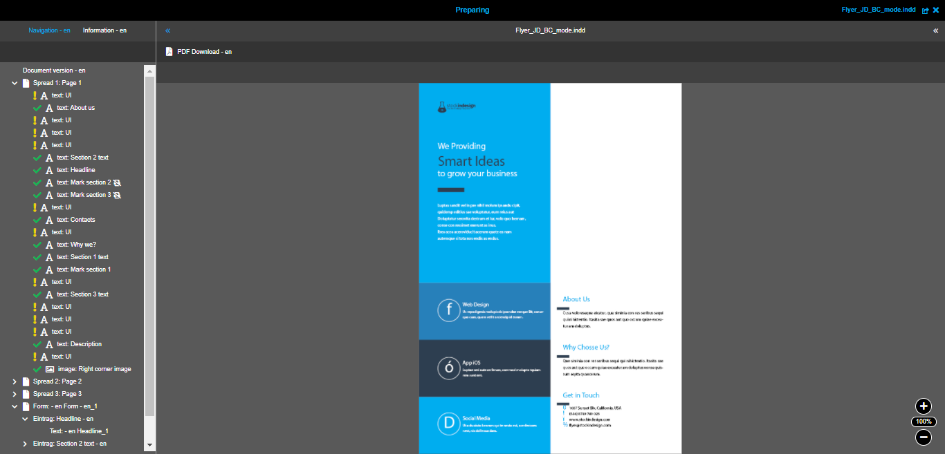
Navigation entries
The following entries are available in navigation:
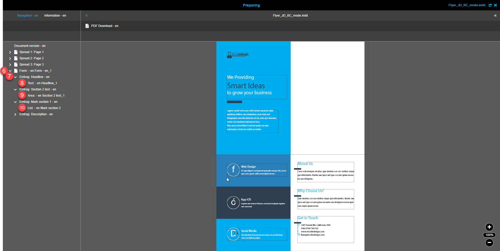
-
Document version entry → selectable. Click on the entry opens the document version editor in the right panel and allows to create a form entry (if was not created yet)
-
Page entry → not selectable. Click on the entry changes the preview to a specific page and expands the list of page’s boxes
-
Text box entry → selectable. Click on the entry opens the text box editor in the right panel
-
Image box entry → selectable. Click on the entry opens the image box editor in the right panel
-
Table box entry → selectable. Click on the entry opens the table box editor in the right panel
-
Form entry → selectable. Click on the entry opens the form editor in the right panel and allows to create an 'Entry' entry
-
'Entry' entry → selectable. Click on the entry opens the entry editor in the right panel and allows creating text field, text area field, list field entries
-
Text field entry → selectable. Click on the entry opens the text field editor in the right panel
-
Text area field entry → selectable. Click on the entry opens the text area field editor in the right panel
-
List field entry → selectable. Click on the entry opens the list field editor in the right panel
Visual hints for navigation entries
The following hints are available for navigation entries:
-
Box state icon
-
→ the box configuration was not changed yet
-
→ the box configuration was changed already
-
-
Entry type icon
-
→ identifies page and form entries
-
→ identifies text box entries
-
→ identifies image box entries
-
→ identifies table box entries
-
-
→ means that 'Delete on print' option is activated for the box. In this case the box with its content will not be present in the output document (e.g. downloaded PDF)
Canvas
Central panel of the Preparing tool contains the canvas - the place where the document’s state can really be seen.
On canvas you can:
-
check the previews of the document’s pages (placement of boxes and their content)
-
select needed content box
-
manage the placement of the image within the image box (more details are available in this section)
Here you can see the overview video of the main functions available on canvas with the comments below:
-
When you are hovering the canvas, all content elements (their frames) are shown. If any box is selected, its frame is shown in blue color. The frame is also blue if the cursor is over the box.
-
The navigation in the left panel and canvas are synchronized, meaning: selected and hovered boxes are always the same in both places.
-
There is a possibility to zoom in/out. Maximum value is 300%, minimum value is 10%.
-
If option 'Enable auto zoom' is activated in ConfigClient, the preview is always zoomed in proportionally when you select a box. The box is always shown fully and centered.
-
Special icon for boxes with activated 'Delete on print' option is shown within the box frame on canvas. Explanation is available in this section.
Box editors
Since the Web-to-Print module is designed to work with InDesign documents, the most part of work is done in the context of boxes.
There are three types of boxes the users of DocEdit can work with: text, image and table boxes. There are corresponding editors for each box type. Within these editors in Preparing you can:
-
Define which boxes should be available for the user in DocEdit
-
Define boxes that are required to be changed in DocEdit
-
Change the sequence of boxes and the names of the boxes
-
Mark some boxes as not shown on the output document
-
Configure specific options for each box
Points from 1 to 4 are the same for both types of boxes, the 5th is unique for each type of the box. All mentioned actions can be done in the editors that are opened in the right panel.
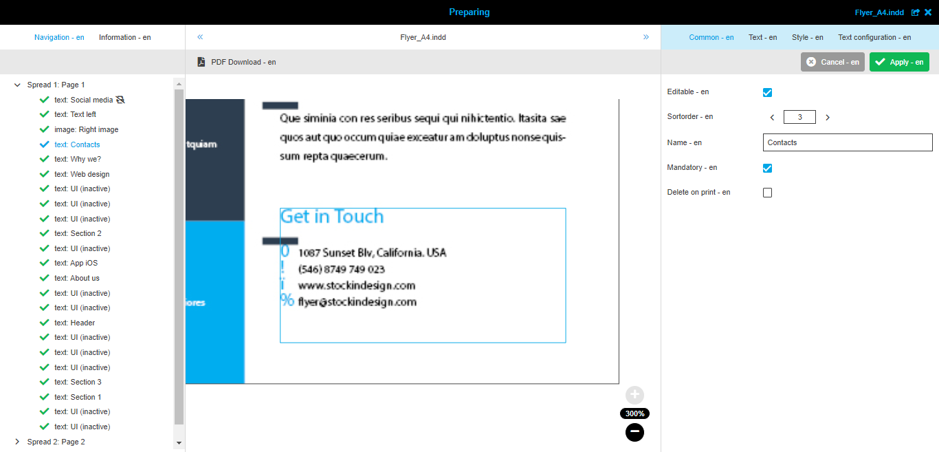
Common tab
The tab is available in the text box editor:
And the same tab is available in the image box editor:
And the same tab is available in the table box editor:
'Editable' checkbox
By enabling this checkbox you can make the box available for editing in DocEdit.
If the checkbox in not activated, the box is not available in the navigation and on canvas in DocEdit.
'Sortorder' input stepper
It is possible to change the sequence of the boxes in the document. To do that you need to update the numbers in these fields for all boxes that need to be reordered.
| The numbering starts from 0. |
'Name' input field
With this field you always have the possibility to rename the boxes. The same box names are not prohibited.
'Mandatory' checkbox
By enabling this checkbox you can define that the box must be adjusted by the user in the DocEdit. Such boxes have state icons in DocEdit.
If the checkbox is not activated, the box is shown without state icon in DocEdit.
'Delete on print' checkbox
If you need to hide the content of some box in the output document, you should activate this option.
When the option is activated, you have the hint icon shown for the box. Finally, in DocEdit the same icon with hint will be shown and for exported as PDF document, this box will not be available.
Text box editor
Text box editor gives you the possibilities to:
-
define which text boxes can be edited by the user in DocEdit
-
define which editing possibilities should be available for each box
-
configure available styles for the box in DocEdit (colors, paragraph and characters styles)
-
restrict the individualization possibilities for the text box in DocEdit
-
configure default text for the boxes
Text box editor consists of four tabs:
-
Common tab
-
Text tab
-
Style tab
-
Text configuration tab
Common tab
Detailed description is available in this section.
Text tab
This tab allows you to set default text for the box and limit the possibilities of editing the content of the box in DocEdit.
This is how this tab looks like:
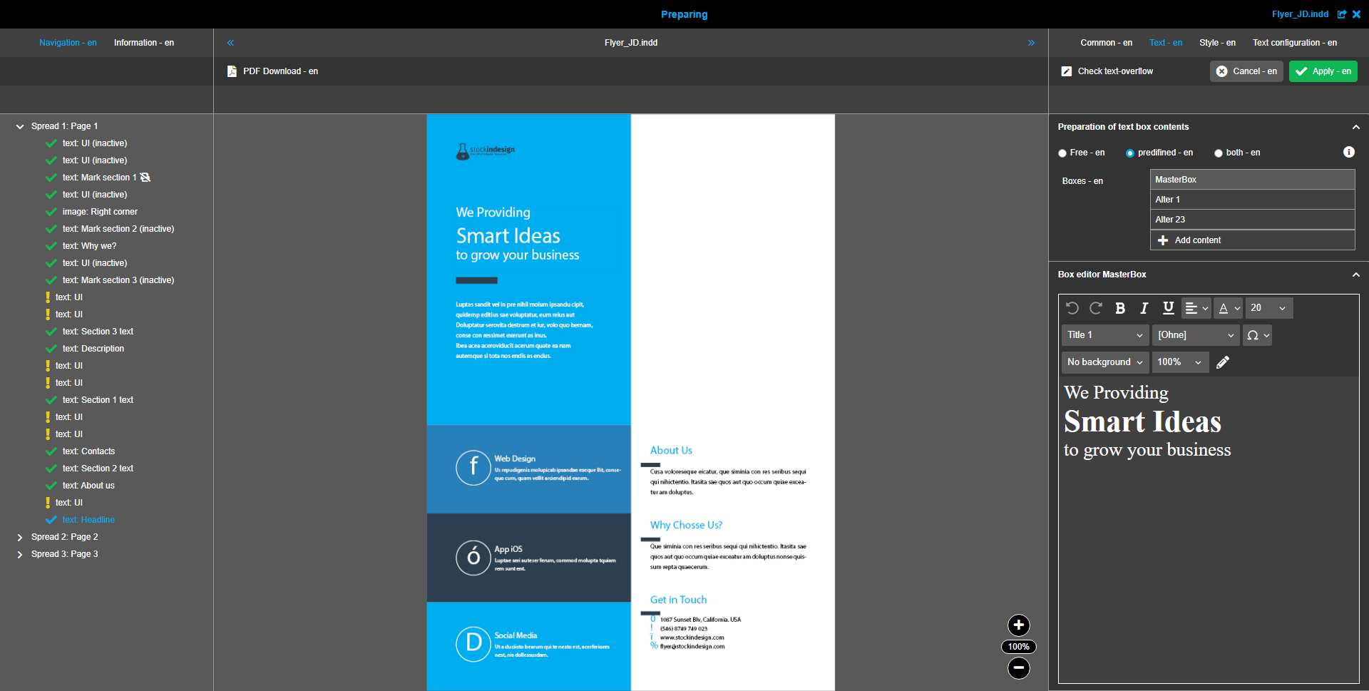
As you can see, there are two sections in the tab and the second one depends on the selection in the first one.
'Preparation of text box contents' section
This section consists of the editing mode switcher and the table with all configured box contents.
In general, there are three modes of editing the text boxes and here is the description of what effects the individual modes have:
-
Free mode → means that the user can edit text box content in DocEdit as he wants (without limitations)
-
Predefined mode → means that the user can only choose between configured contents and cannot edit them in any way
-
Both mode → means that the user has the list of configured contents to choose from, but also can edit the content if he needs to
You can change the mode by selecting one of the radio buttons.
After selecting the mode, you can proceed to the table 'Boxes':
-
'Free' mode is selected → the table is disabled, because you don’t need any alternative contents of the box
-
'Predefined' or 'Both' mode is selected → you have the possibility to add new box content, rename existing ones, remove alternative contents. After adding you should edit the text in the next section - 'Box editor' containing rich-text editor.
'Box editor {name of the selected box}' section
This section contains rich-text editor for the content of selected box in the table in the section above. Here you have a lot of possibilities to prepare the default or alternative content’s texts as you need.
Here is the list of available functions for text editing:
-
Bold
-
Italics
-
Text alignment chooser → Available options:
-
aligned left → text is aligned to the left side of the box
-
aligned right → text is aligned to the right side of the box
-
centered → text is aligned around a midpoint
-
justified → text is aligned to both left and right sides of the box
-
justified left → text is aligned to both sides of the box, the last row is aligned to the left side
-
justified center → text is aligned to both sides of the box, the last row is aligned around the midpoint
-
justified right → text is aligned to both sides of the box, the last row is aligned to the right side
-
-
Underlined
-
Font color chooser (available colors depend on the 'Style' tab)
-
Font size chooser
-
Paragraph styles chooser (available styles depend on the 'Style' tab)
-
Character styles chooser (available styles depend on the 'Style' tab)
-
Special characters chooser → the list is coming from ConfigClient (more information is available here)
|
If the text in the box has a set alignment from InDesign, it will be correctly shown on the preview in W2P and in the text box editors. Here is the example: |
In addition to functions related to text editing, there are functions to ease the usage of text editor:
-
Undo/redo → you can undo/redo all actions from the opening of the editor till saving of changes
-
Background chooser → light or dark one to correspond to font color
-
Zoom → is handy in case of very small or big font sizes
-
Open text editor in modal → allows to open rich-text editor in a separate modal with more space
If you are not sure that the whole entered text will suite the text box, you can execute toolbar function "Check text-overflow" (available if configured) before saving. If part of the text is overflowing the box, it will be highlighted in the editor:

Here you can see the example video on how configuration is done:
Style tab
This tab gives you the possibility to define which styles of the document can be used by the user for specific box. Here you can see the overview of the following styles preconfigured in Indesign:
-
Colors
-
Paragraph styles
-
Character styles
Here is the example how this tab looks like:
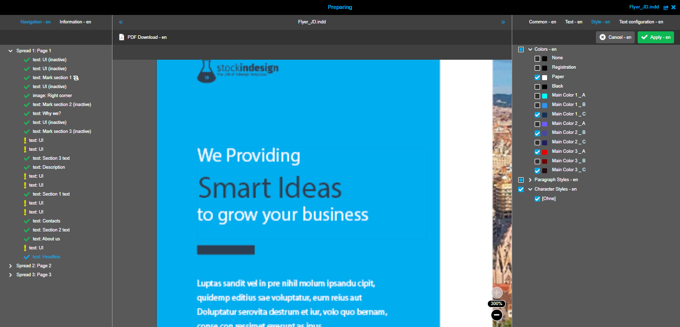
To enable any style you need to set the corresponding checkbox active. The made limitation have an influence on rich-text editors both in Preparing and DocEdit. You can see this on the colors example on the following video:
Text configuration tab
This tab allows you to limit the functions in the rich-text editor in DocEdit for the specific text box. This functionality can be used when some styling is not allowed for the box (e.g. font size should be as defined in Preparing).
The following functions are available for configuration:

-
Show style controls → influences dropdowns with paragraph and character styles in DocEdit
-
Show bold button → influences 'Bold' button in DocEdit
-
Show italic button → influences 'Italic' button in DocEdit
-
Show underline button → influences 'Underline' button in DocEdit
-
Show align buttons → influences dropdown with text alignments in DocEdit
-
Show font size chooser → influences dropdown with font sizes in DocEdit
-
Show color picker → influences color picker in DocEdit
-
Show special characters → influences dropdown with list of special characters in DocEdit
All mentioned settings have the same options to select from:
-
Default → meaning: the value (Enabled or Disabled) will be taken from ConfigClient where the availability of the same functions can be configured by administrator (more information on this page)
-
Enabled → the corresponding function is available in the rich-text editor in DocEdit for specific text box
-
Disabled → the corresponding function is not shown in the rich-text editor in DocEdit for specific text box
Here is the video showing how this mechanism works:
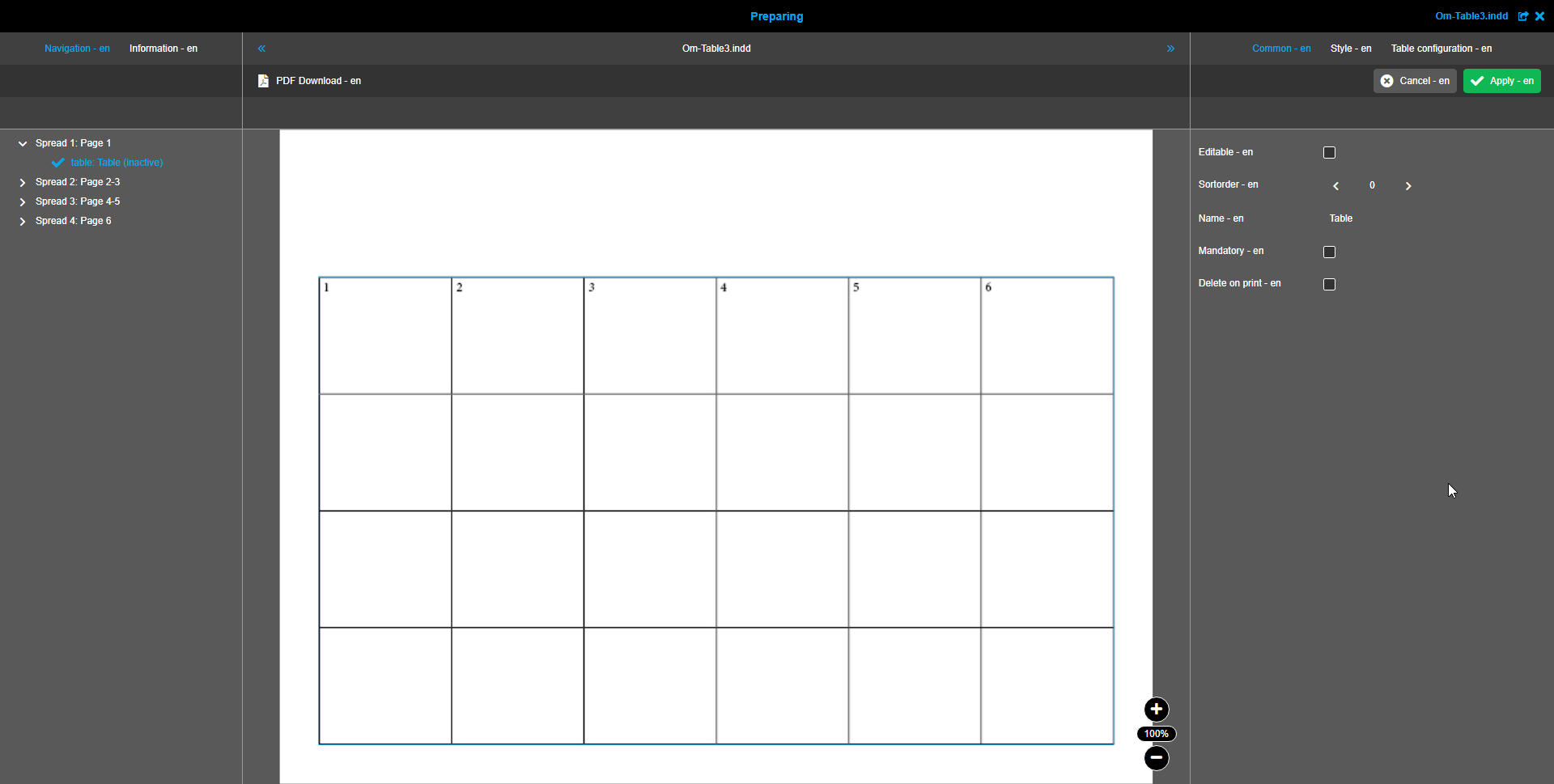
Table box editor
Table box editor gives you the possibilities to:
-
define which table boxes can be edited by the user in DocEdit
-
define which editing possibilities should be available for each box
-
configure available styles for the box in DocEdit (colors, paragraph and characters styles)
Text box editor consists of three tabs:
-
Common tab
-
Style tab
-
Text configuration tab
All the tabs contain the same settings as for text box editor.
Common tab
Detailed description is available in this section.
Style tab
This tab has the same functionality as in text box editor. For detailed description, please, refer to this section.
Text configuration tab
This tab has the same functionality as in text box editor. For detailed description, please, refer to this section.
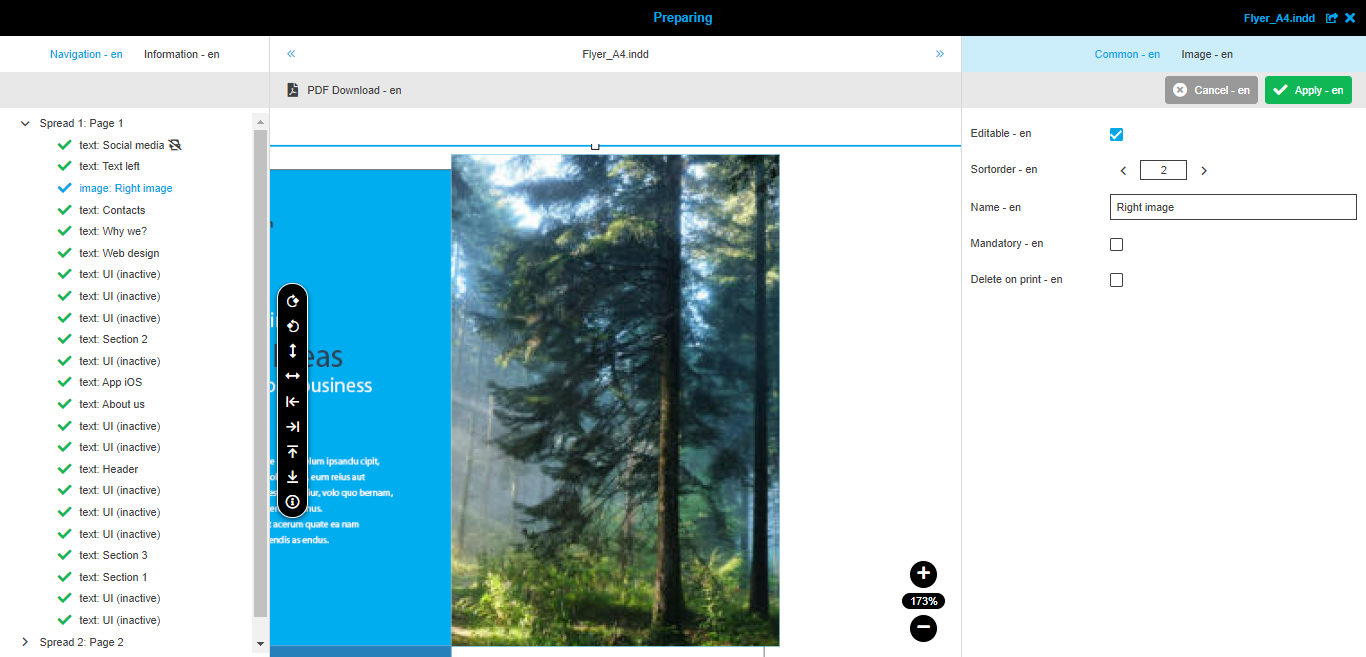
Image box editor
Image box editor gives you the possibilities to:
-
define which images should be available for the image box in DocEdit
-
set default image for the box
-
allow the user to upload own images in DocEdit
-
define dependencies between different boxes
-
enable QRCode generation in DocEdit
Image box editor consists of four tabs:
-
Common tab
-
Image tab
-
Depended boxes tab
-
QRCode tab
| 'Depended boxes' and 'QRCode' tabs availability depends on the corresponding options in ConfigClient. For more information, please refer to this page. |
Common tab
Detailed description is available in this section.
Image tab
In this tab you can configure everything related to the list of available images in image box editor in DocEdit.
Also, here you can specify how the user can set images into the box in DocEdit: only by choosing from predefined set of images or by uploading own images.
General panel
'General' panel contains 2 groups of settings:
-
configuration of toolbar functions availability in DocEdit
-
configuration of available functionality in the functions' toolbar on canvas in DocEdit
Here are the available options in the panel:
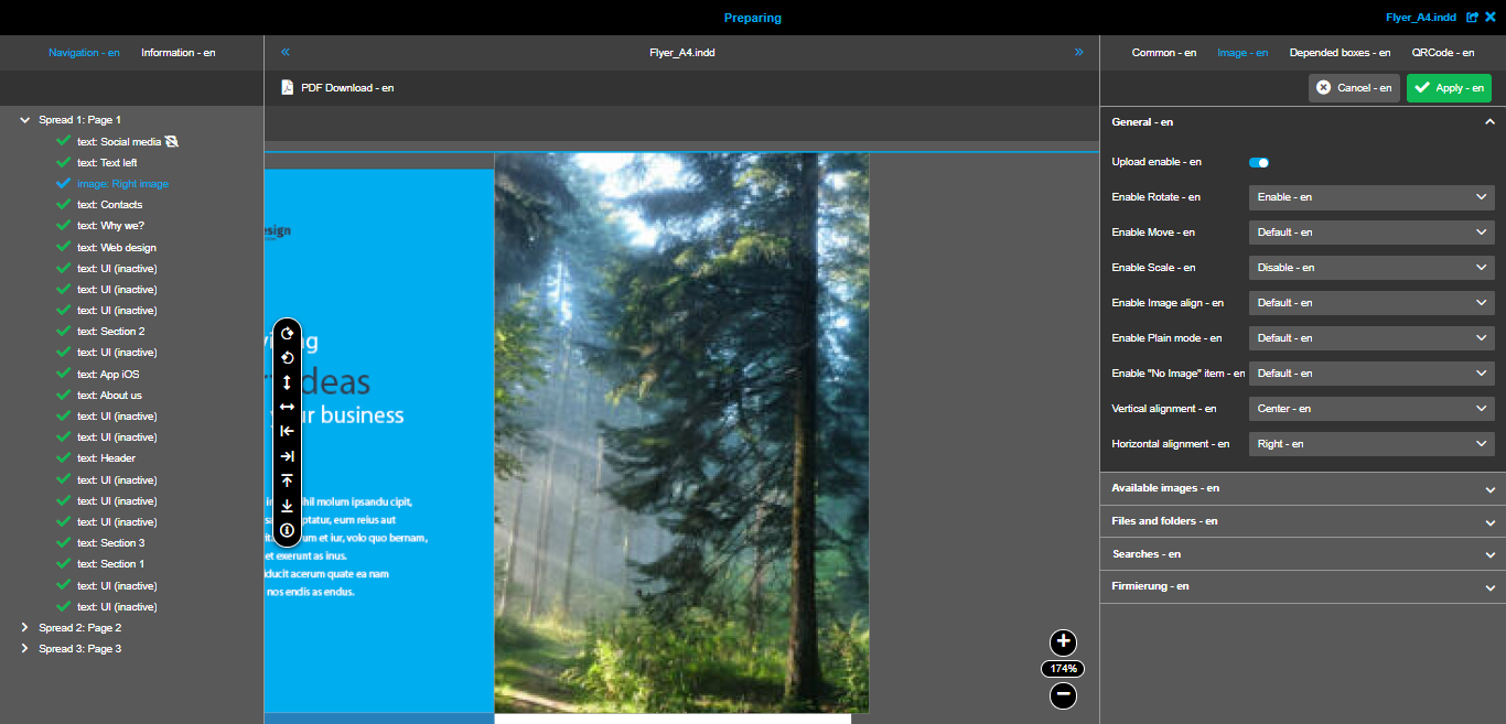
-
'Upload enable' toggle → you should enable it to allow the user to upload own images for the box in DocEdit. Important note: if you enable upload function, you should configure the folder to which the upload is done in the 'Files and folders' section. Otherwise, the user will not see uploaded images in the image box editor in DocEdit.
-
'Enable Rotate' dropdown → you can enable rotation functionality for the image inside the box (on canvas). Meaning of dropdown options:
-
Default - the value is taken from the ConfigClient for Preparing
-
Disable - the function will not be available in DocEdit
-
Enable - the function is available in DocEdit
-
-
'Enable Move' dropdown → you can allow the user to move the image inside the box as he wants. Meaning of dropdown options:
-
Default - the value is taken from the ConfigClient for Preparing
-
Disable - the function will not be available in DocEdit
-
Enable - the function is available in DocEdit
-
-
'Enable Scale' dropdown → you can allow the user to scale the selected image within the image box. Meaning of dropdown options:
-
Default - the value is taken from the ConfigClient for Preparing
-
Disable - the function will not be available in DocEdit
-
Enable - the function is available in DocEdit
-
-
'Enable Image align' dropdown → with this option you can enable buttons for alignment of the image inside the box on canvas in DocEdt. Meaning of dropdown options:
-
Default - the value is taken from the ConfigClient for Preparing
-
Disable - the functions will not be available in DocEdit
-
Enable - the functions is available in DocEdit
-
-
'Enable Plain mode' dropdown → you can decide if the user should see the folders structure or only the images from all folders you have selected. Meaning of dropdown options:
-
Default - the value is taken from the ConfigClient for Preparing
-
Disable - all images are shown on the same level in DocEdit
-
Enable - all images are shown on the different levels as they were added by you. An additional function to jump to the previous level is added to the image box editor in DocEdit
-
-
'Enable 'No Image' item' dropdown → with this option you can allow the user to leave the box empty in DocEdit. Meaning of dropdown options:
-
Default - the value is taken from the ConfigClient for Preparing
-
Disable - it is not possible to leave the image box empty in DocEdit and there is no special tile 'No image'
-
Enable - there is a special tile 'No image' in the image box editor. When it is selected, the image box on canvas is empty
-
-
'Vertical alignment' dropdown → with this option you can define how the image should be placed into the box vertically. Especially important if you limit the alignment functions for the user.
-
'Horizontal alignment' dropdown → with this option you can define how the image should be placed into the box horizontally. Especially important if you limit the alignment functions for the user.
Available images panel
In this panel you can see the images that will be shown in the image box editor in DocEdit.The panel’s content depends on the configuration of the following panels:
-
Files and folders
-
Searches
-
Firmierung
If you have not configured any of the mentioned panels, panel 'Available images' is not shown.As soon as you have activated the functionality and added at least one image inside any panel, the panel 'Available images' appears in the editor.
Here you can see the example of how the panel looks like:
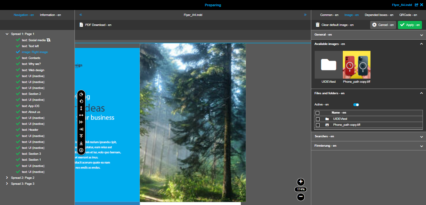
If you are adding folders with images to be available in DocEdit, there is an additional possibility to navigate deeper within folders to recheck their content and set a default image from the deeper level.
Set default image for the box
Another important function within this panel is 'Set default image'.You can select any available image and set it as default → it will be placed to the box, shown on the generated preview and preselected in the image box editor in DocEdit.
You can reset the default image by clicking on it and executing the corresponding function.Defining the default image is not required, so you can simply skip this step.
Here you can see a video showing how the described panel works:
Files and folders panel
This panel is used to add specific images and folders to the list of available images in image box editor in DocEdit.
The panel looks like this:

The main functionality within this panel is the possibility to drop directories and images from the file system.
The perfect flow of work with this panel is the following:
-
Open File system navigation in a separate tab.
-
Expand the 'Files and folders' panel in Preparing.
-
Activate the 'Active' toggle.
-
Expand the newly appeared 'Available images' panel (this step is optional → but it’s handy to view the current state of images' list).
-
Drag an item (image file or directory with images) from the File system navigation and drop it on the table (it is also possible to drag and drop several items).
-
Save the changes of the image box editor.
The described flow of the actions in the panel is shown in the next video:
Searches panel
This panel is also used to add specific images/folders to the list of available images in DocEdit. But in comparison with the previous panel, here you need to have a previously saved search that you will choose to add search results to the images list.
| Right now saved searches from OMN-Search are not shown in the list (feature will be available in the future). |
The panel looks like this:
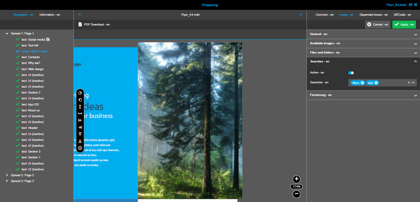
The perfect flow of work with this panel is the following:
-
Prepare a saved search in OMN-Search with the objects (image files and folders).
-
Activate the 'Active' toggle in the panel in Preparing.
-
Expand the newly appeared 'Available images' panel (this step is optional → but it’s handy to view the current state of images' list).
-
Choose the needed search(es) in the dropdown list.
-
Save the changes of the image box editor.
The described flow of the actions in the panel is shown in the next video:
Depended boxes tab
In this tab you can define the dependencies between image box and other boxes. In general, it is needed if some boxes' presence depends on the fact if the image is set or not (e.g. text box 'Description of the image' should be visible on the page only if the image is set).
Here you can see how the configuration looks like:
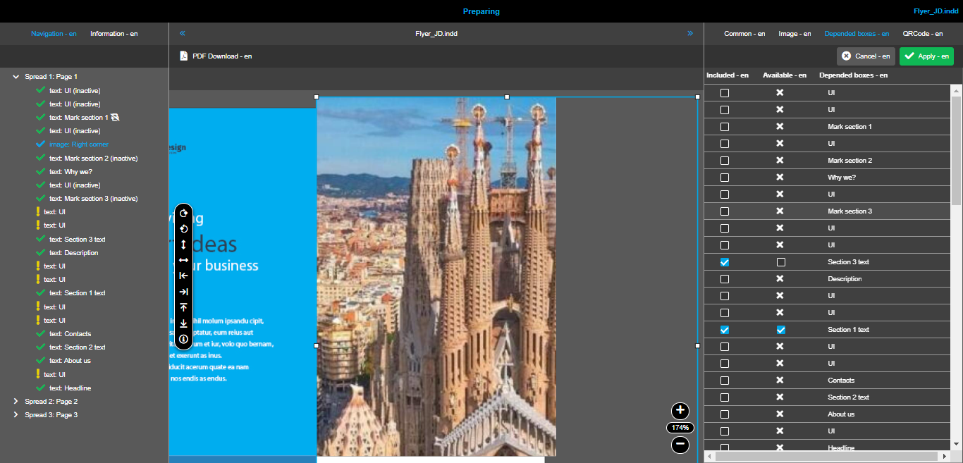
General mechanism is the following:
-
status of depended boxes changes only when the user set or reset the image in the image box
-
you can configure two types of depended text boxes:
-
'included' box → meaning: the box and its content will be visible on canvas and editable only until the image is not set into the image box
-
'available' box → meaning: the box and its content will be visible on canvas and editable only while the image is set into the image box. If the image is reset, the box becomes disabled
-
Here you can see the example on how both types work:
QRCode tab
Web-to-Print module provides you with the possibility to generate QRCodes and add them into image boxes of the documents.
Preconditions for usage of QRCode generation
To use the QRCode generator in DocEdit you need to:
-
have at least one image box in the InDesign document
-
enable and configure QRCode generation for the box in Preparing
Configuration of QRCode generation function in Preparing
To configure the QRCode generation function in Preparing, you should
-
Select the needed image box
-
In the image box editor in the right panel select 'QRCode' tab
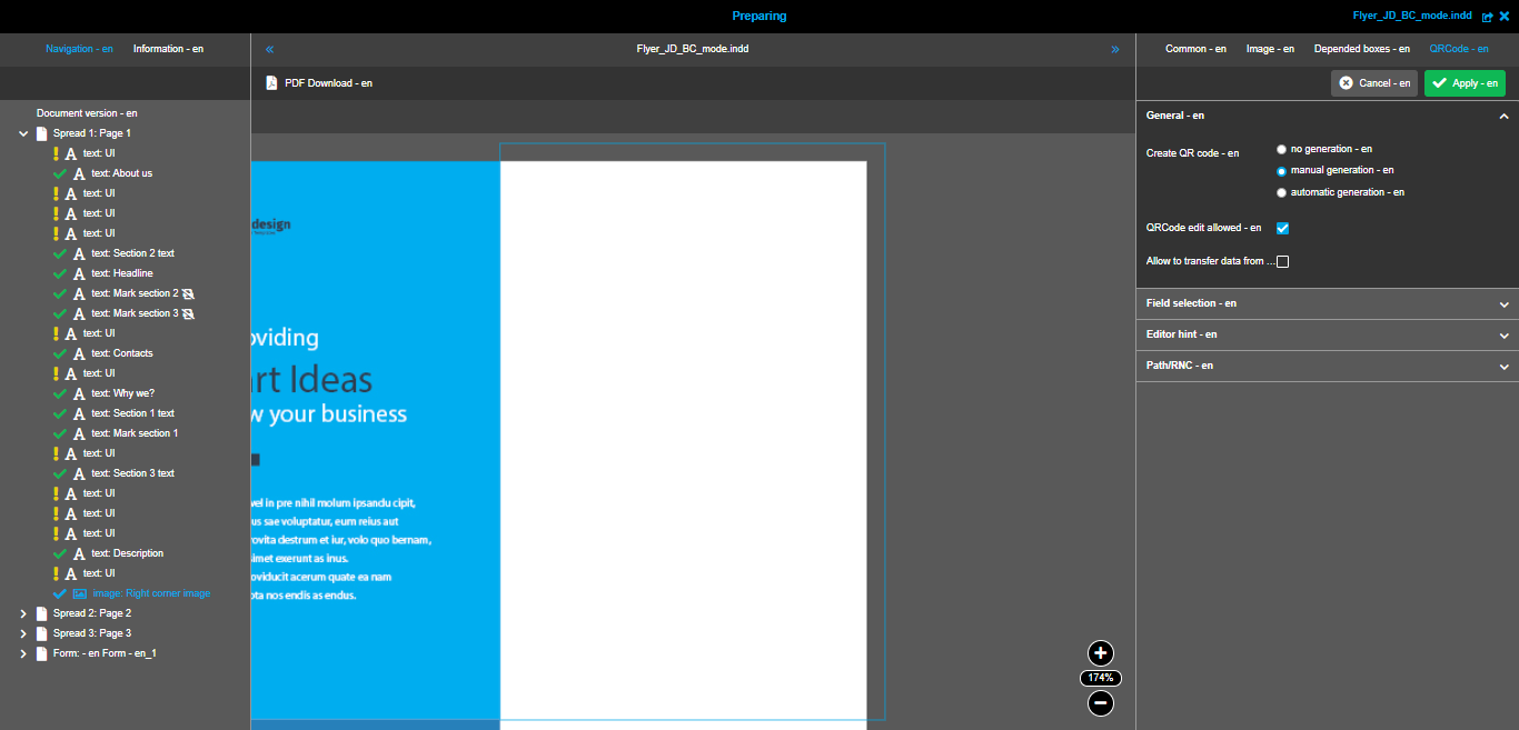
Configuration in 'General' accordion panel
-
Select mode of generation via 'Create QRCode' chooser
-
no generation → the generation is not activated
-
manual generation → the function will be available in DocEdit (but you need to configure input fields additionally)
-
automatic generation → meaning: QRCode is generated automatically after saving of the input form → should be used only for documents with activated BC-mode
-
-
Decide if QRCode’s editing is allowed via 'QRCode edit allow' checkbox
-
checkbox is inactive → there is no possibility to re-generate existing QRCode. If mistake was done, you could generate a new QRCode
-
checkbox is active → additional function will be available in DocEdit
-
-
Set up the synchronization between information from input form with QRCode generation form via 'Allow to transfer data from form'
-
checkbox is inactive → values from input form are not synchronized with fields for QRCode generation
-
checkbox is active → values from input form are synchronized with the fields for QRCode generation. Fields should be configured additionally in 'Field selection' accordion panel. → should be used only for documents with activated BC-mode
-
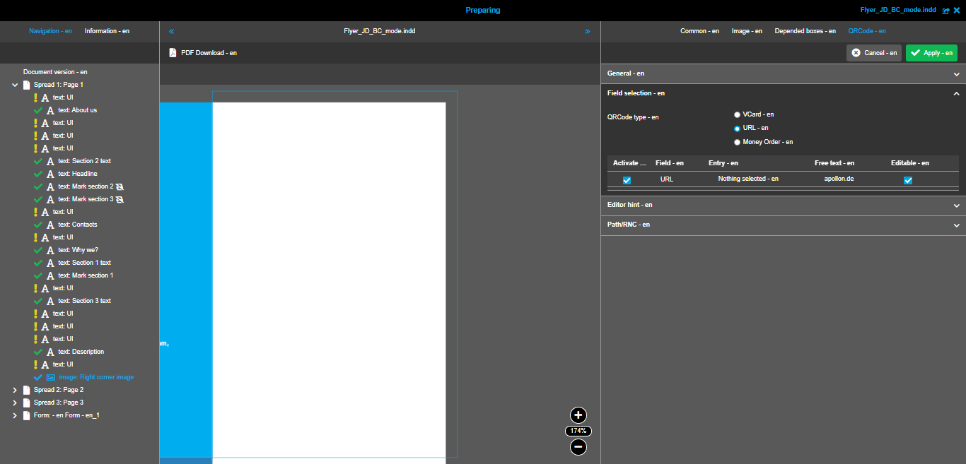
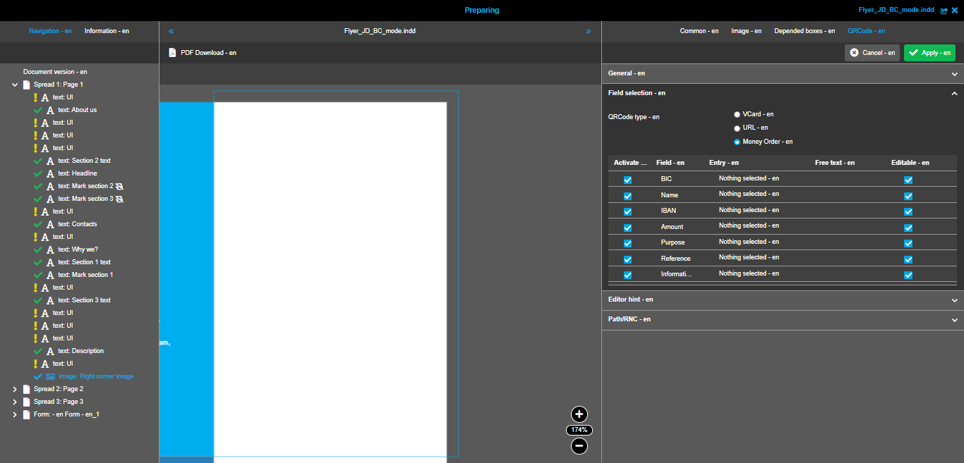
Configuration in 'Field selection' accordion panel
Here you can choose what type of QRCode you are going to allow the users to create in DocEdit. The following predefined types are available:
-
VCard - this is a type for business card QRCodes
-
URL - this is a type for QRCodes with the links inside
-
Money Order - with the help of such QRCodes you can issue an invoice in QRCode for the payers
As soon as you select a type of QRCode, you can see the table with all available fields for a specified type. The lists of fields are different, but the configuration options are the same for all types:
-
'Activate' column - activate the checkbox if you want to make this field available in the QRCode generator in DocEdit
-
'Field' column - here you can see the name of each field (you cannot edit the name)
-
'Entry' column - here is it possible to select any entry from the input form. As result, the value from the form will be pre-entered in the QRCode generator. Important: option 'Allow to transfer data from form' should be active
-
'Free text' column - the value entered here will be pre-entered in the QRCode generator. Important: this configuration works when option 'Allow to transfer data from form' is not active
-
'Editable' column - activate the checkbox if you want to make this field editable by the users in the QRCode generator
Available fields for VCard type:

Available field for URL type:
Available fields for Money Order type:
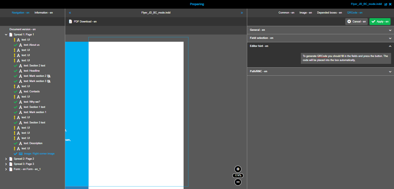
Configuration in 'Editor hint' accordion panel
In this panel you can set the text hint for the users. It will be permanently shown in the QRCode generator in DocEdit.
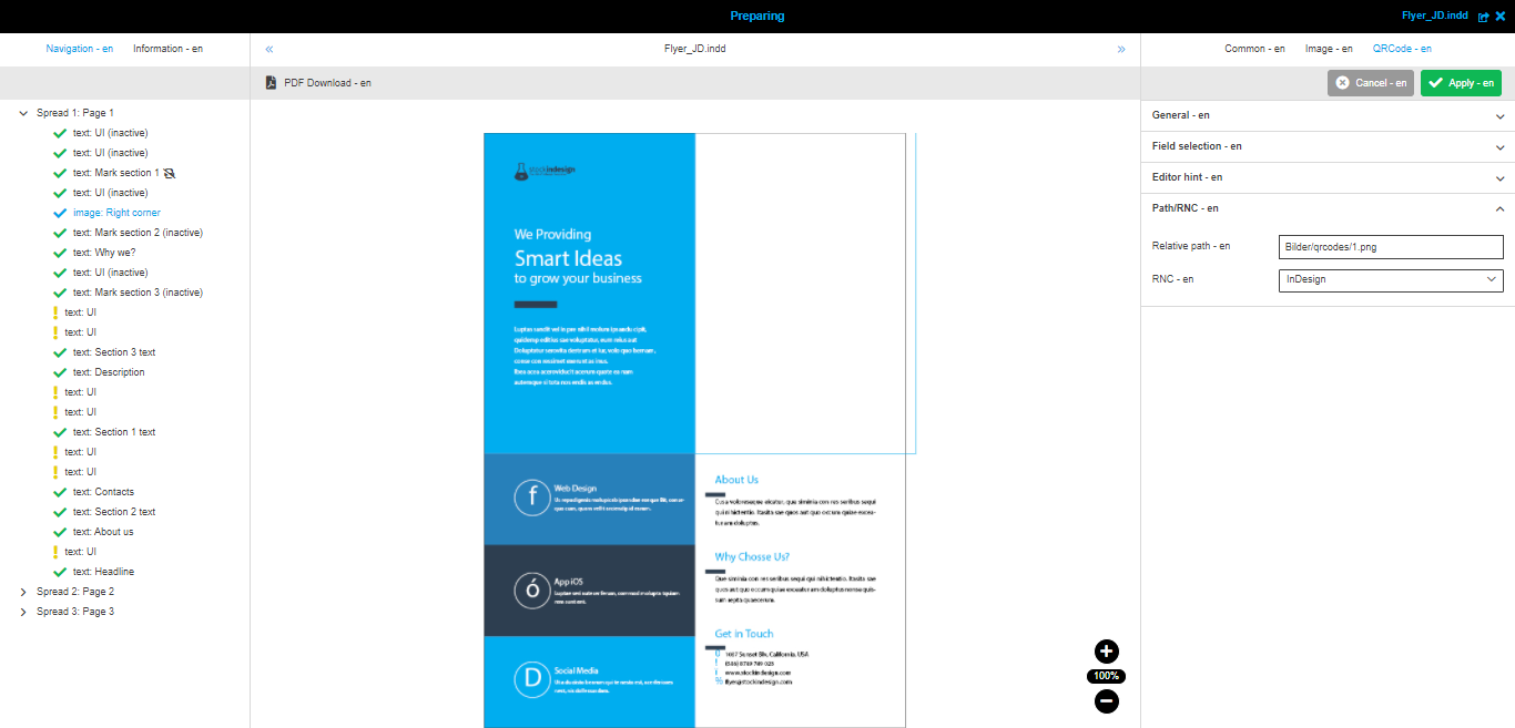
Configuration in 'Path/RNC' accordion panel
In this panel you should choose the folder on the file system where the generated QRCodes will be stored.
You should select the root node on the file system (RNC) and set the exact path to the needed folder. The last segment of the path should contain the file name of the generated qr-code:
When everything is configured, you should save the changes. After saving, QRCode generation function is available in specified image box editor in DocEdit.
Usage of QRCode generator in DocEdit
For detailed information, please, refer to this page.
Functions' toolbar on canvas
In addition to the editor opened in the right panel, there are several functions that allow you to place the default image exactly as you need within the box.These functions are available on the canvas.
The first group of function relates to image border:
-
Rotating → you need to hover the area around image corner and start rotating the image with click. The tooltip shows the hint in degrees.
-
Moving → you can start moving the image within the box by clicking anywhere on the image.
-
Resizing → there are special squares on the image border (on each side and in the corners). By clicking on them, you can start resizing. Resizing is always done proportionally.
The second group is placed in the special toolbar that is shown in the central area:
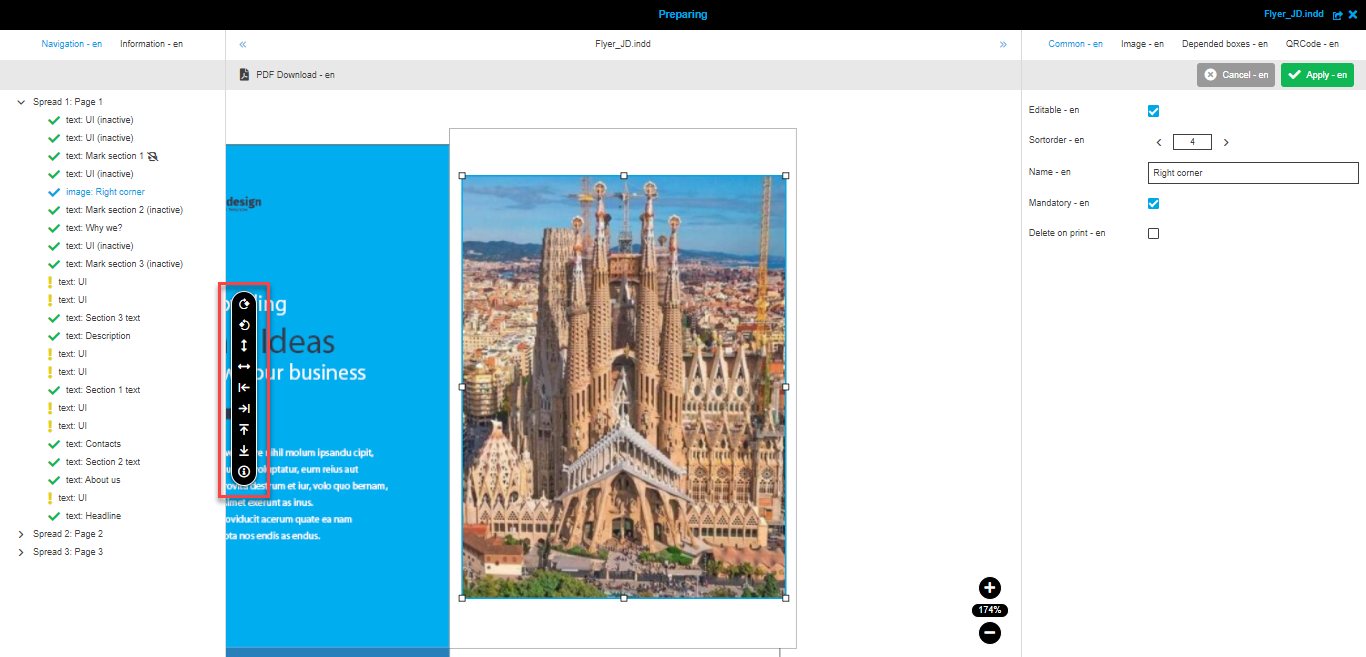
-
 - Rotate 90 degrees to the right → on single click the image is rotated in 90 degrees right from its current position
 -
 - Rotate 90 degrees to the left → on single click the image is rotated in 90 degrees left from its current position
 -
 - Align vertically → on single click the center of the image is aligned to the center of the box vertically
 -
 - Align horizontally → on single click the center of the image is aligned to the center of the box horizontally
 -
 - Align to left → on single click the left side of the image is aligned to the left border of the box
 -
 - Align to right → on single click the right side of the image is aligned to the right border of the box
 -
 - Align to top → on single click the top side of the image is aligned to the top border of the box
 -
 - Align to bottom → on single click the bottom side of the image is aligned to the bottom border of the box
 -
 - Information → when the user activates this function, additional information is shown on the top of canvas. There you can see current move coordinates, rotation angle, zoom percentage.Information is updated after each action.
Here you can see the overview video showing all described functions in action:
BC-mode configuration
General information on what BC-mode is → available in this section.
This mode allows you to create an input form with all needed fields and define the links between fields and text boxes of the document. As a result, in DocEdit the user can enter all information in one Form editor instead of switching between several editors for different text boxes.
The configuration of the input form is a complex process including several steps and different editors. Rough description of the process by steps is the following:
-
Activate 'BC mode' in the 'Information' tab in the left view
-
Select 'Document version' entry in navigation and press 'Add form' button
-
Select new 'Form' entry in navigation and press 'Add entry' button
-
Select new 'Entry' entry in navigation, edit its details in the editor and press 'Add text' / 'Add area' / 'Add list' button
-
Select new 'Text' / 'Area' / 'List' entry in navigation and edit its details in the editor
-
Repeat steps 2-5 until the form is ready
You can see the example of BC-mode’s activation in the following video:
| You can create only one form for the document. |
Toolbar
This section contains the description of functions that relate to the whole document, not to specific boxes. Such functions are placed in the toolbar of the central panel:
PDF Download
This function gives you the possibility to download the preview of the document in PDF format. All current settings of the document and its boxes are applied to generate PDF file, e.g. all 'delete on print' boxes are not shown on the preview.
Here is the video with the usage of this function: